July 2017 Monetary Policy Report: Full Text
Summary
Economic activity increased at a moderate pace over the first half of the year, and the jobs market continued to strengthen. Measured on a 12-month basis, inflation has softened some in the past few months. The Federal Open Market Committee (FOMC) judged that, on balance, current and prospective economic conditions called for a further gradual removal of policy accommodation. At its most recent meeting in June, the Committee boosted the target range for the federal funds rate to 1 to 1-1/4 percent. The Committee also issued additional information regarding its plans for reducing the size of its balance sheet in a gradual and predictable manner.
Economic and Financial Developments
Labor markets. Labor markets. The labor market has strengthened further so far this year. Over the first five months of 2017, payroll employment increased 162,000 per month, on average, somewhat slower than the average monthly increase for 2016 but still more than enough to absorb new entrants into the labor force. The unemployment rate fell from 4.7 percent in December to 4.3 percent in May--modestly below the median of FOMC participants' estimates of its longer-run normal level. Other measures of labor utilization are also consistent with a relatively tight labor market. However, despite the broad-based strength in measures of employment, wage growth has been only modest, possibly held down by the weak pace of productivity growth in recent years.
Inflation. Inflation. Consumer price inflation, as measured by the 12-month change in the price index for personal consumption expenditures, briefly reached the FOMC's 2 percent objective earlier this year, but it more recently has softened. The latest reading, for May, was 1.4 percent--still up from a year earlier when falling energy prices restrained overall consumer prices. The 12-month measure of inflation that excludes food and energy items (so-called core inflation), which historically has been a better indicator than the headline figure of where overall inflation will be in the future, was also 1.4 percent over the year ending in May; this reading was a bit lower than it had been one year earlier. Measures of longer-run inflation expectations have been relatively stable, on balance, though some measures remain low by historical standards.
Economic growth. Economic growth. Real gross domestic product (GDP) is reported to have risen at an annual rate of about 1-1/2 percent in the first quarter of 2017, but more recent data suggest growth stepped back up in the second quarter. Consumer spending was sluggish in the early part of the year but appears to have rebounded recently, supported by job gains, rising household wealth, and favorable consumer sentiment. Business investment has turned up this year after having been weak for much of 2016, and indicators of business sentiment have been strong. The housing market continues its gradual recovery. Economic growth has also been supported by recent strength in foreign activity.
Financial conditions. Financial conditions. On balance, domestic financial conditions for businesses and households have continued to support economic growth. Long-term nominal Treasury yields and mortgage rates have decreased so far in 2017, although yields remain somewhat above levels that prevailed last summer. Broad measures of equity prices increased further during the first half of the year. Spreads of yields on corporate bonds over comparable-maturity Treasury securities decreased. Most types of consumer loans remained widely available, while mortgage credit stayed readily available for households with solid credit profiles but was still difficult to access for households with low credit scores or harder-to-document incomes. In foreign financial markets, equity prices increased and risk spreads decreased amid generally firming economic growth and robust corporate earnings. The broad U.S. dollar index depreciated modestly against foreign currencies.
Financial stability. Financial stability. Vulnerabilities in the U.S. financial system remained, on balance, moderate. Contributing to the financial system's improved resilience, U.S. banks have substantial amounts of capital and liquidity. Valuation pressures across a range of assets and several indicators of investor risk appetite have increased further since mid-February. However, these developments in asset markets have not been accompanied by increased leverage in the financial sector, according to available metrics, or increased borrowing in the nonfinancial sector. Household debt as a share of GDP continues to be subdued, and debt owed by nonfinancial businesses, although elevated, has been either flat or falling in the past two years. (See the box "Developments Related to Financial Stability" in Part 1.)
Monetary Policy
Interest rate policy. Interest rate policy. Over the first half of 2017, the FOMC continued to gradually reduce the amount of monetary policy accommodation. Specifically, the Committee decided to raise the target range for the federal funds rate in March and in June, bringing it to the current range of 1 to 1-1/4 percent. Even with these rate increases, the stance of monetary policy remains accommodative, supporting some further strengthening in labor market conditions and a sustained return to 2 percent inflation.
The FOMC continues to expect that, with gradual adjustments in the stance of monetary policy, economic activity will expand at a moderate pace and labor market conditions will strengthen somewhat further. Inflation on a 12-month basis is expected to remain somewhat below 2 percent in the near term but to stabilize around the Committee's 2 percent objective over the medium term. The federal funds rate is likely to remain, for some time, below levels that are expected to prevail in the longer run. Consistent with this outlook, in the most recent Summary of Economic Projections (SEP), compiled at the time of the June FOMC meeting, most participants projected that the appropriate level of the federal funds rate would be below its longer-run level through 2018. (The June SEP is presented in Part 3 of this report.) However, as the Committee has continued to emphasize, monetary policy is not on a preset course; the actual path of the federal funds rate will depend on the evolution of the economic outlook as informed by incoming data. In particular, the Committee is monitoring inflation developments closely.
Balance sheet policy. Balance sheet policy. To help maintain accommodative financial conditions, the Committee has continued its existing policy of reinvesting principal payments from its holdings of agency debt and agency mortgage-backed securities in agency mortgage-backed securities and rolling over maturing Treasury securities at auction. In June, the FOMC issued an Addendum to the Policy Normalization Principles and Plans that provides additional details regarding the approach the FOMC intends to follow to reduce the Federal Reserve's holdings of Treasury and agency securities in a gradual and predictable manner. The Committee currently expects to begin implementing the balance sheet normalization program this year provided that the economy evolves broadly as anticipated. (See the box "Addendum to the Policy Normalization Principles and Plans" in Part 2.)
Special Topics
Education and climbing the economic ladder. Education and climbing the economic ladder. Education, particularly a college degree, is often seen as a path to improved economic opportunities. However, despite the fact that young blacks and Hispanics have increased their educational attainment over the past quarter-century, their representation in the top 25 percent of the income distribution for young people has not materially increased. In part, this outcome has occurred because educational attainment has increased for young non-Hispanic whites and Asians as well. While education continues to be an important determinant of whether one can climb the economic ladder, sizable differences in economic outcomes across race and ethnicity remain even after controlling for educational attainment. (See the box "Does Education Determine Who Climbs the Economic Ladder?" in Part 1.)
The global productivity slowdown. The global productivity slowdown. Over the past decade, labor productivity growth both in the United States and in other advanced economies has slowed markedly. This slowdown may reflect a waning of the effects from advances in information technology in the 1990s and early 2000s. Productivity growth may also be low because of the severity of the Global Financial Crisis, in part because spending for research and development was muted. Some of the factors restraining productivity growth may eventually fade, but it is difficult to ascertain whether the recent subdued performance of productivity represents a new normal. (See the box "Productivity Developments in the Advanced Economies" in Part 1.)
Liquidity in the corporate bond market. Liquidity in the corporate bond market. A series of changes, including regulatory reforms, since the Global Financial Crisis have likely altered financial institutions' incentives to provide liquidity. Many market participants are particularly concerned with liquidity in markets for corporate bonds. However, the available evidence suggests that financial markets have performed well in recent years, with minimal impairment in liquidity, either in the market for corporate bonds or in markets for other assets. (See the box "Recent Developments in Corporate Bond Market Liquidity" in Part 1.)
Monetary policy rules. Monetary policy rules. Monetary policymakers consider a wide range of information on current economic conditions and the outlook before deciding on a policy stance they deem most likely to foster the FOMC's statutory mandate of maximum employment and stable prices. They also routinely consult monetary policy rules that connect prescriptions for the policy interest rate with variables associated with the dual mandate. The use of such rules requires careful judgments about the choice and measurement of the inputs into these rules as well as the implications of the many considerations these rules do not take into account. (See the box "Monetary Policy Rules and Their Role in the Federal Reserve's Policy Process" in Part 2.)
Statement on Longer-Run Goals and Monetary Policy Strategy
The Federal Open Market Committee (FOMC) is firmly committed to fulfilling its statutory mandate from the Congress of promoting maximum employment, stable prices, and moderate long-term interest rates. The Committee seeks to explain its monetary policy decisions to the public as clearly as possible. Such clarity facilitates well-informed decisionmaking by households and businesses, reduces economic and financial uncertainty, increases the effectiveness of monetary policy, and enhances transparency and accountability, which are essential in a democratic society.
Inflation, employment, and long-term interest rates fluctuate over time in response to economic and financial disturbances. Moreover, monetary policy actions tend to influence economic activity and prices with a lag. Therefore, the Committee's policy decisions reflect its longer-run goals, its medium-term outlook, and its assessments of the balance of risks, including risks to the financial system that could impede the attainment of the Committee's goals.
The inflation rate over the longer run is primarily determined by monetary policy, and hence the Committee has the ability to specify a longer-run goal for inflation. The Committee reaffirms its judgment that inflation at the rate of 2 percent, as measured by the annual change in the price index for personal consumption expenditures, is most consistent over the longer run with the Federal Reserve's statutory mandate. The Committee would be concerned if inflation were running persistently above or below this objective. Communicating this symmetric inflation goal clearly to the public helps keep longer-term inflation expectations firmly anchored, thereby fostering price stability and moderate long-term interest rates and enhancing the Committee's ability to promote maximum employment in the face of significant economic disturbances. The maximum level of employment is largely determined by nonmonetary factors that affect the structure and dynamics of the labor market. These factors may change over time and may not be directly measurable. Consequently, it would not be appropriate to specify a fixed goal for employment; rather, the Committee's policy decisions must be informed by assessments of the maximum level of employment, recognizing that such assessments are necessarily uncertain and subject to revision. The Committee considers a wide range of indicators in making these assessments. Information about Committee participants' estimates of the longer-run normal rates of output growth and unemployment is published four times per year in the FOMC's Summary of Economic Projections. For example, in the most recent projections, the median of FOMC participants' estimates of the longer-run normal rate of unemployment was 4.8 percent.
In setting monetary policy, the Committee seeks to mitigate deviations of inflation from its longer-run goal and deviations of employment from the Committee's assessments of its maximum level. These objectives are generally complementary. However, under circumstances in which the Committee judges that the objectives are not complementary, it follows a balanced approach in promoting them, taking into account the magnitude of the deviations and the potentially different time horizons over which employment and inflation are projected to return to levels judged consistent with its mandate.
The Committee intends to reaffirm these principles and to make adjustments as appropriate at its annual organizational meeting each January.
Domestic Developments
The labor market tightened further during the first half of the year...
Labor market conditions continued to strengthen in the first five months of this year. On average, payrolls expanded 162,000 per month between January and May, a little slower than the average monthly employment gain in 2016 but still more than enough to absorb new entrants to the labor force and therefore consistent with a further tightening of the labor market (figure 1). The unemployment rate has declined 0.4 percentage point since December 2016, and in May it stood at 4.3 percent, its lowest level since late 2000 and modestly below the median of Federal Open Market Committee (FOMC) participants' estimates of its longer-run normal level.
Net change in payroll employment
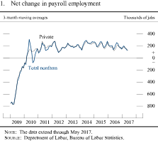
The data extend through May 2017.
Source: Department of Labor, Bureau of Labor Statistics.
The labor force participation rate (LFPR)--that is, the share of adults either working or actively looking for work--was 62.7 percent in May and is little changed, on net, since early 2014 (figure 2). Along with other factors, the aging of the population implies a downward trend in participation, so the flattening out of the LFPR during the past few years is consistent with an overall picture of improving labor market conditions. The employment-to-population ratio--that is, the share of the population that is working--was 60 percent in May and has been increasing for the past couple of years, reflecting the combination of the declining unemployment rate and the flat LFPR.
Labor force participation rate and employment-to-population ratio
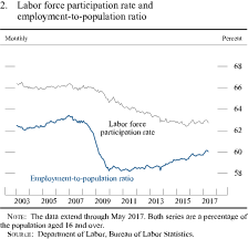
The data extend through May 2017. Both series are a percentage of the population aged 16 and over.
Source: Department of Labor, Bureau of Labor Statistics.
The strengthening condition of the labor market is evident in other measures as well. The number of people filing initial claims for unemployment insurance has fallen to the lowest level in decades. In addition, as reported in the Job Openings and Labor Turnover Survey, the rate of job openings remained elevated in the first part of the year, while the rate of layoffs remained low; both are signs that firms' demand for labor is still solid. In addition, the rate of quits stayed high, an indication that workers are confident in their ability to obtain a new job. Another measure, the share of workers who are working part time but would prefer to be employed full time--which is part of the U-6 measure of underutilization from the Bureau of Labor Statistics--fell noticeably further in the first five months of 2017 (figure 3).
Measures of labor underutilization
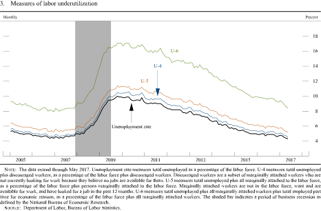
The data extend through May 2017. Unemployment rate measures total unemployed as a percentage of the labor force. U-4 measures total unemployed plus discouraged workers, as a percentage of the labor force plus discouraged workers. Discouraged workers are a subset of marginally attached workers who are not currently looking for work because they believe no jobs are available for them. U-5 measures total unemployed plus all marginally attached to the labor force, as a percentage of the labor force plus persons marginally attached to the labor force. Marginally attached workers are not in the labor force, want and are available for work, and have looked for a job in the past 12 months. U-6 measures total unemployed plus all marginally attached workers plus total employed part time for economic reasons, as a percentage of the labor force plus all marginally attached workers. The shaded bar indicates a period of business recession as defined by the National Bureau of Economic Research: December 2007-June 2009.
Source: Department of Labor, Bureau of Labor Statistics.
...though unemployment rates remain elevated for some demographic groups
Although the aggregate unemployment rate was at a 16-year low in May, there are substantial disparities across demographic groups (figure 4). Notably, the unemployment rate for whites averaged 4 percent during the first five months of the year, and the rate for Asians was about 3-1/2 percent. However, the unemployment rates for Hispanics (5.4 percent) and African Americans (7.8 percent) were substantially higher. The differences in the unemployment rates across racial and ethnic groups are long-standing, and they also vary over the business cycle. Indeed, the unemployment rates for blacks and Hispanics both rose considerably more than the rates for whites and Asians during the Great Recession, and their subsequent declines have been more rapid. On balance, however, the differences in unemployment rates across the groups have not narrowed relative to the pre-recession period. (For additional discussion on differences in economic outcomes by race and ethnicity, see the box "Does Education Determine Who Climbs the Economic Ladder?")
Unemployment rate by race and ethnicity
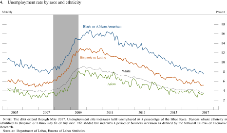
The data extend through May 2017. Unemployment rate measures total unemployed as a percentage of the labor force. Persons whose ethnicity is identified as Hispanic or Latino may be of any race. The shaded bar indicates a period of business recession as defined by the National Bureau of Economic Research: December 2007-June 2009.
Source: Department of Labor, Bureau of Labor Statistics.
Does Education Determine Who Climbs the Economic Ladder?
The persistent gaps in economic outcomes by race and ethnicity in the United States raise important questions about how people ascend the economic ladder. Education, particularly a college degree, is often seen as a path to improved economic opportunities. Past research has shown that human capital in the form of education and experience can explain about one-third of the variation in wages across individuals.1 However, while education continues to be an important determinant of whether one can climb the economic ladder, sizable differences in economic outcomes across race and ethnicity remain even after controlling for educational attainment.
Data on earnings for two cohorts of young adult workers (aged 25 to 34) approximately a generation apart confirm both the gaps in economic outcomes and the lack of substantial upward progress for disadvantaged groups over the past quarter-century (figure A). People of this age typically have limited years of work experience, but most have completed their schooling. Therefore, focusing on young adults allows us to better isolate the effect of education from the influence of other variables, including experience. Furthermore, research has shown that the level of wages received early in an individual's career persists over time and influences that individual's wage trajectory for years to come.2 The figure shows the fraction of each group that has reached the top quartile of earnings for young adults as a whole. The black dashed line at 25 percent marks the fraction of each group that would be in this top quartile if each group were equally represented in proportion to its population size.3
Percent of workers in top quartile of earnings among all young adults
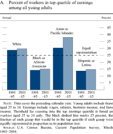
Data cover the preceding calendar year. Young adults include those aged 25 to 34. Earnings include wages, salaries, business income, and farm income. Threshold for crossing into the top earnings quartile is based on workers aged 25 to 34 only. The black dashed line marks 25 percent, the fraction of each group that would be in the top quartile if each group were equally represented in proportion to its population size.
Source: U.S. Census Bureau, Current Population Survey, March 1992-2016.
Non-Hispanic whites, for example, are overrepresented in the top 25 percent of the earnings distribution of young adults for both cohorts, with just under 30 percent of the group in the top quartile in both the 1991-95 and 2011-15 periods. Black or African American young adults are underrepresented in the top quartile in both periods, at about 15 percent. Hispanics are likewise underrepresented, and again there has been little improvement over time. Asians stand out in terms of both high representation and changes over time, though these measures obscure the very high levels of inequality within this group.4
Overall, the representation of black and Hispanic workers in the top earnings quartile continues to lag in the later period. This lag in representation occurs despite the gains in educational attainment--the critical driver of improved incomes--that blacks and Hispanics have achieved over time. For both blacks and Hispanics, the share achieving a bachelor's degree or higher has doubled over the period of study (figure B). However, even with these improvements, the educational attainment gap between each of those groups and whites persists, because the fraction of whites attaining a bachelor's degree has also increased substantially in the past quarter-century.
Percent of young adults with a bachelor's degree or higher
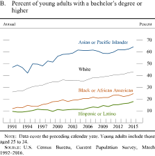
Data cover the preceding calendar year. Young adults include those aged 25 to 34.
Source: U.S. Census Bureau, Current Population Survey, March 1992-2016.
Across all groups, it is true that completing a bachelor's degree or higher roughly doubles one's chances of reaching the top 25 percent of earners (figure C). This relationship strongly corroborates the conventional wisdom that, for many individuals, a college education can indeed represent a path to improved economic opportunities. However, even within this group, representation is substantially unequal, with college-educated white and Asian people much more likely to achieve the top quartile of income than their black or African American and Hispanic or Latino peers.
Percent of workers with a bachelor's degree in top quartile of earnings among all young adults
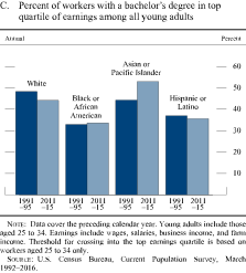
Data cover the preceding calendar year. Young adults include those aged 25 to 34. Earnings include wages, salaries, business income, and farm income. Threshold for crossing into the top earnings quartile is based on workers aged 25 to 34 only.
Source: U.S. Census Bureau, Current Population Survey, March 1992-2016.
Here the interpretation of changes over time is a bit more nuanced, because the overall increase in college attainment among young adults implies increased competition for crossing into the top quartile of earnings. In the 1991-95 period, 35 percent of those in the top income quartile had only a bachelor's degree, and an additional 14 percent had gone on to receive a graduate degree. By the period from 2011 to 2015, these shares had risen to 42 percent and 24 percent, respectively, suggesting that the average skill level needed to reach the top quartile of income has increased between generations.
Taken together, these observations show that educational attainment can help young adults improve their lifetime earning potential. However, increased levels of educational attainment across all groups have created greater competition for positions at the top of the economic ladder. Even among those with college degrees, important differences remain in representation at the top of the income distribution by race and ethnicity. The relationship between educational attainment and economic outcomes is complex and heterogeneous across people, suggesting that the specific nature of that attainment--the types of degrees received and the specific schools attended, among other factors--may matter much more than previously thought.5
Growth of labor compensation has been modest...
Indicators of hourly compensation suggest that wage growth has remained modest. Growth of compensation per hour in the business sector--a broad-based measure of wages, salaries, and benefits--has slowed in recent quarters and was 2-1/4 percent over the four quarters ending in 2017:Q1 (figure 5).1 This measure can be quite volatile even at annual frequencies (and a smoothed version is shown in figure 5 for that reason). The employment cost index--which also measures both wages and the cost to employers of providing benefits--also was up 2-1/4 percent in the first quarter relative to its year-ago level, about 1/2 percentage point faster than its gain of a year earlier. Among measures limited to wages, average hourly earnings growth--at 2-1/2 percent through May--was little changed from a year ago, and a compensation measure computed by the Federal Reserve Bank of Atlanta that tracks median 12-month wage growth of individuals reporting to the Current Population Survey was about 3-1/2 percent in May, also similar to its reading from a year earlier.
Measures of change in hourly compensation
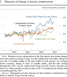
For average hourly earnings, change is from 12 months earlier, and the data extend through May 2017; for the Atlanta Fed's Wage Growth Tracker, the data are shown as a three-month moving average of the 12-month percent change and extend through May 2017.
Source: Department of Labor, Bureau of Labor Statistics; Federal Reserve Bank of Atlanta, Wage Growth Tracker.
...and likely restrained by slow growth of labor productivity
These modest rates of compensation gain likely reflect the offsetting influences of a tightening labor market and persistently weak productivity growth. Since 2008, labor productivity has increased only about 1 percent per year, on average, well below the average pace from 1996 through 2007 and also below the gains in the 1974-95 period (figure 6). For most of the period since 2011, labor productivity growth has been particularly weak, although it has turned up in recent quarters. The longer-term softness in productivity growth may be partly attributable to the sharp pullback in capital investment during the most recent recession and the relatively modest rebound that followed. But there may be other explanations, too, and considerable debate remains about the reasons for the general slowdown in productivity growth. (For a more comprehensive discussion of productivity, see the box "Productivity Developments in the Advanced Economies.")
Change in business-sector output per hour
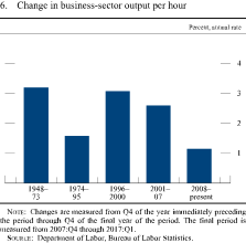
Changes are measured from Q4 of the year immediately preceding the period through Q4 of the final year of the period. The final period is measured from 2007:Q4 through 2017:Q1.
Source: Department of Labor, Bureau of Labor Statistics.
Productivity Developments in the Advanced Economies
The slow pace of U.S. productivity growth has attracted much attention of late, with vigorous debate on whether the slowdown represents the lingering, but temporary, effect of the Global Financial Crisis (GFC) or marks the start of an era of prolonged lower economic growth. This discussion reviews recent productivity developments in the United States and the major advanced foreign economies (AFEs) and outlines possible causes of the slowdown.1
Over the past decade, labor productivity growth in advanced economies has weakened markedly (figure A). Labor productivity growth in the United States has averaged only 1 percent since 2005, about half the pace of the years 1990 to 2004.2 Productivity growth has been even weaker in the AFEs, with the United Kingdom experiencing a meager 1/2 percent growth. As shown in the table, the widespread slowdown in labor productivity growth reflects weak capital deepening and, more importantly, very poor performance of total factor productivity (TFP)--a measure of how efficiently labor and capital are combined to produce output.3 TFP across the advanced economies has stagnated in the past decade against historical average growth of about 3/4 percent.
Labor productivity growth
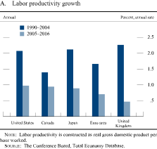
Labor productivity is constructed as real gross domestic product per hour worked.
Source: The Conference Board, Total Economy Database.
Accounting for labor productivity growth, 2005-2016
Note: Average annual rates.
Source: The Conference Board, Total Economy Database.
A number of potential explanations have been put forward for the abysmal performance of TFP. Some authors emphasize structural factors that predate the GFC. For example, Gordon (2012) sees recent technological advances such as information technology (IT) as less revolutionary than earlier general-purpose technologies like electricity and internal combustion.4 Relatedly, Fernald (2015) provides evidence that the effects of the IT revolution--an important factor boosting productivity since the 1990s--began to fade in the early 2000s.5 There are signs, however, that the influence of IT is still spreading, as exemplified by the surge in cloud-computing technology investments in recent years, and we may not yet have reaped the full benefits of this major technological innovation. Under this more optimistic view, slow TFP growth may reflect a temporary "productive pause" as firms spend resources on activities such as equipment retooling, reorganization of management practices, and workforce training. After all, it took several decades for the full effect of electricity to materialize.6
Other explanations blame the weak TFP growth on the unusual severity of the GFC. Some empirical evidence suggests that the "Schumpeterian" process in which workers move toward higher-productivity firms--a key source of productivity growth following previous recessions--has been greatly impaired since the GFC.7 In addition, measures of innovation such as research and development (R&D) spending fell sharply during the GFC, as shown in figure B, partly in response to tight financial conditions and weak demand. Declines in R&D tend to induce gradual and persistent declines in TFP, suggesting that the recent low TFP growth may in part be traced to GFC-induced weakness in R&D.8 In this view, the recent pickup in R&D spending could anticipate some normalization in productivity growth. Finally, the slowdown in TFP growth may also be related to the slowdown of global trade in the wake of the GFC. Conventional trade theories suggest that greater trade integration should bring productivity gains by facilitating the diffusion of new technologies and by allowing countries to specialize in the production of goods for which they have a comparative advantage. After decades of steady increases, however, trade integration appears to have plateaued in recent years (figure C).
Change in private real research and development
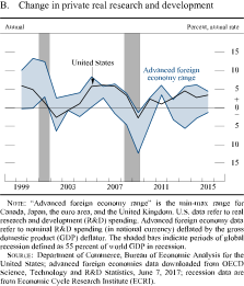
"Advanced foreign economy range" is the min-max range for Canada, Japan, the euro area, and the United Kingdom. U.S. data refer to real research and development (R&D) spending. Advanced foreign economy data refer to nominal R&D spending (in national currency) deflated by the gross domestic product (GDP) deflator. The shaded bars indicate periods of global recession defined as 55 percent of world GDP in recession: January 2001-November 2001 and May 2008-August 2009.
Source: Department of Commerce, Bureau of Economic Analysis for the United States; advanced foreign economies data downloaded from OECD Science, Technology and R&D Statistics, June 7, 2017; recession data are from Economic Cycle Research Institute (ECRI).
World trade as a share of gross domestic product
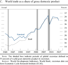
The shaded bars indicate periods of global recession defined as 55 percent of world gross domestic product in recession: April 1982-October 1982, January 2001-November 2001, and May 2008-August 2009.
Source: World Development Indicators, World Bank; recession data are from Economic Cycle Research Institute (ECRI).
In sum, it is difficult to ascertain whether the recent subdued performance of labor productivity represents a new normal. Some of the GFC-related factors restraining productivity growth may eventually fade, leading to a rise in productivity growth from its anemic post-GFC pace. However, to the extent that longer-run factors--such as the waning effects of the IT revolution--are at work, productivity growth in the future may be noticeably below historical averages. Sustained low rates of productivity growth would greatly restrain the improvement of living standards. In addition, they would put downward pressure on the long-run neutral interest rate, making the policy rate more likely to reach its effective lower bound and thus constraining the ability of monetary policy to provide economic stimulus, even in the presence of shallow recessions.
Price inflation moved up but softened in the spring and remains below 2 percent
In the early months of 2017, consumer price inflation, as measured by the 12-month change in the price index for personal consumption expenditures (PCE), continued its climb from the very low levels that prevailed in 2015 and early 2016 when it was held down by falling oil and import prices. Indeed, consumer price inflation briefly reached the FOMC's 2 percent objective earlier this year before falling back to 1.4 percent in May (figure 7). Core inflation, which typically provides a better indication than the headline measure of where overall inflation will be in the future, also was 1.4 percent over the 12 months ending in May, a slightly slower rate than a year earlier. As is the case with headline inflation, the 12-month measure of core inflation had been higher earlier this year, reaching 1.8 percent. Both measures of inflation have recently been held down by steep and likely idiosyncratic price declines for a few specific categories, including wireless telephone services and prescription drugs, which do not appear to be related to the overall trends in consumer prices. The 12-month change in the trimmed mean PCE price index--an alternative indicator of underlying inflation produced by the Federal Reserve Bank of Dallas--slowed by less than overall or core PCE price inflation over the past several months.
Change in the price index for personal consumption expenditures
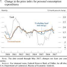
The data extend through May 2017; changes are from one year earlier.
Source: For trimmed mean, Federal Reserve Bank of Dallas; for all else, U.S. Department of Commerce, Bureau of Economic Analysis.
Oil prices declined somewhat but remain well above their early 2016 lows...
After rebounding from their early 2016 lows, oil prices leveled off early this year (figure 8). Since then they have declined somewhat, despite OPEC's decision in late May to renew its November 2016 agreement to reduce its oil production, thereby extending the November production cuts through early 2018. Reflecting lower crude oil prices as well as smaller retail margins, seasonally adjusted retail gasoline prices have also declined since the beginning of the year. Nevertheless, prices of both crude oil and retail gasoline remain above their early 2016 lows, and futures prices suggest that market participants expect oil prices to rise gradually in coming years.
Brent spot and futures prices
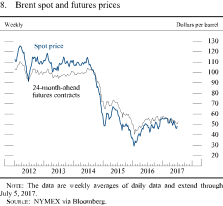
The data are weekly averages of daily data and extend through July 5, 2017.
Source: NYMEX via Bloomberg.
Series: Spot price and 24-month-ahead futures contracts Horizon: January 5, 2012, to July 5, 2017 Description: The data are weekly averages of daily data and are plotted as two lines. Units for both the spot price and the futures contracts are in dollars per barrel along the right axis. Both series start in 2012 above 100. In the early part of 2012, there is a notable increase and then a sharp decrease in the spot price. Both series remain fairly constant from late 2012 until the latter half of 2014, when they decrease sharply. The series fluctuate over the first half of 2015 and then decline steadily over the second half of 2015. Both series begin to increase in early 2016 but then start to level off in early 2017. Over the remainder of the horizon, both series decline, but they experience a slight uptick in the final month. Spot prices decline more rapidly than futures prices over 2017:Q2, ending the horizon below futures prices. The spot price starts at just above 110 at the beginning of 2012 and increases fairly rapidly through the first quarter before peaking at about 125. The series then falls dramatically to about 90 before recovering to about 110 in early August. The series fluctuates around 110 through the first half of 2014, with the most dramatic change being a fall from about 120 to 100 in the beginning of 2013. In the second half of 2014, the series declines dramatically from above 110 to below 50 in January 2015. In 2015:Q1, the series increases steeply to 60 before making a slight drop to near 55. In the second quarter, the series increases to above 65, then declines to about 45 in the middle of the third quarter. From the beginning of the fourth quarter to the beginning of 2016:Q1, the series declines from about 50 to just under 30. The series gradually increases over 2016 and the beginning of 2017 to about 55 by the beginning of February. The series then falls to about 45 in mid-June and experiences a slight uptick to just below 50 at the end of the horizon. The 24-month-ahead futures contracts series starts just above 100 in 2012 and is relatively unchanged with little volatility until the middle of 2014. Starting in the third quarter until January 2015, the series drops dramatically to about 70. The series stays around 70 before a steeper decline to about 60 in the third quarter. The series remains at around 60 in the beginning of the fourth quarter but then declines to just below 40 between the middle of the fourth quarter and the beginning of 2016:Q1. The series gradually increases over the first half of 2016 to about 55 by the middle of June, then fluctuates between 50 and 60 from the middle of June until early February 2017. The series declines from its peak of just above 55 to about 50 by the end of May, finally experiencing a slight uptick to just above 50 at the end of the horizon.
...while prices of imports other than energy have been bolstered by higher commodity prices
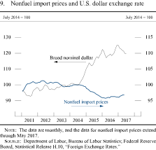
Throughout 2015, nonfuel import prices declined because of appreciation of the dollar and declines in nonfuel commodity prices (figure 9). Nonfuel import prices stabilized last year and have risen since then, as the dollar stopped appreciating and supply disruptions boosted world prices of some nonfuel commodities, especially industrial supplies and metals. In recent months, depreciation of the dollar has further pushed up non-oil import prices, which are now slightly higher than in mid-2016.
Survey-based measures of inflation expectations are little changed this year...
Expectations of inflation likely influence actual inflation by affecting wage- and price-setting decisions. Survey-based measures of inflation expectations at medium- and longer-term horizons have remained relatively stable so far in 2017. In the second-quarter Survey of Professional Forecasters conducted by the Federal Reserve Bank of Philadelphia, the median expectation for the annual rate of increase in the PCE price index over the next 10 years was 2.1 percent, the same as in the first quarter and little changed from the readings during 2016 (figure 10). In the University of Michigan Surveys of Consumers, the median value for inflation expectations over the next 5 to 10 years--which has been drifting downward for the past few years--has held about flat at a low level since late last year.
Median inflation expectations
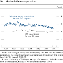
The Michigan survey data are monthly.
Source: University of Michigan Surveys of Consumers.
...while market-based measures of inflation compensation fell back somewhat
Inflation expectations can also be gauged by market-based measures of inflation compensation, though the inference is not straightforward because inflation compensation can be importantly affected by changes in premiums associated with risk and liquidity. Measures of longer-term inflation compensation--derived either from differences between yields on nominal Treasury securities and those on comparable Treasury Inflation-Protected Securities (TIPS) or from inflation swaps--have fallen back somewhat this year after having moved up in late 2016 (figure 11).2 The TIPS-based measure of 5-to-10-year-forward inflation compensation is now 1-3/4 percent, and the analogous measure of inflation swaps is now about 2 percent. Both measures are well below the 2-1/2 to 3 percent range that persisted for most of the 10 years before 2014.
5-to-10-year-forward inflation compensation
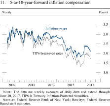
The data are weekly averages of daily data and extend through June 30, 2017. TIPS is Treasury Inflation-Protected Securities.
Source: Federal Reserve Bank of New York; Barclays; Federal Reserve Board staff estimates.
Series: Inflation swaps and TIPS breakeven rates Horizon: January 2009 to June 2017 Description: Weekly data are plotted as two curves. Units for both series are percent and are along the right axis. Broadly speaking, the two curves tend to run parallel, with the inflation swaps series running a little higher than the TIPS breakeven series after 2011. The two series are largely indistinguishable between 2009 and 2011. The inflation swaps series starts in January 2009 at approximately 2.75, spiking to approximately 3.5 in mid-2009, declining to approximately 2.5 in mid-2010, and spiking again to approximately 3 in mid-2011. The series continues to fluctuate between 2.5 and 3.25 through mid-2014. The series then sharply declines over the latter half of 2014 to almost 2, briefly rises to 2.4 in mid-2015, and then declines on average through mid-2016 to a low of approximately 1.75. The series begins to climb over the second half of 2016 to a high of approximately 2.5 in December. In 2017, the series reaches a high of about 2.4 in late January before falling to around 2.1 in mid-June. The series inches back up at the end of June and ends at around 2.2. The TIPS breakeven series starts at approximately 2 for the first week of January 2009, spikes to approximately 2.75 later that month, and subsequently follows a path similar to the inflation swaps series. The series continues to fluctuate between 2.25 and 3.25 from early 2009 through mid-2014. The series then sharply declines to 1.75 over the latter half of 2014 and increases modestly to 2.1 in 2015:Q2. The series stays below 2 for the rest of 2015 and 2016 and then climbs mostly at the end of 2016 to reach a high of just over 2 in January 2017 before falling back under 2 in March. Similar to the inflation swaps series, the TIPS breakeven series inches back up at the end of June to reach about 1.75.
Real gross domestic product growth slowed in the first quarter, but spending by households and businesses appears to have picked up in recent months
After having moved up at an annual rate of 2-3/4 percent in the second half of 2016, real gross domestic product (GDP) is reported to have increased about 1-1/2 percent in the first quarter of this year (figure 12).3 The step-down in first-quarter growth was largely attributable to soft inventory investment and a lull in the growth of consumer spending; in contrast, net exports increased a bit, residential investment grew robustly, and spending by businesses surged. Indeed, business investment was strong enough that overall private domestic final purchases--that is, final purchases by U.S. households and businesses, which tend to carry more signal for future GDP growth than most other components of overall spending--moved up at an annual rate of about 3 percent in the first quarter. For more recent months, indicators of spending by consumers and businesses have been strong and suggest that growth of economic activity rebounded in the second quarter; thus, overall activity appears to have expanded moderately, on average, over the first half of the year.
The economic expansion continues to be supported by accommodative financial conditions, including the low cost of borrowing and easy access to credit for many households and businesses, continuing job gains, rising household wealth, and favorable consumer and business sentiment.
Change in real gross domestic product and gross domestic income
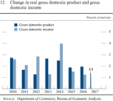
Source: Department of Commerce, Bureau of Economic Analysis.
Gains in income and wealth continue to support consumer spending...
After increasing strongly in the second half of 2016, consumer spending in the first quarter of this year was tepid. Unseasonably warm weather depressed spending on energy services, and purchases of motor vehicles slowed from an unusually high pace late last year. However, household spending seems to have picked up in more recent months, as purchases of energy services returned to seasonal norms and retail sales firmed. All told, consumer spending increased at an annual rate of 2 percent over the first five months of this year, only a bit slower than in the past couple of years (figure 13).
Change in real personal consumption expenditures and disposable personal income
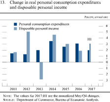
The values for 2017:H1 are the annualized May/Q4 changes.
Source: Department of Commerce, Bureau of Economic Analysis.
Beyond spending, other indicators of consumers' economic well-being have been strong in the aggregate. The ongoing improvement in the labor market has supported further gains in real disposable personal income (DPI), a measure of income after accounting for taxes and adjusting for inflation. Real DPI increased at a solid annual rate of 3 percent over the first five months of this year.
Gains in the stock market and in house prices over the first half of the year have boosted household net wealth. Broad measures of U.S. equity prices have continued to increase in recent months after moving up considerably late last year and in the first quarter. House prices have also continued to climb, adding to the balance sheet strength of homeowners (figure 14). Indeed, nominal house price indexes are close to their peaks of the mid-2000s. However, while the ratio of house prices to rents has edged higher, it remains well below its previous peak (figure 15). As a result of the increases in home and equity prices, aggregate household net worth has risen appreciably. In fact, at the end of the first quarter of 2017, household net worth was more than six times the value of disposable income, the highest-ever reading for that ratio (figure 16).
Prices of existing single-family houses
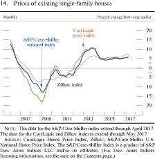
The data for the S&P/Case-Shiller index extend through April 2017. The data for the CoreLogic and Zillow indexes extend through May 2017.
Source: CoreLogic Home Price Index; Zillow; S&P/Case-Shiller U.S. National Home Price Index. The S&P/Case-Shiller Index is a product of S&P Dow Jones Indices LLC and/or its affiliates. (For Dow Jones Indices licensing information, see the note on the Contents page: For figures 14 and 34, note that the S&P 500 Index and the Dow Jones Bank Index are products of S&P Dow Jones Indices LLC and/or its affiliates and have been licensed for use by the Board. Copyright © 2017 S&P Dow Jones Indices LLC, a division of S&P Global, and/or its affiliates. All rights reserved. Redistribution, reproduction, and/or photocopying in whole or in part are prohibited without written permission of S&P Dow Jones Indices LLC. For more information on any of S&P Dow Jones Indices LLC's indices please visit www.spdji.com. S&P® is a registered trademark of Standard & Poor's Financial Services LLC, and Dow Jones® is a registered trademark of Dow Jones Trademark Holdings LLC. Neither S&P Dow Jones Indices LLC, Dow Jones Trademark Holdings LLC, their affiliates nor their third party licensors make any representation or warranty, express or implied, as to the ability of any index to accurately represent the asset class or market sector that it purports to represent, and neither S&P Dow Jones Indices LLC, Dow Jones Trademark Holdings LLC, their affiliates nor their third party licensors shall have any liability for any errors, omissions, or interruptions of any index or the data included therein.)
Nominal house prices and price-rent ratio
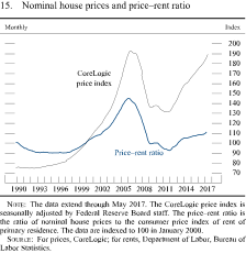
The data extend through May 2017. The CoreLogic price index is seasonally adjusted by Federal Reserve Board staff. The price-rent ratio is the ratio of nominal house prices to the consumer price index of rent of primary residence. The data are indexed to 100 in January 2000.
Source: For prices, CoreLogic; for rents, Department of Labor, Bureau of Labor Statistics.
Wealth-to-income ratio
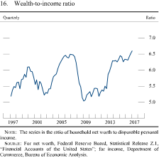
The series is the ratio of household net worth to disposable personal income.
Source: For net worth, Federal Reserve Board, Statistical Release Z.1, "Financial Accounts of the United States"; for income, Department of Commerce, Bureau of Economic Analysis.
Consumer spending has also been supported by low burdens from debt service payments. The household debt service burden--the ratio of required principal and interest payments on outstanding household debt to disposable income, measured for the household sector as a whole--has remained at a very low level by historical standards. As interest rates rise, the debt burden will move up only gradually, as most household debt is in fixed-interest products.
...as does credit availability
Consumer credit has continued to expand this year but more moderately than in 2016 (figure 17). Financing conditions are generally favorable, with auto and student loans remaining widely available and outstanding balances continuing to expand at a robust, albeit somewhat reduced, pace. Even though delinquency rates on most types of consumer debt have remained low by historical standards, credit card and auto loan delinquencies among subprime borrowers have drifted up some. Possibly in response to this deteriorating credit performance, banks have tightened standards for credit cards and auto lending. Mortgage credit has remained readily available for households with solid credit profiles, but it was still difficult to access for households with low credit scores or harder-to-document incomes.
Changes in household debt
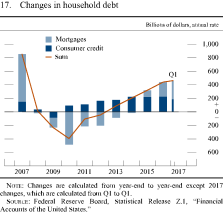
Changes are calculated from year-end to year-end except 2017 changes, which are calculated from Q1 to Q1.
Source: Federal Reserve Board, Statistical Release Z.1, "Financial Accounts of the United States."
Consumer confidence is strong
Consumers have remained optimistic about their financial situation. As measured by the Michigan survey, consumer sentiment was solid through most of 2016, likely reflecting rising income and job gains. Sentiment moved up appreciably after the presidential election last November and has remained at a high level so far this year (figure 18). Furthermore, the share of households expecting real income to rise over the next year or two has gone up markedly in the past few months and is now in line with its pre-recession level.
Indexes of consumer sentiment and income expectations
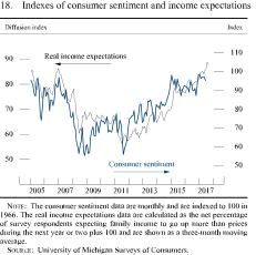
The consumer sentiment data are monthly and are indexed to 100 in 1966. The real income expectations data are calculated as the net percentage of survey respondents expecting family income to go up more than prices during the next year or two plus 100 and are shown as a three-month moving average.
Source: University of Michigan Surveys of Consumers.
Activity in the housing sector has improved modestly
Several indicators of housing activity have continued to strengthen gradually this year. Sales of existing homes have gained, on net, while house prices have continued to rise and mortgage rates have remained low, even though they are up from last year (figures 19 and 20). In addition, single-family housing starts registered a slight increase, on average, in the first five months of the year, although multifamily housing starts have slipped (figure 21). Despite the modest increase in construction activity, the months' supply of homes for sale has remained near the low levels seen in 2016, and the aggregate vacancy rate has fallen back to levels observed in the mid-2000s. Lean inventories are likely to support further gains in homebuilding activity going forward.
New and existing home sales
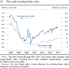
The data extend through May 2017. New home sales includes only single-family sales. Existing home sales includes single-family, condo, townhome, and co-op sales.
Source: For new home sales, Census Bureau; for existing home sales, National Association of Realtors.
Mortgage rates and housing affordability
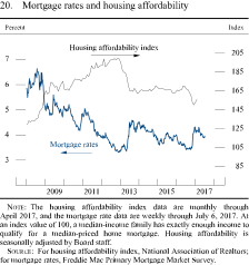
The mortgage rate data are weekly through July 6, 2017.
Source: Freddie Mac Primary Mortgage Market Survey.
Private housing starts and permits
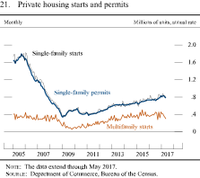
The data extend through May 2017.
Source: Department of Commerce, Bureau of the Census.
Business investment has turned up after a period of weakness...
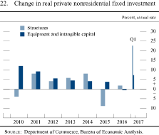
Led by a surge in spending on drilling and mining structures, real outlays for business investment--that is, private nonresidential fixed investment--rose robustly at the beginning of the year after having been about flat for 2016 as a whole (figure 22). The sharp gains in drilling and mining in the first quarter mark a turnaround for the sector; energy-sector investment had declined noticeably following the drop in oil prices that began in mid-2014 and ran through early 2016. More recently, rapid increases in the number of drilling rigs in operation suggest that investment in this area remained strong in the second quarter of this year.
Change in real private nonresidential fixed investment
Source: Department of Commerce, Bureau of Economic Analysis.
Moreover, business spending on equipment and intangibles (such as research and development) advanced solidly at the beginning of the year after having been roughly flat in 2016. Furthermore, indicators of business spending are generally upbeat: Orders and shipments of capital goods have posted net gains in recent months, and indexes of business sentiment and activity remain elevated after having improved significantly late last year.
...while corporate financing conditions have remained accommodative
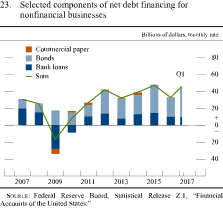
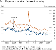
Aggregate flows of credit to large nonfinancial firms have remained solid, supported in part by continued low interest rates (figure 23). The gross issuance of corporate bonds was robust during the first half of 2017, and yields on both speculative- and investment-grade corporate bonds remained low by historical standards (figure 24). Gross equity issuance by nonfinancial firms stayed solid, on average, as seasoned equity offerings continued at a robust pace and the pace of initial public offerings picked up from the low levels seen in 2016.
Selected components of net debt financing for nonfinancial businesses
Source: Federal Reserve Board, Statistical Release Z.1, "Financial Accounts of the United States."
Corporate bond yields, by securities rating
The yields shown are yields on 10-year bonds.
Source: BofA Merrill Lynch Global Research, used with permission.
Series: High-yield, Triple-B, and Double-A Horizon: 1998 to 2017 Description: Data are plotted as three curves. Units are percentage points along the right axis. Frequency is daily. All three curves follow a similar pattern. The high-yield series starts at the beginning of 1998 at just above 9. The series increases generally to about 13 by the end of 2000, reaching a high of about 13.7 in December 2000. The series then decreases, bottoming out at around 7.3 in early 2005. The series fluctuates in small increments around 8 before beginning to increase in mid-2007. At the beginning of 2008:Q4, the series jumps quickly, and it reaches nearly 20 in 2009. The series then declines quickly to about 14, experiences another jump to about 17, and then continues to decline generally, landing near 7 in early 2012. After increasing slightly to around 7.7 in mid-2012, the series resumes its fall, reaching below 6 in 2013:Q2. The series increases to slightly below 7 through 2014:Q4 before falling again in early 2015. The series rises starting in mid-2015 and climbs above 8 in early 2016 before falling for the remainder of 2016 and 2017, reaching about 5.6 by the end of the horizon. The Triple-B series starts at the beginning of 1998 at about 6.5. The series fluctuates between about 6 and about 8 until mid-2003, when it decreases generally to around 5. The series gradually climbs back up to 7 by mid-2008 and then increases quickly, reaching nearly 10 later that year. Throughout 2009 the series sharply declines, reaching about 6 by the end of the year; it then continues to decline more gradually, dipping below 4 near the end of 2012 and again in 2013:Q1. Then the series increases, reaching about 5 in late 2013 before falling to just above 4 by mid-2014. The series falls below 4 in early 2015 before rising to almost 4.75 in early 2016. In 2016, the series declines, remaining mostly below 4 until November. At the end of 2016:Q4, it increases and reaches a high of about 4.4 in March 2017. The series continues to fluctuate between 3.8 and 4.25 in the first half of 2017 before reaching about 4 by the end of the horizon. The Double-A series starts at the beginning of 1998 at about 6.25. The series declines generally to about 5.5 in 1998:Q4 before increasing generally to about 8 in 2000:Q2. The series then decreases generally to just above 4 in mid-2003. The series remains between about 5 and about 6 through the beginning of 2008. Then the series increases quickly, reaching about 8.5 by 2008:Q4. The series sharply declines in late 2008 and early 2009 and then continues to fall more gradually until it reaches about 2.5 by the end of 2012. The series increases through the beginning of 2014 to around 4 but then falls through January 2015 to just under 3. The series rises to about 3.75 by mid-2015 before falling below 3 for most of 2016. In late 2016, the series jumps to about 3.6 and then gradually declines throughout 2017, reaching about 2.2 by the end of the horizon.
Despite the pickup in business investment, demand for business loans was subdued early this year, and outstanding commercial and industrial (C&I) loans on banks' books contracted in the first quarter. In the April Senior Loan Officer Opinion Survey on Bank Lending Practices (SLOOS), banks reported a broad-based decline in demand for C&I loans during the first quarter of 2017 even as lending standards on such loans were reported to be basically unchanged.4 Banks also reported weaker demand for commercial real estate loans as well as a continued tightening of standards on such loans. However, lending to large nonfinancial firms appeared to be strengthening somewhat during the second quarter. Meanwhile, measures of small business credit demand remained weak amid stable supply.
U.S. exports grew at a faster pace
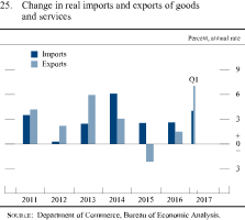
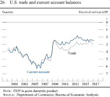
In the first quarter of 2017, U.S. real exports increased briskly and broadly following moderate growth in the second half of last year that was driven by a surge in agricultural exports (figure 25). At the same time, real import growth declined somewhat from its strong pace in the second half of last year. As a result, real net exports contributed slightly to U.S. real GDP growth in the first quarter. Available trade data through May suggest that the growth of real exports slowed to a modest pace in the second quarter. Nevertheless, the average pace of export growth appears to have stepped up in the first half of 2017 compared with last year, partly reflecting stronger growth abroad and a diminishing drag from earlier dollar appreciation. All told, the available data for the first half of this year suggest that net exports added a touch to U.S. real GDP growth and that the nominal trade deficit widened slightly relative to GDP (figure 26).
Change in real imports and exports of goods and services
Source: Department of Commerce, Bureau of Economic Analysis.
U.S. trade and current account balances
GDP is gross domestic product.
Source: Department of Commerce, Bureau of Economic Analysis.
Federal fiscal policy had a roughly neutral effect on economic growth...
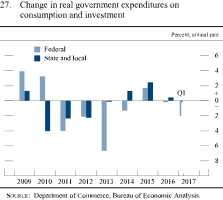
Federal purchases moved sideways in 2016, and policy actions had little effect on federal taxes or transfers (figure 27). Under currently enacted legislation, federal fiscal policy will likely again have a roughly neutral influence on the growth in real GDP this year.
Change in real government expenditures on consumption and investment
Source: Department of Commerce, Bureau of Economic Analysis.
After narrowing significantly for several years, the federal unified deficit has widened from about 2-1/2 percent of GDP in fiscal year 2015 to 3-1/4 percent currently. Although expenditures as a share of GDP have been relatively stable over this period at a little under 21 percent, receipts moved lower in 2016 and have edged down further so far this year to roughly 17-1/2 percent of GDP (figure 28). The ratio of federal debt held by the public to nominal GDP is quite elevated relative to historical norms. Nevertheless, the deficit remains small enough to roughly stabilize this ratio in the neighborhood of 75 percent (figure 29).
Federal receipts and expenditures
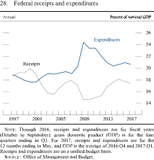
Through 2016, receipts and expenditures are for fiscal years (October to September); gross domestic product (GDP) is for the four quarters ending in Q3. For 2017, receipts and expenditures are for the 12 months ending in May, and GDP is the average of 2016:Q4 and 2017:Q1. Receipts and expenditures are on a unified-budget basis.
Source: Office of Management and Budget.
Federal government debt held by the public

The data for gross domestic product (GDP) are at an annual rate. Federal debt held by the public equals federal debt less Treasury securities held in federal employee defined benefit retirement accounts, evaluated at the end of the quarter.
Source: For GDP, Department of Commerce, Bureau of Economic Analysis; for federal debt, Federal Reserve Board, Statistical Release Z.1, "Financial Accounts of the United States."
...and the fiscal position of most state and local governments is stable
The fiscal position of most state and local governments is stable, although there is a range of experiences across these governments. Many state governments are experiencing lackluster revenue growth, as income tax collections have been only edging up, on average, in recent quarters. In contrast, house price gains have continued to push up property tax revenues at the local level. Employment growth in the state and local government sector has been anemic so far this year following a pace of hiring in 2016 that was the strongest since 2008. Outlays for construction by these governments have been declining (figure 30).
State and local employment and structures investment
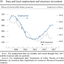
The structures data are quarterly.
Source: Department of Commerce, Bureau of Economic Analysis.
Financial Developments
The expected path for the federal funds rate flattened
The path for the expected federal funds rate implied by market quotes on interest rate derivatives has flattened, on net, since the end of December, moving higher for 2017 but slightly lower further out (figure 31). The expected policy path moved up at the beginning of the year, reportedly reflecting investor perceptions that expansionary fiscal policy would likely be forthcoming over the near term, but subsequently fell amid some waning of these expectations as well as FOMC communications that were interpreted as signaling a somewhat slower pace of policy rate increases than had been anticipated.
Market-implied federal funds rate
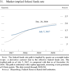
The federal funds rate path is implied by quotes on overnight index swaps--a derivative contract tied to the effective federal funds rate. The implied path as of July 5, 2017, is compared with that as of December 30, 2016. The path is estimated with a spline approach, assuming a term premium of 0 basis points. The data extend through 2020:Q4.
Source: Bloomberg; Federal Reserve Board staff estimates.
Survey-based measures of the expected path of policy also moved up for 2017. Most of the respondents to the Federal Reserve Bank of New York's Survey of Primary Dealers and Survey of Market Participants--which were conducted just before the June FOMC meeting--projected an additional 25 basis point increase in the FOMC's target range for the federal funds rate, relative to what they projected in surveys conducted before the December FOMC meeting, as the most likely outcome for this year. Expectations for the number of rate hikes in 2018 were about unchanged. Market-based measures of uncertainty about the policy rate approximately one to two years ahead decreased slightly, on balance, from their year-end levels.
Longer-term nominal Treasury yields remain low
After rising significantly during the second half of 2016, yields on medium- and longer-term nominal Treasury securities have decreased 5 to 25 basis points, on net, so far in 2017 (figure 32). The decrease in longer-term nominal yields since the beginning of the year largely reflects declines in inflation compensation due in part to soft incoming data on inflation, with real yields little changed on net. Consistent with the changes in Treasury yields, yields on 30-year agency mortgage-backed securities (MBS)--an important determinant of mortgage interest rates--decreased slightly over the first half of the year (figure 33). Treasury and MBS yields picked up somewhat in late June, driven in part by increases in government yields overseas. However, yields remain quite low by historical standards.
Yields on nominal Treasury securities
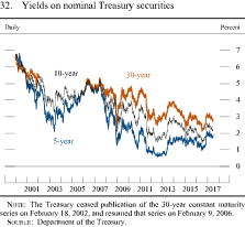
The Treasury ceased publication of the 30-year constant maturity series on February 18, 2002, and resumed that series on February 9, 2006.
Source: Department of the Treasury.
Series: 5-, 10-, and 30-year yields on nominal Treasury securities Horizon: January 2000 to July 5, 2017 Description: Data are plotted as three curves. Units are percent along the right axis. Frequency is daily. The curves follow similar patterns and rarely intersect. The 5-year Treasury yield curve starts in 2000 at 6.5 and declines steeply to just above 2 in 2003. The series gradually increases to roughly 5 by 2006, where it stays until the end of 2007 before dropping to 1.5 by late 2008. The series increases in the beginning of 2009 to roughly 2.5, and it remains between 2 and 3 until declining to 1 in 2010. The series rises back above 2 in early 2011 but falls again below 1 in mid-2011, where it stays until mid-2013. In mid-2013, the series increases sharply to roughly 1.5. The series generally stays between 1 and 2 between mid-2013 and the end of 2016, when it increases sharply again to 2. The series ends at around 2 in July 2017. The 10-year Treasury yield curve starts in 2000 slightly above 6.5 and then falls less steeply than the 5-year Treasury yield curve to reach a low of roughly 3.5 in 2003. The series gradually increases to roughly 5 by 2006, once again at the same level as the 5-year Treasury yield curve. At the end of 2007, the series remains above the 5-year Treasury yield curve by roughly 1 percentage point. The curve drops below 2.5 in late 2008. The series then increases in the beginning of 2009 to nearly 4, and it remains between 3 and 4 until declining to 2.5 in 2010. The series rises back above 3 in early 2011 but falls again below 2 in late 2011, where it stays until mid-2013. In mid-2013, the series sharply increases to 2.75. Aside from a slight uptick in mid-2015, the series has a gradual decline from the 2.75 peak to a low of 1.5 in mid-2016 before sharply increasing to 2.5 at the end of 2016. The series ends at about 2.5 in July 2017. The 30-year Treasury yield curve starts in 2000 slightly above 6.5 and gradually falls to just above 5.25 in early 2002, when the series breaks until early 2006. The series resumes at roughly 4.5 and hovers around this value until late 2008, when it rapidly spikes down to 2.5. The series rises back above 4 in mid-2009, where it remains until declining to 3.75 in late 2010. The series rises to nearly 4.5 in early 2011 but falls below 3 in late 2011, where it stays until mid-2013. In mid-2013, the series sharply increases to nearly 4. The series falls gradually to 2.25 by early 2015, reaching a level close to the 10-year Treasury yield. By mid-2015, the series rises to slightly more than 3 and gradually declines to 2.5 by the end of 2016, when it sharply increases again to slightly more than 3. The series ends just below 3 in July 2017.
Yield and spread on agency mortgage-backed securities
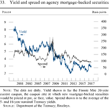
The data are daily. Yield shown is for the Fannie Mae 30-year current coupon, the coupon rate at which new mortgage-backed securities would be priced at par, or face, value. Spread shown is to the average of the 5- and 10-year nominal Treasury yields.
Source: Department of the Treasury; Barclays.
Series: Yield and spread Horizon: January 2000 to July 5, 2017 Description: Daily data are plotted as two curves. Units for the yield series are percent and are along the left axis. Units for the spread series are basis points and are along the right axis. The yield series starts at just below 8 at the beginning of 2000, sharply increasing to about 8.5 in mid-2000 before declining to approximately 4.25 by mid-2003. The series then increases to approximately 6.25 by mid-2006 before declining to approximately 4 by early 2009 and approximately 2 by late 2012. The series increases again to approximately 3.75 by late 2013, gradually declining to 2.5 before slightly increasing to 3 in mid-2015. The series declines to 2.5 at the end of 2016, when it increases sharply to slightly more than 3. From the start of 2017, the series fluctuates between 3 and 3.5 and ends at around 3 in July 2017. The spread series starts at approximately 125 in 2000. A rise to about 175 occurs in mid-2000, and then the series hovers around 150 throughout 2001. The series increases to approximately 175 by late 2002. The series declines to approximately 100 by early 2007, then spikes to approximately 275 by the beginning of 2008, where it remains throughout 2008 before declining to approximately 150 by mid-2009. The series then fluctuates between 100 and 150 from late 2009 through early 2015, with a brief decline below 100 in late 2012. The series flattens to roughly 100 by mid-2015 and ends at approximately 100 in July 2017.
Broad equity price indexes increased further...
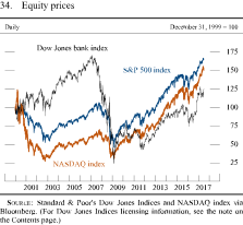
Broad U.S. equity indexes continued to increase during the period (figure 34). Equity prices were reportedly supported by lower interest rates and increased optimism that corporate earnings will continue to strengthen this year. Stock prices of companies in the technology sector increased notably on net. After rising significantly toward the end of last year, stock prices of banks performed about in line with the broader market during the first half of 2017. The implied volatility of the S&P 500 index one month ahead--the VIX--decreased, on net, ending the period close to the bottom of its historical range. (For a discussion of financial stability issues, see the box "Developments Related to Financial Stability.")
Equity prices
Source: Standard & Poor's Dow Jones Indices and NASDAQ index via Bloomberg. (For Dow Jones Indices licensing information, see the note on the Contents page, or Figure 14.)
Series: Dow Jones bank index, S&P 500 index, and NASDAQ index Horizon: January 2000 to July 5, 2017 Description: Daily data are plotted as three curves. Units for all series have been indexed to 100 based on their respective values on December 31, 1999. The Dow Jones bank index series starts in January 2000 at 100. The series increases to approximately 125 by mid-2002 and returns to 100 in early 2003. The series rebounds and steadily increases to its peak, just below 175, in mid-2007 and crashes to about 25 by early 2009. From 2009 through 2011, the series fluctuates between 50 and 75, and it steadily rises to about 100 by the end of 2015. After a drop to about 75 in early 2016, the series rises sharply at the end of 2016 and ends at about 125 in July 2017. The S&P 500 index series starts in January 2000 at 100. The series steadily decreases to around 67 in mid-2003 and recovers to about 100 in late 2007 before falling again to approximately 50 by the beginning of 2009. The series has a steady increase to just under 150 in 2015 and fluctuates between 125 and 150 in late 2015 and 2016. The series finishes a little below 175 in July 2017. The NASDAQ index series starts in January 2000 at 100. After a brief increase in early 2000 to 125, the series decreases to about 25 by 2003. The series has a steady increase to just below 75 in 2008 and drops again to just above 25 in early 2009. The series steadily increases to just above 125 in early 2015 and fluctuates between 100 and 125 in 2015 and 2016. The series then increases and ends at about 150 in July 2017.
Developments Related to Financial Stability
Vulnerabilities in the U.S. financial system remain moderate on balance. Capital and liquidity ratios at most large U.S. banks continue to be at historical highs, and reliance on short-term wholesale funding at these institutions has continued to decline. Valuation pressures across a range of assets and several indicators of investor risk appetite have increased further since mid-February, but apparent high risk appetite in asset markets has not led to increased borrowing in the nonfinancial sector. Debt owed by nonfinancial corporations remains elevated, although it has been flat or falling in the past two years. Household debt as a share of gross domestic product has remained subdued, and new borrowing has been driven primarily by households with strong credit histories.
The strong capital position of the financial sector has contributed to the improved resilience of the U.S. financial system. Regulatory capital ratios at most bank holding companies have continued to be historically high, mainly as a result of the higher regulatory capital requirements. At the same time, measures of bank profitability have increased modestly on a year-on-year basis. Regulatory capital ratios at insurance companies are also high by historical standards.
Vulnerabilities stemming from maturity and liquidity transformation in the financial sector remain low. High-quality liquid asset holdings at all large domestic bank holding companies are above regulatory liquidity coverage ratio requirements. Moreover, banks have continued to replace short-term wholesale funding, such as commercial paper held by money market mutual funds (also referred to as money market funds, or MMFs), with relatively more stable core deposits. The use of Federal Home Loan Bank (FHLB) advances as a source of funding for the banks, which had increased notably through 2016, has fallen slightly in the first quarter of 2017 (figure A). The MMF reforms, designed by the Securities and Exchange Commission and fully implemented in October 2016, have led to a shift of about $1.2 trillion in assets from prime funds--which can hold a range of risky instruments, including commercial paper issued by banks--to government funds, which can hold only assets collateralized by Treasury and agency securities. This shift has reduced the risk of runs on MMFs. However, run risk could increase if investors shift out of MMFs into more opaque and fragile alternative vehicles. Thus, continued monitoring of this sector is important. The FHLBs have increased their issuance of short-maturity liabilities, mainly to government funds. However, the FHLBs have not reduced the maturity of their own assets, which increases their liquidity mismatch and potential vulnerability to funding strains. This mismatch has also been highlighted by the Federal Housing Finance Agency, which continues to evaluate ways to formalize its supervisory expectations regarding the appropriate amount of short-term funding of long-term assets by the FHLBs.1
Selected funding for large banks
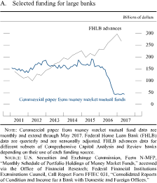
Commercial paper from money market mutual fund data are monthly and extend through May 2017. Federal Home Loan Bank (FHLB) data are quarterly and are seasonally adjusted. FHLB advances data for different subsets of Comprehensive Capital Analysis and Review banks depending on their use of each funding source.
Source: U.S. Securities and Exchange Commission, Form N-MFP, "Monthly Schedule of Portfolio Holdings of Money Market Funds," accessed via the Office of Financial Research; Federal Financial Institutions Examinations Council, Call Report Form FFIEC 031, "Consolidated Reports of Condition and Income for a Bank with Domestic and Foreign Offices."
Series: Commercial paper from money market mutual funds and FHLB advances Horizon: 2011 to 2017 Description: Commercial paper from money market mutual funds data are monthly, and FHLB advances data are quarterly; both are plotted as curves. Units for both series are billions of dollars, along the right axis. The curves follow a similar pattern until 2016, when they diverge significantly. The commercial paper from money market mutual funds series starts at around 150 in January 2011. The series slowly rises to around 185 in late 2012 before falling back to fluctuate around 155. In late 2014 and 2015, the series jumps to approximately 190. The series then sharply declines in 2016 until it levels out at 50, where it remains for the first half of 2017, reaching about 43 on May 31, 2017. The FHLB advances series begins in 2011 at approximately 140. The series drops moderately through mid-2012, dipping below 100. The series then slowly rises until late 2014, reaching approximately 230. The series falls slightly and fluctuates around 200 in 2015 before beginning to rise again through 2016, peaking at around 300. The series then falls to about 270 in 2017:Q1.
Valuation pressures have increased further across a range of assets, including Treasury securities, equities, corporate bonds, and commercial real estate (CRE). Term premiums on Treasury securities continue to be in the lower part of their historical distribution. A sudden rise in term premiums to more normal levels poses a downside risk to long-maturity Treasury prices, which could in turn affect the prices of other assets. Forward equity price-to-earnings ratios rose a bit further and are now at their highest levels since the early 2000s, while a measure of the risk premium embedded in high-yield corporate bond spreads declined a touch from an already low level, implying high asset valuations in this market as well. Prices of CRE have continued to advance at a rapid clip amid slowing rent growth and rising interest rates, though there are signs of tightening credit conditions in CRE markets. In contrast, farmland prices have declined, albeit more slowly than prevailing rents, implying that farmland price-to-rent ratios have continued to move up to very high levels. In derivatives markets, investor compensation for bearing near-term volatility risk has remained low, suggesting a sustained investor risk appetite.
The ratio of private nonfinancial (household and nonfinancial business) debt to gross domestic product, shown in figure B, remains below the estimates of its long-term upward trend. The debt-to-income ratio of households has changed little over the past few years and remains at a relatively low level. Moreover, new borrowing is concentrated among borrowers with high credit scores. In contrast, the leverage of nonfinancial corporations continues to be notably elevated. New borrowing is concentrated among firms with stronger balance sheets, and the total outstanding amount of speculative-grade bonds and leveraged loans edged down, especially in the oil sector.
Private nonfinancial sector credit-to-GDP ratio
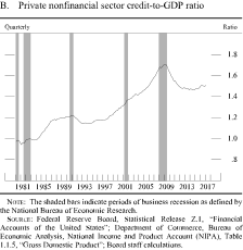
The shaded bars indicate periods of business recession as defined by the National Bureau of Economic Research: January 1980-July 1980, July 1981-November 1982, July 1990-March 1991, March 2001-November 2001, and December 2007-June 2009.
Source: Federal Reserve Board, Statistical Release Z.1, "Financial Accounts of the United States"; Department of Commerce, Bureau of Economic Analysis, national income and product accounts (NIPA), Table 1.1.5: Gross Domestic Product; Board staff calculations.
As part of its effort to reduce regulatory burden while promoting the financial stability of the United States, the Federal Reserve Board has taken two key steps since mid-February. First, member agencies of the Federal Financial Institutions Examination Council, including the Board, issued a joint report to the Congress under the Economic Growth and Regulatory Paperwork Reduction Act of 1996 detailing their review of regulations affecting smaller financial institutions, such as community banks, and describing burden-reducing actions the agencies plan to take.2 Second, the Board and the Federal Deposit Insurance Corporation jointly announced the completion of their evaluation of the 2015 resolution plans of 16 domestic banks and separately issued resolution plan guidance to 4 foreign banks.3 The agencies identified shortcomings in one domestic firm's resolution plan, which must be satisfactorily addressed in the firm's 2017 plan by December 31. For foreign banking organizations, resolution plans are focused on their U.S. operations, and guidance issued to these organizations reflects the significant restructuring they have undertaken to form intermediary holding companies.
...and risk spreads on corporate bonds decreased
Bond spreads for investment- and speculative-grade firms decreased, and spreads for speculative-grade firms now stand near the bottom of their historical ranges.
Treasury and mortgage securities markets have functioned well
Available indicators of Treasury market functioning remained stable over the first half of 2017. A variety of liquidity metrics--including bid-ask spreads, bid sizes, and estimates of transaction costs--either improved or remained unchanged over the period, displaying no notable signs of liquidity pressures. The agency MBS market also continued to function well. (For a detailed discussion of corporate bond market functioning, see the box "Recent Developments in Corporate Bond Market Liquidity.")
Recent Developments in Corporate Bond Market Liquidity
Market liquidity refers to the extent to which investors can rapidly execute sizable securities transactions at a low cost and with a limited price effect. A high degree of market liquidity facilitates informationally efficient market pricing and lowers the returns required by investors to hold financial assets; it therefore decreases the cost of valuable economic projects and so contributes to the efficient allocation of capital. Moreover, liquidity conditions that are resilient in the face of economic and financial shocks reduce the risk of excess volatility and fire sale losses, thus helping mitigate systemic risk.
Financial institutions that serve as "market makers," by posting prices and standing ready to buy or sell, are critical to healthy liquidity in the markets for certain assets, including corporate bonds. A series of changes, including regulatory reforms, since the Global Financial Crisis have likely altered financial institutions' incentives to provide liquidity, raising concerns about decreased liquidity in these markets, especially during periods of market stress. However, the available evidence does not point to any substantial impairment in liquidity in major financial markets in recent years. In addition, financial markets have generally performed well during recent episodes of financial stress.1 Even in instances in which liquidity conditions in certain markets appear to have deteriorated, the effects have been mild and suggest limited economic consequences. In the remainder of this discussion, we illustrate these points with emphasis on the market for corporate bonds.
In recent years, market participants have been particularly concerned with liquidity conditions in the corporate bond market because the securities are traded less frequently, and the liquidity provision has relied more heavily on dealer intermediation, than in many other markets. However, a range of conventional metrics of liquidity indicate that liquidity strains in corporate bond markets have been minimal. Figure A shows that the estimated mean effective bid-ask spread for U.S. corporate bonds has remained low in recent years. Before the financial crisis, bid-ask spreads averaged about 1 percent of the price of the bond. This measure of trading costs skyrocketed during the financial crisis but has returned to the range seen before the crisis. Measures of the effect of trades on prices follow a similar pattern and have been fairly stable in recent years.2 In addition, other measures related to factors associated with market liquidity, such as trends in average trade size and turnover, also suggest market liquidity conditions are benign.3
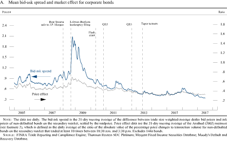
That said, some recent work suggests that these traditional measures of transaction costs might exaggerate the degree of liquidity in part because dealers have increasingly shifted from acting as principals to acting as agents to reduce their risk exposure, resulting in tighter bid-ask spreads.4 Indeed, many market participants have expressed a concern that declines in dealer inventories may reflect in part a reduced willingness or capacity of the primary dealers to make markets, which may in turn lead to lower liquidity.
Figure B shows that primary dealers' inventories of corporate bonds (including foreign bonds issued in the United States), which are predominantly used for market making, indeed began to decline sharply following the Bear Stearns collapse in March 2008 and fell further after Lehman Brothers failed in October 2008. Such a sharp decline in dealer inventories may be the result of dealers' actions on their own, reflecting changes in risk preferences in reaction to the financial crisis. In addition, changing regulations--such as the Volcker rule and the supplementary leverage ratio, which aimed to make the financial system safer and sounder--and changes in technology may have contributed to the continued trend of lower dealer inventories.5
Broker-dealer holdings of corporate and foreign bonds
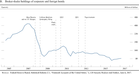
Several events are marked by dashed vertical lines: Bear Stearns sale to JP Morgan, March 16, 2008; Lehman Brothers bankruptcy filing, September 15, 2008; flash crash, May 6, 2010; QE2, November 3, 2010; QE3, September 13, 2012; and taper tantrum, May 22, 2013.
Source: Federal Reserve Board, Statistical Release Z.1, "Financial Accounts of the United States," L.130 Security Brokers and Dealers, June 8, 2017.
The factors affecting a dealer's willingness or capacity to facilitate trading may also affect other activities such as arbitrage trading, which equates prices for financing arrangements with economically similar risks. Therefore, impediments in arbitrage may also indicate market illiquidity. One widely studied no-arbitrage relationship is the so-called CDS-bond basis, the difference between bonds' credit default swap (CDS) spreads and bond-implied credit spreads.6 Figure C shows that the CDS-bond basis for corporate bonds was close to zero before the crisis, widened dramatically during the crisis (indicating a significant unrealized arbitrage opportunity), and has returned to a level closer to, but still below, zero in recent years. More recently, the CDS-bond basis has narrowed further.
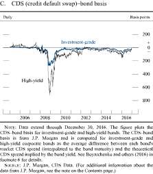
Overall, the degree to which dealer balance sheet constraints affect corporate bond market liquidity depends not only on dealers' capacity and willingness to provide liquidity, but also on the extent to which nonbank financial institutions such as hedge funds, mutual funds, and insurance companies fill any lost market-making capacity. Other factors such as changes in technology, risk preferences, and investor composition also interact to shape the trading environment.7 There are indications that market structure has changed in recent years, and trades in certain situations and market segments might have been more costly at times. But markets have also adjusted, and some measures of dislocation have lessened with these adjustments. In summary, liquidity conditions have been quite good overall since the Global Financial Crisis. The sharp deterioration of market liquidity during 2007 and 2008 illustrates clearly that the most significant risk has been distress at financial institutions. Any modest potential effects of regulation on liquidity should be balanced with the gains to resilience at large financial institutions associated with regulation.
Money market rates have moved up in line with increases in the FOMC's target range
Conditions in domestic short-term funding markets have remained stable so far in 2017. Yields on a broad set of money market instruments moved higher in response to the FOMC's policy actions in March and June. The effective federal funds rate generally traded near the middle of the target range and was closely tracked by the overnight Eurodollar rate. The spread between the three-month LIBOR (London interbank offered rate) and the OIS (overnight index swap) rate has returned to historical norms over the first half of 2017, declining from the elevated levels that prevailed at the end of last year around the implementation of the Securities and Exchange Commission money market fund reform.
Bank credit continued to expand, though at a slower pace than in 2016, and bank profitability improved
Aggregate credit provided by commercial banks continued to increase through the first quarter of 2017, though at a slower pace than in 2016, leaving the ratio of total commercial bank credit to nominal GDP slightly lower (figure 35). The expansion of core loans slowed during 2017, consistent with banks' reports in the April SLOOS of weakened demand for most loan categories and tighter lending standards for commercial real estate loans. However, the growth of core loans appeared to be picking up somewhat during the second quarter. Measures of bank profitability have continued to improve so far this year but remained below their historical averages (figure 36).
Ratio of total commercial bank credit to nominal gross domestic product
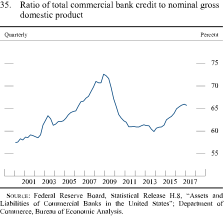
Source: Federal Reserve Board, Statistical Release H.8, "Assets and Liabilities of Commercial Banks in the United States"; Department of Commerce, Bureau of Economic Analysis.
Profitability of bank holding companies
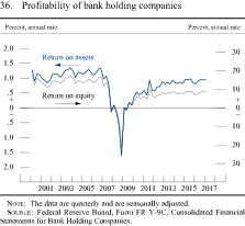
The data are quarterly and are seasonally adjusted.
Source: Federal Reserve Board, Form FR Y-9C, Consolidated Financial Statements for Bank Holding Companies.
Credit conditions in municipal bond markets have generally been stable
Credit conditions in municipal bond markets have generally remained stable since year-end. Over that period, yield spreads on 20-year general obligation municipal bonds over comparable-maturity Treasury securities were little changed on balance. Puerto Rico filed to enter a court-supervised process to restructure its debt after it failed to reach an agreement with bondholders, and several credit rating agencies downgraded the bond ratings of the state of Illinois. However, these events have had no noticeable effect on broader municipal bond markets.
International Developments
Foreign financial market conditions eased
Financial market conditions in both the advanced foreign economies (AFEs) and the emerging market economies (EMEs) have generally eased since January. Better-than-expected data releases, robust corporate earnings, and the passage of risk events--such as national elections in some European countries--boosted investor confidence. Broad equity indexes in advanced and emerging foreign economies rose further (figure 37). In addition, spreads of emerging market sovereign bonds over U.S. Treasury securities narrowed, and capital flows into emerging market mutual funds picked up (figure 38). Government bond yields in the AFEs generally remained very low, partly reflecting investor expectations that substantial monetary policy accommodation would be required for some time (figure 39). In the United Kingdom, softer macroeconomic data and uncertainty about future policies and growth as the country begins the process of exiting the European Union also weighed on yields. However, AFE government bond yields picked up somewhat in late June, partly reflecting investors' focus on remarks by officials from some AFE central banks suggesting possible shifts toward less accommodative policy stances. In the euro area, bank supervisors intervened to prevent the disorderly failure of a few small to medium-sized lenders in Italy and Spain; business disruptions were minimal, and spillovers to other European banks were limited.
Equity indexes for selected foreign economies
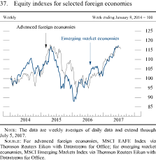
The data are weekly averages of daily data and extend through July 5, 2017.
Source: For advanced foreign economies, MSCI EAFE Index via Thomson Reuters Eikon with Datastream for Office; for emerging market economies, MSCI Emerging Markets Index via Thomson Reuters Eikon with Datastream for Office.
Series: Advanced foreign economies and emerging market economies Horizon: January 8, 2014, to July 5, 2017 Description: The data are weekly averages of daily data, plotted as two curves. The units along the right axis are an index with the week of January 8, 2014, equal to 100. The advanced foreign economies (AFE) and the emerging market economies (EME) series move roughly in the same direction. The EME series is higher through most of 2014 and begins to decline around May 2015, while the AFE series begins to fall off in the middle of 2015. Both series reach a trough around the beginning of 2016 before increasing through May 2017. While the EME series continues to rise throughout the end of the period, the AFE series ticks downward at the end of the horizon. The AFE series fluctuates between 95 and 102 in the beginning of 2014. The series then drops significantly around 2014:Q4 before steadily increasing to around 115 in early 2015. The series fluctuates around 115 until 2015:Q3, when it suddenly drops to around 100. After regaining some ground, the series falls again around the beginning of 2016 to below 95. It then fluctuates around 100, gradually increasing through the third quarter. The series then begins to rise quickly around end-2016 to about 117 in May 2017 before falling to just above 115 in July. The EME series fluctuates between 95 and 100 in the beginning of 2014 before gradually rising above 110 in 2014:Q3. The series then decreases below 105 before rebounding to around 115 in early 2015. It falls dramatically in 2015:Q3, regains some ground, and falls again to a trough of about 87 in early 2016. The series then rises, ending at around 118.
Emerging market mutual fund flows and spreads
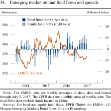
The EMBI+ data are weekly averages of daily data and extend through July 5, 2017. The EPFR data are monthly sums of weekly data. The fund flows data exclude funds located in China.
Source: For bond and equity fund flows, EPFR Global; for EMBI+, J.P. Morgan Emerging Markets Bond Index Plus via Bloomberg.
Series: Bond fund flows, equity fund flows, and EMBI+ Horizon: January 2014 to July 5, 2017 Description: The JP Morgan Emerging Market Bond Index Plus (or EMBI+) is an index of total returns of foreign currency denominated debt of selected emerging market economies. EMBI+ data are weekly averages of daily data and are plotted as a curve. The units for EMBI+ are in basis points along the left axis. EPFR fund flows are flows into dedicated emerging market economy bond and equity mutual funds and ETFs. EPFR fund flows data are plotted as stacked bars. The units for both bond and equity fund flows are billions of dollars along the right axis. Both bond and equity fund flows are negative in early 2014 before becoming positive in the middle of the year and falling off at the end of the year. Total fund flows are volatile but are generally negative for 2015 and early 2016. They are then generally positive through October before falling off at the end of the year. They become positive again in 2017 and increase before falling slightly in June 2017. For EMBI+, the data fall for much of the first half of 2014 before trending up in the second half of the year. The EMBI+ series then shows significant volatility through 2015 before rapidly increasing in late 2015 and falling off in early 2016. The series continues to trend downward before a slight uptick near the end of the horizon. EMBI+ data begin around 340 before rapidly increasing to around 390 in early February 2014 and then trending down to around 275 in the middle of 2014. The data then trend up through the end of 2014, with the pace rapidly accelerating in December. The series falls off again in early 2015 before rising to about 450 in August and falling back to around 380 in November. The series rises again in early 2016, reaching about 470 in February, and then decreases, reaching 340 in October before rising to around 380 in December. The series declines through the beginning of 2017, reaching a low point of just above 320 before moving up to around 340, then closer to 335 in the final few months of the horizon. Both bond and equity fund flows are negative for 2014:Q1, with the magnitudes for equities larger than those for bonds each month. The data turn positive in the second quarter before decreasing to near zero in October and November, with equity flows slightly negative in October. The data are negative with significant magnitudes in December and in January 2015, with equity fund flows especially large. After a brief period with both equity and bond fund flows near zero, the data again show significant outflows for both equity and bond funds from the middle of 2015 through early 2016, except for one month of positive equity fund flows in October 2015. In the middle of 2016, there is a brief period of positive and large inflows into both equity and bond funds. In late 2016, there are pronounced outflows from both equity and bond funds before a return to moderate inflows in January 2017. For the duration of the horizon, total bond and equity fund flows gradually increase to more than 15 in May but then fall below 15 in June.
Nominal 10-year government bond yields in selected advanced economies
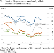
The data are weekly averages of daily benchmark yields and extend through July 5, 2017.
Source: Bloomberg.
Series: United States, United Kingdom, Germany, and Japan 10-year benchmark yields Horizon: January 8, 2014, to July 5, 2017 Description: The data are weekly averages of daily data, plotted as four curves. Units for the 10-year benchmark yields are in percent along the right axis. The lines generally move in the same direction from 2014 to 2016, with the United States and United Kingdom tracking closely until the middle of 2016, when the United Kingdom falls considerably below the United States. Both remain above Germany and Japan over the entire horizon. The series for the United States, United Kingdom, and Germany decline from 2014 to early 2015, when they rise sharply. They then decline until mid-2016 and start to climb in late 2016, with particularly sharp moves in the United Kingdom and United States. Germany starts considerably higher than Japan but briefly dips below Japan twice, around 2015:Q2 and 2016:Q4. Japanese yields fall slightly throughout 2014, increase through mid-2015, then trend downward until mid-2016. After mid-2016, they trend upward through the end of the horizon. Germany ends the horizon above Japan in July 2017, experiencing a much sharper uptick in the final weeks of the series. The series for the United States starts in January 2014 at approximately 3 and gradually decreases to about 1.7 by midway through 2015:Q1. The series then climbs to around 2.4 by the beginning of the third quarter. It fluctuates between 2 and just above 2.3 until the end of 2015. The series then declines to just above 1.7 in February 2016 before fluctuating between 1.7 and 2 through the beginning of June. The series dips below 1.5 before beginning to rise substantially around November. The series peaks above 2.5 near the beginning of 2017 before trending downward to about 2.2 at the end of June. Finally, it rises to about 2.25 at the beginning of July, when the series ends. The series for the United Kingdom starts in January 2014 at about 3. In the first quarter, it gradually declines to slightly below 1.5, increases to about 1.9, and decreases to around 1.5. The series then climbs to 2.1 by the beginning of the third quarter and fluctuates between 1.75 and just above 2 until the end of 2015. The series declines to about 1.4 in the middle of 2016:Q1 before fluctuating between about 1.4 and 1.6 through the end of May. The series begins to fall rapidly in June and bottoms out in the third quarter at around 0.5. The series then begins to recover, peaking at nearly 1.5 in early 2017 before trending down to around 1 at the end of June. The series then ticks up to about 1.25 at the beginning of July. The series for Germany starts in January 2014 at around 1.9 and steadily decreases to just above 0.9 by midway through the third quarter. The series rebounds slightly to almost 1.1 at the end of the third quarter before continuing its steady decline to about 0.1 around 2015:Q2. Then the series increases to about 0.9 before declining below 0.2 in 2016:Q1. It then fluctuates between 0.1 and 0.3 through the beginning of June. The series dips below zero around the middle of 2016 and fluctuates near zero until the fourth quarter, when the series begins to rise; it then fluctuates between 0.2 and 0.5 for the remainder of the horizon, ending with an uptick around 0.5 at the beginning of July 2017. The series for Japan starts in January 2014 at 0.7 and gradually declines to about 0.25 in early 2015. It then slowly increases to almost 0.5 by the end of 2015:Q2. The series then declines to its lowest value of near negative 0.25 in 2016:Q3 before gradually rising just above zero by the series' end. The series for Japan does not rise as sharply as the other three series at the end of the horizon.
The dollar depreciated somewhat
Since the start of the year, the broad dollar index--a measure of the trade-weighted value of the dollar against foreign currencies--has depreciated about 5 percent, on balance, after rising more than 20 percent between mid-2014 and late 2016 (figure 40). The weakening since the start of the year partly reflected growing uncertainty about prospects for more expansionary U.S. fiscal policy as well as mounting confidence in the foreign economic outlook. The euro rose against the dollar following the French presidential election, and the Mexican peso appreciated substantially as the Mexican central bank tightened monetary policy and as investor concerns about the potential for substantial disruptions of U.S.-Mexico trade appeared to ease.
U.S. dollar exchange rate indexes
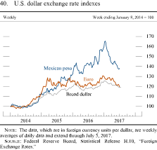
The data, which are in foreign currency units per dollar, are weekly averages of daily data and extend through July 5, 2017.
Source: Federal Reserve Board, Statistical Release H.10, "Foreign Exchange Rates."
Economic activity in the AFEs grew at a solid pace
In the first quarter, real GDP grew at a solid pace in Canada, the euro area, and Japan, partly reflecting robust growth in fixed investment in all three economies (figure 41). In contrast, economic growth slowed to a tepid pace in the United Kingdom, reflecting weaker consumption growth and a decline in exports. In most AFEs, economic survey indicators, such as purchasing manager surveys, generally remained consistent with continued economic growth at a solid pace during the second quarter.
Real gross domestic product growth in selected advanced foreign economies
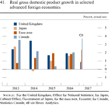
Source: For the United Kingdom, Office for National Statistics; for Japan, Cabinet Office, Government of Japan; for the euro area, Eurostat; for Canada, Statistics Canada; all via Haver Analytics.
Inflation leveled off in most AFEs...
In late 2016, consumer price inflation (measured as a 12-month percent change) rose substantially in most AFEs, partly reflecting increases in energy prices (figure 42). Since then, inflation has leveled off in Japan and declined somewhat in the euro area as upward pressure from energy prices eased, core inflation stayed low, and wage growth was subdued even as unemployment rates declined further in both economies. In contrast, in the United Kingdom, headline inflation rose well above the Bank of England's (BOE) 2 percent target, largely reflecting upward pressure from the substantial sterling depreciation since the Brexit referendum in June 2016.
Inflation in selected advanced foreign economies
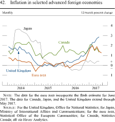
The data for the euro area incorporate the flash estimate for June 2017. The data for Canada, Japan, and the United Kingdom extend through May 2017.
Source: For the United Kingdom, Office for National Statistics; for Japan, Ministry of International Affairs and Communications; for the euro area, Statistical Office of the European Communities; for Canada, Statistics Canada; all via Haver Analytics.
...and AFE central banks maintained highly accommodative monetary policies
AFE central banks kept their policy rates at historically low levels, and the Bank of Japan kept its target range for 10-year government bond yields near zero. The European Central Bank (ECB) maintained its asset purchase program, though it slightly reduced the pace of purchases, and the BOE completed the bond purchase program it announced last August. However, the Bank of Canada, BOE, and ECB have recently suggested that if growth continues to reduce resource slack, some policy accommodation could be withdrawn. The ECB remarked that the forces holding down inflation could be temporary. The BOE indicated that some monetary accommodation might need to be removed if the tradeoff between supporting employment and expediting the return of inflation to its target is reduced.
In EMEs, Asian growth was solid...
Chinese economic activity was robust in the first quarter of 2017 as a result of solid domestic and external demand (figure 43). More recent indicators suggest that growth moderated in the second quarter as Chinese authorities tightened financial conditions and as export growth slowed. In some other emerging Asian economies, growth picked up in early 2017 as a result of stronger external demand and manufacturing activity. However, growth of the region's exports, especially to China, slowed so far in the second quarter.
Real gross domestic product growth in selected emerging market economies
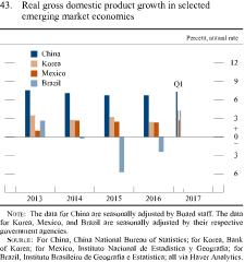
The data for China are seasonally adjusted by Board staff. The data for Korea, Mexico, and Brazil are seasonally adjusted by their respective government agencies.
Source: For China, China National Bureau of Statistics; for Korea, Bank of Korea; for Mexico, Instituto Nacional de Estadistica y Geografia; for Brazil, Instituto Brasileiro de Geografia e Estatistica; all via Haver Analytics.
...and many Latin American economies continue their tepid recovery
In Mexico, growth decelerated a touch in the first quarter of 2017, partly reflecting a slowdown in private consumption following sharp hikes in domestic fuel prices. These price hikes, together with the effects of earlier peso depreciation on import prices, contributed to a sharp rise in Mexican inflation, which prompted the Bank of Mexico to further tighten monetary policy. Following a prolonged period of contraction, the Brazilian economy posted solid growth in the first quarter of 2017, partly reflecting a surge in exports and a strong harvest. However, domestic demand has remained very weak amid high unemployment and heightened political tensions, and indicators of economic activity have stepped down recently. In Brazil and some other South American economies, declining inflation has led central banks to reduce their policy interest rates.
Footnotes
Monetary Policy
The Federal Open Market Committee raised the federal funds rate target range in March and June
Over the past year and a half, the Federal Open Market Committee (FOMC) has been gradually increasing its target range for the federal funds rate as the economy continued to make progress toward the Committee's objectives of maximum employment and price stability. After having raised the target range for the federal funds rate last December, the Committee decided to raise the target range again in March and in June, bringing it to 1 to 1-1/4 percent (figure 44).5 The FOMC's decisions reflected the progress the economy has made, and is expected to make, toward the Committee's objectives.
Selected interest rates
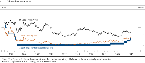
The 2-year and 10-year Treasury rates are the constant-maturity yields based on the most actively traded securities.
Source: Department of the Treasury.
When the Committee met in March, it decided to raise the target range for the federal funds rate to 3/4 to 1 percent. Available information suggested that the labor market had continued to strengthen even as growth in economic activity slowed during the first quarter. Inflation measured on a 12-month basis had moved up appreciably and was close to the Committee's 2 percent longer-run objective. Core inflation, which excludes volatile energy and food prices, continued to run somewhat below 2 percent.
The data available at the time of the June FOMC meeting suggested a rebound in economic activity in the second quarter, leaving the projected average pace of growth over the first half of the year at a moderate level. The labor market had continued to strengthen, with the unemployment rate falling nearly 1/2 percentage point since the beginning of the year to 4.3 percent in May, a low level by historical standards and modestly below the median of FOMC participants' estimates of its longer-run normal level. Inflation measured on a 12-month basis had declined over the previous few months but was still up significantly since last summer. Like the headline inflation measure, core inflation was running somewhat below 2 percent. With employment expected to remain near its maximum sustainable level, the Committee continued to expect that inflation would move up and stabilize around 2 percent over the next couple of years, in line with the Committee's longer-run objective. In view of realized and expected labor market conditions and inflation, the Committee decided to raise the target another 1/4 percentage point to a range of 1 to 1-1/4 percent.
Monetary policy continues to support economic growth
Even with the gradual reductions in the amount of policy accommodation to date, the Committee judges that the stance of monetary policy remains accommodative, thereby supporting some further strengthening in labor market conditions and a sustained return to 2 percent inflation. In particular, the federal funds rate appears to remain somewhat below its neutral level--that is, the level of the federal funds rate that is neither expansionary nor contractionary.
In evaluating the stance of monetary policy, policymakers routinely consult prescriptions from a variety of policy rules, which can serve as useful benchmarks. However, the use and interpretation of such prescriptions require careful judgments about the choice and measurement of the inputs to these rules as well as the implications of the many considerations these rules do not take into account (see the box "Monetary Policy Rules and Their Role in the Federal Reserve's Policy Process").
Monetary Policy Rules and Their Role in the Federal Reserve's Policy Process
Monetary policy rules are formulas that prescribe a tight link between a small number of economic variables--typically including the gap between actual and target inflation along with an estimate of resource slack in the economy--and the setting of a policy rate, such as the federal funds rate.1 While policy rules can provide helpful guidance for policymakers, their interpretation requires careful judgment about the measurement of the inputs to these rules and the implications of the many considerations these rules do not take into account.
Policy rules can incorporate key principles of good monetary policy. One key principle is that monetary policy should respond in a predictable way to changes in economic conditions. A second key principle is that monetary policy should be accommodative when inflation is below the desired level and employment is below its maximum sustainable level; conversely, monetary policy should be restrictive when the opposite holds. A third key principle is that, to stabilize inflation, the policy rate should be adjusted by more than one-for-one in response to persistent increases or decreases in inflation.
Economists have analyzed many monetary policy rules, including the well-known Taylor (1993) rule as well as other rules discussed later: the "balanced approach" rule, the "adjusted Taylor (1993)" rule, the "change" rule, and the "first difference" rule (figure A).2 These policy rules generally embody the three key principles of good monetary policy noted earlier. Each rule takes into account two gaps--the difference between inflation and its objective (2 percent as measured by the price index for personal consumption expenditures (PCE), in the case of the Federal Reserve) as well as the difference between the rate of unemployment in the longer run (u LR) and the current unemployment rate.3 Unlike the other rules, the first-difference rule considers the change in the unemployment gap rather than its level.
Monetary Policy Rules
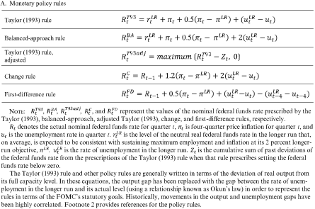
$$ R_t^{T93}$$, $$ R_t^{BA}$$, $$ R_t^{T93adj}$$, $$ R_t^C$$, and $$ R_t^{FD}$$ represent the values of the nominal federal funds rate prescribed by the Taylor (1993), balanced-approach, adjusted Taylor (1993), change, and first-difference rules, respectively.
The Taylor (1993), balanced-approach, and adjusted Taylor (1993) rules provide prescriptions for the level of the federal funds rate and require an estimate of the neutral real interest rate in the longer run (r LR)--that is, the level of the real federal funds rate that is expected to be consistent with sustaining maximum employment and stable inflation in the longer run.4 In contrast, the change and first-difference rules prescribe how the level of the federal funds rate at a given time should be altered from its previous level--that is, they indicate how the existing rate should change over time. The adjusted Taylor (1993) rule recognizes that the federal funds rate cannot be reduced materially below zero, implying that interest rate policy alone may not be able to provide enough policy accommodation during periods when the unadjusted Taylor (1993) rule prescribes setting the federal funds rate below zero. To make up for the cumulative shortfall in accommodation ( Zt,) the adjusted rule prescribes only a gradual return of the policy rate to the (positive) levels prescribed by the unadjusted Taylor (1993) rule as the economy recovers.
The small number of variables involved in policy rules makes them easy to use. However, the U.S. economy is highly complex, and these rules, by their very nature, do not capture that complexity. For example, while the unemployment rate is an important measure of the state of the labor market, it often lags business cycle developments and does not provide a complete measure of slack or tightness. In practice, Federal Open Market Committee (FOMC) policymakers examine a great deal of information about the labor market to gauge its health; this information includes broader measures of labor underutilization, the labor force participation rate, employment, hours worked, and the rates of job openings, hiring, layoffs, and quits, as well as anecdotal information not easily reduced to numerical indexes.5
Another issue related to the implementation of rules involves the measurement of the variables that drive the prescriptions generated by the rules. For example, there are many measures of inflation, and they do not always move together or by the same amount. The broadest measure of inflation, shown by the percent change in the gross domestic product price index, displays notable differences from measures that gauge changes in consumer prices (figure B). Even measures that focus on the prices paid by consumers differ importantly. For example, inflation as measured by the consumer price index (or CPI) has generally been somewhat higher historically than inflation measured using the PCE price index (the index to which the FOMC's 2 percent longer-run inflation objective refers). Core inflation, meaning inflation excluding changes in food and energy prices, is less volatile than headline inflation and is often used in estimating monetary policy rules because it has historically been a good predictor of future headline inflation (figure C).
Inflation measures
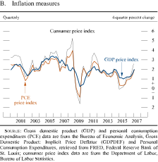
Source: Gross domestic product (GDP) and personal consumption expenditures (PCE) data are from the Bureau of Economic Analysis, Gross Domestic Product: Implicit Price Deflator (GDPDEF) and Personal Consumption Expenditures, retrieved from FRED, Federal Reserve Bank of St. Louis; consumer price index data are from the Department of Labor, Bureau of Labor Statistics.
Total inflation versus core inflation
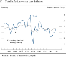
Source: Bureau of Economic Analysis.
In addition, both the level of the neutral real interest rate in the longer run and the level of the unemployment rate that is sustainable in the longer run are difficult to estimate precisely, and estimates made in real time may differ substantially from estimates made later on, after the relevant economic data have been revised and additional data have become available.6 For example, since 2000, respondents to the Blue Chip survey have markedly reduced their projections of the longer-run level of the real short-term interest rate (figure D). Survey respondents have also made considerable changes over time to their estimates of the rate of unemployment in the longer run, with consequences for the unemployment gap. Revisions of this magnitude to the neutral real interest rate and the rate of unemployment in the longer run can have important implications for the federal funds rate prescribed by monetary policy rules. Sensible estimation of policy rules requires that policymakers take into account these changes in the projected values of longer-run rates as they occur over time.
Real-time estimates of the neutral real interest rate and the unemployment rate in the longer run
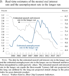
The data for the estimated neutral real interest rate in the longer run and the estimated unemployment rate in the longer run are biannual and have been interpolated to yield quarterly values. The estimated neutral real interest rate in the longer run equals the three-month Treasury bill rate projected in the long run deflated by the long-run projected annual change in the price index for gross domestic product.
Source: Wolters Kluwer, Blue Chip Economic Indicators.
Furthermore, the prescribed responsiveness of the federal funds rate to its determinants differs across policy rules. For example, the sensitivity of the federal funds rate to the unemployment gap in the balanced-approach rule is twice as large as it is in the Taylor (1993) rule. The fact that the policy interest rate responds differently to the inflation and unemployment gaps in the different policy rules means that the rules provide different tradeoffs between stabilizing inflation and stabilizing unemployment.
Finally, monetary policy rules do not take account of broader risk considerations. For example, policymakers routinely assess risks to financial stability. Furthermore, over the past few years, with the federal funds rate still close to zero, the FOMC has recognized that it would have limited scope to respond to an unexpected weakening in the economy by lowering short-term interest rates. This asymmetric risk has, in recent years, provided a sound rationale for following a more gradual path of rate increases than that prescribed by policy rules. (Asymmetric risk need not always provide a rationale for a more gradual path; if the risks were strongly tilted toward substantial and persistent overheating and too-high inflation, the asymmetric risk could argue for higher rates than prescribed by simple rules.)
How does the FOMC use monetary policy rules?
In the briefing materials prepared for FOMC meetings, Federal Reserve staff regularly report prescriptions for the current setting of the federal funds rate from a number of monetary policy rules.7 FOMC policymakers discussed prescriptions from monetary policy rules as long ago as 1995 and have consulted them routinely since 2004. The materials that FOMC policymakers see also include forecasts of how the federal funds rate and key macro indicators would evolve, under each of the rules, several years into the future. Policymakers weigh this information, along with other information bearing on the economic outlook.8
Different monetary policy rules often offer quite different prescriptions for the federal funds rate; moreover, there is no obvious metric for favoring one rule over another. While monetary policy rules often agree about the direction (up or down) in which policymakers should move the federal funds rate, they frequently disagree about the appropriate level of that rate. Historical prescriptions from policy rules differ from one another and also differ from the Committee's target for the federal funds rate, as shown in figure E. (These prescriptions are calculated using both the actual data and the estimates of the neutral real interest rate in the longer run and of the rate of unemployment in the longer run--data and estimates that were available to FOMC policymakers at the time.) Moreover, the rules sometimes prescribe setting short-term interest rates well below zero--a setting that is not feasible. With the exception of the adjusted Taylor (1993) rule, which imposes a lower limit of zero, all of the rules shown in figure E called for the federal funds rate to turn negative in 2009 and to stay below zero for several years thereafter. Thus, these rules indicated that the Federal Reserve should provide more monetary stimulus than could be achieved by setting the federal funds rate at zero. While all of the policy rules have called for higher values of the federal funds rate in recent years, the pace of tightening that the rules prescribe has varied widely. Prescriptions from these rules for the level of the federal funds rate in the first quarter of 2017 ranged from 37 basis points (change rule) to 2.5 percent (balanced-approach rule).9
Historical federal funds rate prescriptions from simple policy rules
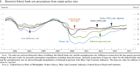
The rules use real-time historical values of inflation, the federal funds rate, and the unemployment rate. Inflation is measured as the four-quarter percent change in the price index for personal consumption expenditures excluding food and energy. Quarterly projections of long-run values for the federal funds rate and the unemployment rate are derived through interpolations of biannual projections from Blue Chip Economic Indicators. The long-run value for inflation is taken as 2 percent.
Source: Federal Reserve Bank of Philadelphia; Wolters Kluwer, Blue Chip Economic Indicators; Federal Reserve Board staff estimates.
Future changes in the federal funds rate will depend on the economic outlook as informed by incoming data
The FOMC has continued to emphasize that, in determining the timing and size of future adjustments to the target range for the federal funds rate, it will assess realized and expected economic conditions relative to its objectives of maximum employment and 2 percent inflation. This assessment will take into account a wide range of information, including measures of labor market conditions, indicators of inflation pressures and inflation expectations, and readings on financial and international developments. The Committee will carefully monitor actual and expected inflation developments relative to its symmetric inflation goal.
The Committee currently expects that the ongoing strength in the economy will warrant gradual increases in the federal funds rate, and that the federal funds rate will likely remain, for some time, below the levels that the Committee expects to prevail in the longer run. Consistent with this outlook, in the most recent Summary of Economic Projections, which was compiled at the time of the June FOMC meeting, most FOMC participants projected that the appropriate level of the federal funds rate would be below its longer-run level through 2018.6
The size of the Federal Reserve's balance sheet has remained stable so far this year
To help maintain accommodative financial conditions, the Committee has continued its existing policy of reinvesting principal payments from its holdings of agency debt and agency mortgage-backed securities in agency mortgage-backed securities and rolling over maturing Treasury securities at auction. Consequently, the Federal Reserve's total assets have held steady at around $4.5 trillion, with holdings of U.S. Treasury securities at $2.5 trillion and holdings of agency debt and agency mortgage-backed securities at approximately $1.8 trillion (figure 45). Total liabilities on the Federal Reserve's balance sheet were also mostly unchanged over the first half of 2017.
Federal Reserve assets and liabilities
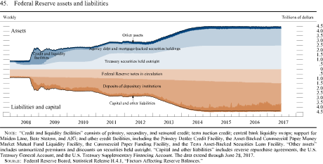
"Capital and other liabilities" includes reverse repurchase agreements, the U.S. Treasury General Account, and the U.S. Treasury Supplementary Financing Account. The data extend through June 28, 2017.
Source: Federal Reserve Board, Statistical Release H.4.1, "Factors Affecting Reserve Balances."
The Committee intends to implement a balance sheet normalization program
In June, policymakers augmented the Committee's Policy Normalization Principles and Plans issued in September 2014 by providing additional details regarding the approach the FOMC intends to use to reduce the Federal Reserve's holdings of Treasury and agency securities once normalization of the federal funds rate is well under way.7 The Committee intends to gradually reduce the Federal Reserve's securities holdings by decreasing its reinvestment of the principal payments it receives from the securities held in the System Open Market Account. Specifically, such payments will be reinvested only to the extent that they exceed gradually rising caps. Initially, these caps will be set at relatively low levels to limit the volume of securities that private investors will have to absorb. The Committee currently expects that, provided the economy evolves broadly as anticipated, it would likely begin to implement the program this year. In addition, the Committee affirmed that changing the target range for the federal funds rate remains its primary means of adjusting the stance of monetary policy (see the box "Addendum to the Policy Normalization Principles and Plans").
Addendum to the Policy Normalization Principles and Plans
Adopted effective September 16, 2014; as amended effective June 14, 2017
All participants agreed to augment the Committee's Policy Normalization Principles and Plans by providing the following additional details regarding the approach the FOMC intends to use to reduce the Federal Reserve's holdings of Treasury and agency securities once normalization of the level of the federal funds rate is well under way.1
The Committee intends to gradually reduce the Federal Reserve's securities holdings by decreasing its reinvestment of the principal payments it receives from securities held in the System Open Market Account. Specifically, such payments will be reinvested only to the extent that they exceed gradually rising caps. For payments of principal that the Federal Reserve receives from maturing Treasury securities, the Committee anticipates that the cap will be $6 billion per month initially and will increase in steps of $6 billion at three-month intervals over 12 months until it reaches $30 billion per month. For payments of principal that the Federal Reserve receives from its holdings of agency debt and mortgage-backed securities, the Committee anticipates that the cap will be $4 billion per month initially and will increase in steps of $4 billion at three-month intervals over 12 months until it reaches $20 billion per month. The Committee also anticipates that the caps will remain in place once they reach their respective maximums so that the Federal Reserve's securities holdings will continue to decline in a gradual and predictable manner until the Committee judges that the Federal Reserve is holding no more securities than necessary to implement monetary policy efficiently and effectively. For payments of principal that the Federal Reserve receives from maturing Treasury securities, the Committee anticipates that the cap will be $6 billion per month initially and will increase in steps of $6 billion at three-month intervals over 12 months until it reaches $30 billion per month. For payments of principal that the Federal Reserve receives from its holdings of agency debt and mortgage-backed securities, the Committee anticipates that the cap will be $4 billion per month initially and will increase in steps of $4 billion at three-month intervals over 12 months until it reaches $20 billion per month. The Committee also anticipates that the caps will remain in place once they reach their respective maximums so that the Federal Reserve's securities holdings will continue to decline in a gradual and predictable manner until the Committee judges that the Federal Reserve is holding no more securities than necessary to implement monetary policy efficiently and effectively. Gradually reducing the Federal Reserve's securities holdings will result in a declining supply of reserve balances. The Committee currently anticipates reducing the quantity of reserve balances, over time, to a level appreciably below that seen in recent years but larger than before the financial crisis; the level will reflect the banking system's demand for reserve balances and the Committee's decisions about how to implement monetary policy most efficiently and effectively in the future. The Committee expects to learn more about the underlying demand for reserves during the process of balance sheet normalization. The Committee affirms that changing the target range for the federal funds rate is its primary means of adjusting the stance of monetary policy. However, the Committee would be prepared to resume reinvestment of principal payments received on securities held by the Federal Reserve if a material deterioration in the economic outlook were to warrant a sizable reduction in the Committee's target for the federal funds rate. Moreover, the Committee would be prepared to use its full range of tools, including altering the size and composition of its balance sheet, if future economic conditions were to warrant a more accommodative monetary policy than can be achieved solely by reducing the federal funds rate.
The Federal Reserve's implementation of monetary policy has continued smoothly
The Federal Reserve successfully raised the effective federal funds rate in March and June of 2017 by increasing the interest rate paid on reserve balances along with the interest rate offered on overnight reverse repurchase agreements (ON RRPs). Specifically, the Federal Reserve increased the interest rate paid on required and excess reserve balances to 1.00 percent in March and 1.25 percent in June while increasing the ON RRP offering rate to 0.75 percent in March and 1.00 percent in June. In addition, the Board of Governors approved 1/4 percentage point increases in the discount rate (the primary credit rate) in March and June. In both March and June, the effective federal funds rate rose near the middle of its new target range amid orderly trading conditions in money markets, closely tracked by most other overnight money market rates.
Usage of the ON RRP facility, which had increased late last year as a result of higher demand by government money market funds in the wake of last October's money fund reform, has declined some, on average, in recent months. However, usage has remained somewhat above its levels of one year ago.
Footnotes
Summary of Economic Projections
The following material appeared as an addendum to the minutes of the June 13-14, 2017, meeting of the Federal Open Market Committee. The following material appeared as an addendum to the minutes of the June 13-14, 2017, meeting of the Federal Open Market Committee.
In conjunction with the Federal Open Market Committee (FOMC) meeting held on June 13-14, 2017, meeting participants submitted their projections of the most likely outcomes for real output growth, the unemployment rate, and inflation for each year from 2017 to 2019 and over the longer run.8 Each participant's projection was based on information available at the time of the meeting, together with his or her assessment of appropriate monetary policy, including a path for the federal funds rate and its longer-run value, and assumptions about other factors likely to affect economic outcomes.9 The longer-run projections represent each participant's assessment of the value to which each variable would be expected to converge, over time, under appropriate monetary policy and in the absence of further shocks to the economy.10 "Appropriate monetary policy" is defined as the future path of policy that each participant deems most likely to foster outcomes for economic activity and inflation that best satisfy his or her individual interpretation of the Federal Reserve's objectives of maximum employment and stable prices.
All participants who submitted longer-run projections expected that, under appropriate monetary policy, growth in real gross domestic product (GDP) this year would run somewhat above their individual estimates of its longer-run rate. Over half of these participants expected that economic growth would slow a bit in 2018, and almost all of them expected that in 2019 economic growth would run at or near its longer-run level. All participants who submitted longer-run projections expected that the unemployment rate would run below their estimates of its longer-run normal level in 2017 and remain below that level through 2019. The majority of participants also lowered their estimates of the longer-run normal rate of unemployment by 0.1 to 0.2 percentage point. All participants projected that inflation, as measured by the four-quarter percentage change in the price index for personal consumption expenditures (PCE), would run below 2 percent in 2017 and then step up in the next two years; over half of them projected that inflation would be at the Committee's 2 percent objective in 2019, and all judged that inflation would be within a couple of tenths of a percentage point of the objective in that year. Table 1 and figure 1 provide summary statistics for the projections.
Table 1. Economic projections of Federal Reserve Board members and Federal Reserve Bank presidents, under their individual assessments of projected appropriate monetary policy, June 2017
Note: Projections of change in real gross domestic product (GDP) and projections for both measures of inflation are percent changes from the fourth quarter of the previous year to the fourth quarter of the year indicated. PCE inflation and core PCE inflation are the percentage rates of change in, respectively, the price index for personal consumption expenditures (PCE) and the price index for PCE excluding food and energy. Projections for the unemployment rate are for the average civilian unemployment rate in the fourth quarter of the year indicated. Each participant's projections are based on his or her assessment of appropriate monetary policy. Longer-run projections represent each participant's assessment of the rate to which each variable would be expected to converge under appropriate monetary policy and in the absence of further shocks to the economy. The projections for the federal funds rate are the value of the midpoint of the projected appropriate target range for the federal funds rate or the projected appropriate target level for the federal funds rate at the end of the specified calendar year or over the longer run. The March projections were made in conjunction with the meeting of the Federal Open Market Committee on March 14-15, 2017. One participant did not submit longer-run projections for the change in real GDP, the unemployment rate, or the federal funds rate in conjunction with the March 14-15, 2017, meeting, and one participant did not submit such projections in conjunction with the June 13-14, 2017, meeting.
1. For each period, the median is the middle projection when the projections are arranged from lowest to highest. When the number of projections is even, the median is the average of the two middle projections. Return to table
2. The central tendency excludes the three highest and three lowest projections for each variable in each year. Return to table
3. The range for a variable in a given year includes all participants' projections, from lowest to highest, for that variable in that year. Return to table
4. Longer-run projections for core PCE inflation are not collected. Return to table
Medians, central tendencies, and ranges of economic projections, 2017-19 and over the longer run
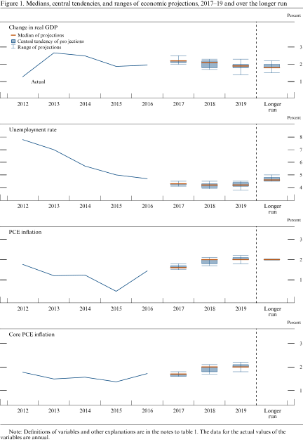
Definitions of variables and other explanations are in the notes to table 1. The data for the actual values of the variables are annual.
As shown in figure 2, participants generally expected that evolving economic conditions would likely warrant further gradual increases in the federal funds rate to achieve and sustain maximum employment and 2 percent inflation. Although some participants raised or lowered their federal funds rate projections since March, the median projections for the federal funds rate in 2017 and 2018 were essentially unchanged, and the median projection in 2019 was slightly lower; the median projection for the longer-run federal funds rate was unchanged. However, the economic outlook is uncertain, and participants noted that their economic projections and assessments of appropriate monetary policy could change in response to incoming information.
FOMC participants' assessments of appropriate monetary policy: Midpoint of target range or target level for the federal funds rate
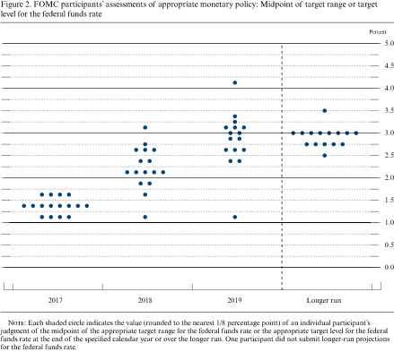
Each shaded circle indicates the value (rounded to the nearest 1/8 percentage point) of an individual participant's judgment of the midpoint of the appropriate target range for the federal funds rate or the appropriate target level for the federal funds rate at the end of the specified calendar year or over the longer run. One participant did not submit longer-run projections for the federal funds rate.
In general, participants viewed the uncertainty attached to their projections as broadly similar to the average of the past 20 years, although a couple of participants saw the uncertainty associated with their real GDP growth forecasts as higher than average. Most participants judged the risks around their projections for economic growth, the unemployment rate, and inflation as broadly balanced.
Figures 4.A through 4.C for real GDP growth, the unemployment rate, and inflation, respectively, present "fan charts" as well as charts of participants' current assessments of the uncertainty and risks surrounding the economic projections. The fan charts (the panels at the top of these three figures) show the median projections surrounded by confidence intervals that are computed from the forecast errors of various private and government projections made over the past 20 years. The width of the confidence interval for each variable at a given point is a measure of forecast uncertainty at that horizon. For all three macroeconomic variables, these charts illustrate that forecast uncertainty is substantial and generally increases as the forecast horizon lengthens. Reflecting, in part, the uncertainty about the future evolution of GDP growth, the unemployment rate, and inflation, participants' assessments of appropriate monetary policy are also subject to considerable uncertainty. To illustrate the uncertainty regarding the appropriate path for monetary policy, figure 5 shows a comparable fan chart around the median projections for the federal funds rate.11 As with the macroeconomic variables, forecast uncertainty for the federal funds rate is substantial and increases at longer horizons.
The Outlook for Economic Activity
The median of participants' projections for the growth rate of real GDP, conditional on their individual assumptions about appropriate monetary policy, was 2.2 percent in 2017, 2.1 percent in 2018, and 1.9 percent in 2019; the median of projections for the longer-run normal rate of real GDP growth was 1.8 percent. Compared with the March Summary of Economic Projections (SEP), the medians of the forecasts for real GDP growth over the period from 2017 to 2019, as well as the median assessment of the longer-run growth rate, were mostly unchanged. Fewer than half of the participants incorporated expectations of fiscal stimulus into their projections, and a couple indicated that they had marked down the magnitude of expected fiscal stimulus relative to March.
All participants revised down their projections for the unemployment rate in the fourth quarter of 2017 and of 2018, and almost all also revised down their projections for the unemployment rate in the fourth quarter of 2019. Many who did so cited recent lower-than-expected readings on unemployment. The median of the projections for the unemployment rate was 4.3 percent in 2017 and 4.2 percent in each of 2018 and 2019, 0.2 percentage point and 0.3 percentage point lower than in the March projections, respectively. The majority of participants also revised down their estimates of the longer-run normal rate of unemployment by 0.1 or 0.2 percentage point, and the median longer-run level was 4.6 percent, down 0.1 percentage point from March.
Figure 3.A. and figure 3.B. show the distributions of participants' projections for real GDP growth and the unemployment rate from 2017 to 2019 and in the longer run. The distribution of individual projections for real GDP growth for this year shifted up, with some participants now expecting real GDP growth between 2.4 and 2.5 percent and none seeing it below 2 percent. The distributions of projected real GDP growth in 2018, 2019, and in the longer run were broadly similar to the distributions of the March projections. The distributions of individual projections for the unemployment rate shifted down noticeably for 2017 and 2018. Most participants projected an unemployment rate of 4.2 or 4.3 percent at the end of this year, and the majority anticipated an unemployment rate between 4.0 and 4.3 percent at the end of 2018. Participants' projections also shifted down in 2019 but were more dispersed than the distributions of their projected unemployment rates in the two earlier years. The distribution of projections for the longer-run normal unemployment rate shifted down modestly.
Distribution of participants' projections for the change in real GDP, 2017-19 and over the longer run
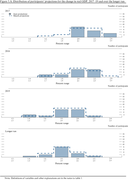
Definitions of variables and other explanations are in the notes to table 1.
Distribution of participants' projections for the unemployment rate, 2017-19 and over the longer run
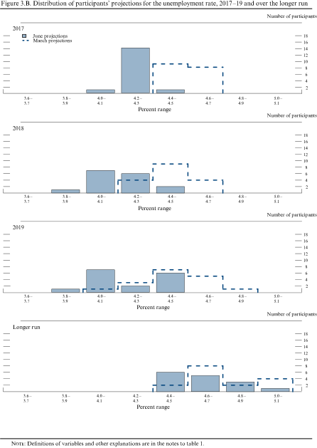
Definitions of variables and other explanations are in the notes to table 1.
The Outlook for Inflation
The median of projections for headline PCE price inflation this year was 1.6 percent, down 0.3 percentage point from March. As in March, median projected inflation was 2.0 percent in 2018 and 2019. About half of the participants anticipated that inflation would continue to run a bit below 2 percent in 2018, while only one participant expected inflation above 2 percent in that year--and, in that case, just modestly so. More than half projected that inflation would be equal to the Committee's objective in 2019. A few participants projected that inflation would run slightly below 2 percent in that year, while several projected that it would run a little above 2 percent. The median of projections for core PCE price inflation was 1.7 percent in 2017, a decline of 0.2 percentage point from March; the median projection for 2018 and 2019 was 2.0 percent, as in the March projections.
Figure 3.C. and figure 3.D. provide information on the distributions of participants' views about the outlook for inflation. The distributions of projections for headline PCE price inflation and for core PCE price inflation in 2017 shifted down noticeably from March, while the distributions for both measures of inflation in 2018 shifted down slightly. Many participants cited recent surprisingly low readings on inflation as a factor contributing to the revisions in their inflation forecasts.
Distribution of participants' projections for PCE inflation, 2017-19 and over the longer run
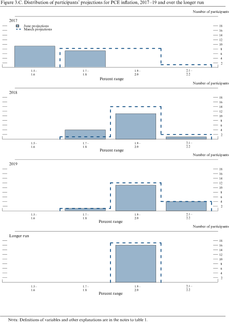
Definitions of variables and other explanations are in the notes to table 1.
Distribution of participants' projections for core PCE inflation, 2017-20
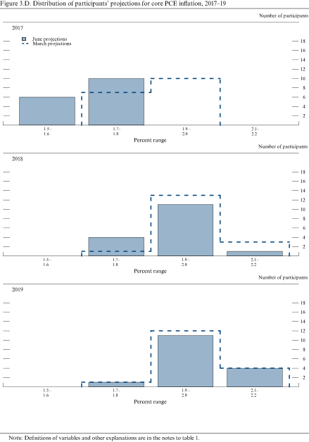
Definitions of variables and other explanations are in the notes to table 1.
Appropriate Monetary Policy
Figure 3.E. provides the distribution of participants' judgments regarding the appropriate target or midpoint of the target range for the federal funds rate at the end of each year from 2017 to 2019 and over the longer run.12 The distribution for 2017 was less dispersed than that in March, while the distribution for 2018 was slightly less dispersed. The distributions in 2019 and in the longer run were broadly similar to those in March. The median projections of the federal funds rate continued to show gradual increases, with the median assessment for 2017 standing at 1.38 percent, consistent with three 25 basis point increases this year. Thereafter, the medians of the projections were 2.13 percent at the end of 2018 and 2.94 percent at the end of 2019; the median of the longer-run projections of the federal funds rate was 3.00 percent.
Distribution of participants' judgments of the midpoint of the appropriate target range for the federal funds rate or the appropriate target level for the federal funds rate, 2017-19 and over the longer run
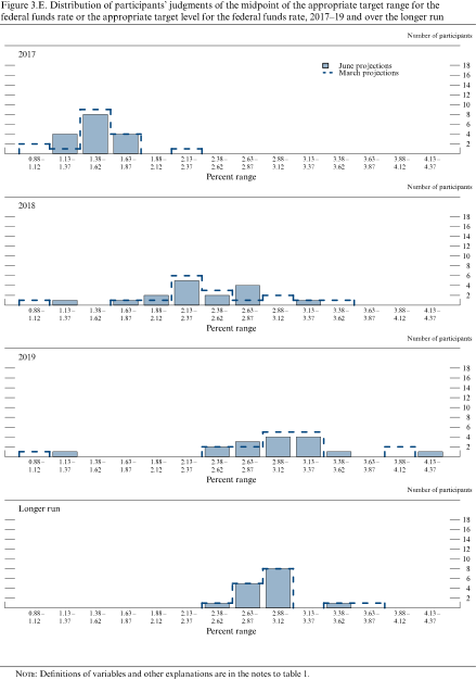
Definitions of variables and other explanations are in the notes to table 1.
In discussing their June projections, many participants continued to express the view that the appropriate upward trajectory of the federal funds rate over the next few years would likely be gradual. That anticipated pace reflected a few factors, such as a neutral real interest rate that was currently low and was expected to move up only slowly as well as a gradual return of inflation to the Committee's 2 percent objective. Several participants judged that a slightly more accommodative path of monetary policy than in their previous projections would likely be appropriate, citing an apparently slower rate of progress toward the Committee's 2 percent inflation objective. In their discussions of appropriate monetary policy, half of the participants commented on the Committee's reinvestment policy; all of those who did so expected a change in reinvestment policy before the end of this year.
Uncertainty and Risks
Projections of economic variables are subject to considerable uncertainty. In assessing the path of monetary policy that, in their view, is likely to be most appropriate, FOMC participants take account of the range of possible outcomes, the likelihood of those outcomes, and the potential benefits and costs to the economy should they occur. Table 2 provides one measure of forecast uncertainty for the change in real GDP, the unemployment rate, and total consumer price inflation--the root mean squared error (RMSE) for forecasts made over the past 20 years. This measure of forecast uncertainty is incorporated graphically in the top panels of figures 4.A, 4.B, and 4.C, which display fan charts plotting the median SEP projections for the three variables surrounded by symmetric confidence intervals derived from the RMSEs presented in table 2. If the degree of uncertainty attending these projections is similar to the typical magnitude of past forecast errors and if the risks around the projections are broadly balanced, future outcomes of these variables would have about a 70 percent probability of occurring within these confidence intervals. For all three variables, this measure of forecast uncertainty is substantial and generally increases as the forecast horizon lengthens.
Table 2. Average historical projection error ranges
Percentage points
Note: Error ranges shown are measured as plus or minus the root mean squared error of projections for 1997 through 2016 that were released in the summer by various private and government forecasters. As described in the box "Forecast Uncertainty," under certain assumptions, there is about a 70 percent probability that actual outcomes for real GDP, unemployment, consumer prices, and the federal funds rate will be in ranges implied by the average size of projection errors made in the past. For more information, see David Reifschneider and Peter Tulip (2017), "Gauging the Uncertainty of the Economic Outlook Using Historical Forecasting Errors: The Federal Reserve's Approach," Finance and Economics Discussion Series 2017-020 (Washington: Board of Governors of the Federal Reserve System, February), available at www.federalreserve.gov/econresdata/feds/2017/files/2017020pap.pdf.
1. Definitions of variables are in the general note to table 1. Return to table
2. Measure is the overall consumer price index, the price measure that has been most widely used in government and private economic forecasts. Projection is percent change, fourth quarter of the previous year to the fourth quarter of the year indicated. Return to table
3. For Federal Reserve staff forecasts, measure is the federal funds rate. For other forecasts, measure is the rate on 3-month Treasury bills. Historical projections are the average level, in percent, in the fourth quarter of the year indicated. Return to table
FOMC participants may judge that the width of the historical fan charts shown in figures 4.A through 4.C does not adequately capture their current assessments of the degree of uncertainty that surrounds their economic projections. Participants' assessments of the current level of uncertainty surrounding their economic projections are shown in the bottom-left panels of figure 4.A., figure 4.B., and figure 4.C.. All or nearly all participants viewed the uncertainty attached to their economic projections as broadly similar to the average of the past 20 years, with three fewer participants than in March seeing uncertainty about GDP growth, the unemployment rate, and inflation as higher than its historical average.13 In their discussion of the uncertainty attached to their current projections, most participants again expressed the view that, at this point, uncertainty surrounding prospective changes in fiscal and other government policies is very large or that there is not yet enough information to make reasonable assumptions about the timing, nature, and magnitude of the changes.
Uncertainty and risks in projections of GDP growth
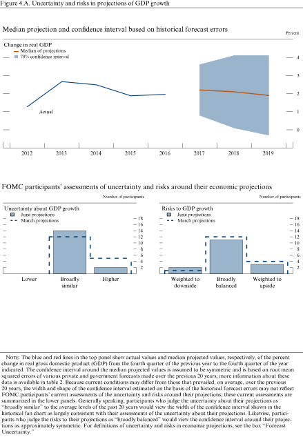
The blue and red lines in the top panel show actual values and median projected values, respectively, of the percent change in real gross domestic product (GDP) from the fourth quarter of the previous year to the fourth quarter of the year indicated. The confidence interval around the median projected values is assumed to be symmetric and is based on root mean squared errors of various private and government forecasts made over the previous 20 years; more information about these data is available in table 2. Because current conditions may differ from those that prevailed, on average, over the previous 20 years, the width and shape of the confidence interval estimated on the basis of the historical forecast errors may not reflect FOMC participants' current assessments of the uncertainty and risks around their projections; these current assessments are summarized in the lower panels. Generally speaking, participants who judge the uncertainty about their projections as "broadly similar" to the average levels of the past 20 years would view the width of the confidence interval shown in the historical fan chart as largely consistent with their assessments of the uncertainty about their projections. Likewise, participants who judge the risks to their projections as "broadly balanced" would view the confidence interval around their projections as approximately symmetric. For definitions of uncertainty and risks in economic projections, see the box "Forecast Uncertainty."
Uncertainty and risks in projections of the unemployment rate
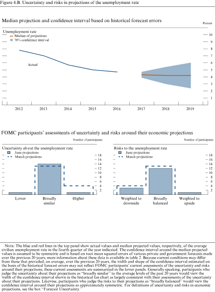
The blue and red lines in the top panel show actual values and median projected values, respectively, of the average civilian unemployment rate in the fourth quarter of the year indicated. The confidence interval around the median projected values is assumed to be symmetric and is based on root mean squared errors of various private and government forecasts made over the previous 20 years; more information about these data is available in table 2. Because current conditions may differ from those that prevailed, on average, over the previous 20 years, the width and shape of the confidence interval estimated on the basis of the historical forecast errors may not reflect FOMC participants' current assessments of the uncertainty and risks around their projections; these current assessments are summarized in the lower panels. Generally speaking, participants who judge the uncertainty about their projections as "broadly similar" to the average levels of the past 20 years would view the width of the confidence interval shown in the historical fan chart as largely consistent with their assessments of the uncertainty about their projections. Likewise, participants who judge the risks to their projections as "broadly balanced" would view the confidence interval around their projections as approximately symmetric. For definitions of uncertainty and risks in economic projections, see the box "Forecast Uncertainty."
Uncertainty and risks in projections of PCE inflation
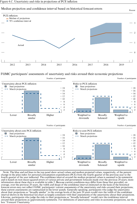
The blue and red lines in the top panel show actual values and median projected values, respectively, of the percent change in the price index for personal consumption expenditures (PCE) from the fourth quarter of the previous year to the fourth quarter of the year indicated. The confidence interval around the median projected values is assumed to be symmetric and is based on root mean squared errors of various private and government forecasts made over the previous 20 years; more information about these data is available in table 2. Because current conditions may differ from those that prevailed, on average, over the previous 20 years, the width and shape of the confidence interval estimated on the basis of the historical forecast errors may not reflect FOMC participants' current assessments of the uncertainty and risks around their projections; these current assessments are summarized in the lower panels. Generally speaking, participants who judge the uncertainty about their projections as "broadly similar" to the average levels of the past 20 years would view the width of the confidence interval shown in the historical fan chart as largely consistent with their assessments of the uncertainty about their projections. Likewise, participants who judge the risks to their projections as "broadly balanced" would view the confidence interval around their projections as approximately symmetric. For definitions of uncertainty and risks in economic projections, see the box "Forecast Uncertainty."
The fan charts--which are constructed so as to be symmetric around the median projections--also may not fully reflect participants' current assessments of the balance of risks to their economic projections. Participants' assessments of the balance of risks to their economic projections are shown in the bottom-right panels of figures 4.A, 4.B, and 4.C. As in March, most participants judged the risks to their projections of real GDP growth, the unemployment rate, headline inflation, and core inflation as broadly balanced--in other words, as broadly consistent with a symmetric fan chart. Three participants judged the risks to the unemployment rate as weighted to the downside, and one participant judged the risks as weighted to the upside (as shown in the lower-right panel of figure 4.B). In addition, the balance of risks to participants' inflation projections shifted down slightly from March (shown in the lower-right panels of figure 4.C), as two fewer participants judged the risks to inflation to be weighted to the upside and two more viewed the risks as weighted to the downside.
Participants' assessments of the future path of the federal funds rate consistent with appropriate policy are also subject to considerable uncertainty, reflecting in part uncertainty about the evolution of GDP growth, the unemployment rate, and inflation over time. The final line in table 2 shows the RMSEs for forecasts of short-term interest rates. These RMSEs are not strictly consistent with the SEP projections for the federal funds rate, in part because the SEP projections are not forecasts of the likeliest outcomes but rather reflect each participant's individual assessment of appropriate monetary policy. However, the associated confidence intervals provide a sense of the likely uncertainty around the future path of the federal funds rate generated by the uncertainty about the macroeconomic variables and additional adjustments to monetary policy that may be appropriate to offset the effects of shocks to the economy.
Figure 5 shows a fan chart plotting the median SEP projections for the appropriate path of the federal funds rate surrounded by confidence intervals derived from the results presented in table 2. As with the macroeconomic variables, forecast uncertainty is substantial and increases at longer horizons.14
Uncertainty in projections of the federal funds rate
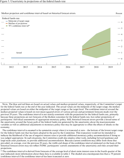
The blue and red lines are based on actual values and median projected values, respectively, of the Committee's target for the federal funds rate at the end of the year indicated. The actual values are the midpoint of the target range; the median projected values are based on either the midpoint of the target range or the target level. The confidence interval around the median projected values is based on root mean squared errors of various private and government forecasts made over the previous 20 years. The confidence interval is not strictly consistent with the projections for the federal funds rate, primarily because these projections are not forecasts of the likeliest outcomes for the federal funds rate, but rather projections of participants' individual assessments of appropriate monetary policy. Still, historical forecast errors provide a broad sense of the uncertainty around the future path of the federal funds rate generated by the uncertainty about the macroeconomic variables as well as additional adjustments to monetary policy that may be appropriate to offset the effects of shocks to the economy.
Forecast Uncertainty
The economic projections provided by the members of the Board of Governors and the presidents of the Federal Reserve Banks inform discussions of monetary policy among policymakers and can aid public understanding of the basis for policy actions. Considerable uncertainty attends these projections, however. The economic and statistical models and relationships used to help produce economic forecasts are necessarily imperfect descriptions of the real world, and the future path of the economy can be affected by myriad unforeseen developments and events. Thus, in setting the stance of monetary policy, participants consider not only what appears to be the most likely economic outcome as embodied in their projections, but also the range of alternative possibilities, the likelihood of their occurring, and the potential costs to the economy should they occur.
Table 2 summarizes the average historical accuracy of a range of forecasts, including those reported in past Monetary Policy Reports and those prepared by the Federal Reserve Board's staff in advance of meetings of the Federal Open Market Committee (FOMC). The projection error ranges shown in the table illustrate the considerable uncertainty associated with economic forecasts. For example, suppose a participant projects that real gross domestic product (GDP) and total consumer prices will rise steadily at annual rates of, respectively, 3 percent and 2 percent. If the uncertainty attending those projections is similar to that experienced in the past and the risks around the projections are broadly balanced, the numbers reported in table 2 would imply a probability of about 70 percent that actual GDP would expand within a range of 1.6 to 4.4 percent in the current year, 1.0 to 5.0 percent in the second year, and 0.8 to 5.2 percent in the third year. The corresponding 70 percent confidence intervals for overall inflation would be 1.2 to 2.8 percent in the current year, and 1.0 to 3.0 percent in the second and third years. Figures 4.A through 4.C illustrate these confidence bounds in "fan charts" that are symmetric and centered on the medians of FOMC participants' projections for GDP growth, the unemployment rate, and inflation. However, in some instances, the risks around the projections may not be symmetric. In particular, the unemployment rate cannot be negative; furthermore, the risks around a particular projection might be tilted to either the upside or the downside, in which case the corresponding fan chart would be asymmetrically positioned around the median projection.
Because current conditions may differ from those that prevailed, on average, over history, participants provide judgments as to whether the uncertainty attached to their projections of each economic variable is greater than, smaller than, or broadly similar to typical levels of forecast uncertainty seen in the past 20 years, as presented in table 2 and reflected in the widths of the confidence intervals shown in the top panels of figures 4.A through 4.C. Participants' current assessments of the uncertainty surrounding their projections are summarized in the bottom-left panels of those figures. Participants also provide judgments as to whether the risks to their projections are weighted to the upside, are weighted to the downside, or are broadly balanced. That is, while the symmetric historical fan charts shown in the top panels of figures 4.A through 4.C imply that the risks to participants' projections are balanced, participants may judge that there is a greater risk that a given variable will be above rather than below their projections. These judgments are summarized in the lower-right panels of figures 4.A through 4.C.
As with real activity and inflation, the outlook for the future path of the federal funds rate is subject to considerable uncertainty. This uncertainty arises primarily because each participant's assessment of the appropriate stance of monetary policy depends importantly on the evolution of real activity and inflation over time. If economic conditions evolve in an unexpected manner, then assessments of the appropriate setting of the federal funds rate would change from that point forward. The final line in table 2 shows the error ranges for forecasts of short-term interest rates. They suggest that the historical confidence intervals associated with projections of the federal funds rate are quite wide. It should be noted, however, that these confidence intervals are not strictly consistent with the projections for the federal funds rate, as these projections are not forecasts of the most likely quarterly outcomes but rather are projections of participants' individual assessments of appropriate monetary policy and are on an end-of-year basis. However, the forecast errors should provide a sense of the uncertainty around the future path of the federal funds rate generated by the uncertainty about the macroeconomic variables as well as additional adjustments to monetary policy that would be appropriate to offset the effects of shocks to the economy.
If at some point in the future the confidence interval around the federal funds rate were to extend below zero, it would be truncated at zero for purposes of the fan chart shown in figure 5; zero is the bottom of the lowest target range for the federal funds rate that has been adopted by the Committee in the past. This approach to the construction of the federal funds rate fan chart would be merely a convention; it would not have any implications for possible future policy decisions regarding the use of negative interest rates to provide additional monetary policy accommodation if doing so were appropriate. In such situations, the Committee could also employ other tools, including forward guidance and asset purchases, to provide additional accommodation.
While figures 4.A through 4.C provide information on the uncertainty around the economic projections, figure 1 provides information on the range of views across FOMC participants. A comparison of figure 1 with figures 4.A through 4.C shows that the dispersion of the projections across participants is much smaller than the average forecast errors over the past 20 years.