February 2022 Monetary Policy Report: Full Text
Summary
U.S. economic activity posted further impressive gains in the second half of last year, but inflation rose to its highest level since the early 1980s. The labor market tightened substantially further amid high demand for workers and constrained supply, with the unemployment rate reaching the median of Federal Open Market Committee (FOMC) participants' estimates of its longer-run normal level and nominal wages rising at their fastest pace in decades. With demand strong, and amid ongoing supply chain bottlenecks and constrained labor supply, inflation increased appreciably last year, running well above the FOMC's longer-run objective of 2 percent and broadening out to a wider range of items. As 2022 began, the rapid spread of the Omicron variant appeared to be causing a slowdown in some sectors of the economy, but with Omicron cases having declined sharply since mid-January, the slowdown is expected to be brief.
Over the second half of last year, the FOMC held its policy rate near zero to support the continued economic recovery. The Committee began phasing out net asset purchases in November and accelerated the pace of the phaseout in December; net asset purchases will end in early March. With inflation well above the FOMC's longer-run objective and a strong labor market, the Committee expects it will soon be appropriate to raise the target range for the federal funds rate.
Recent Economic and Financial Developments
Economic activity and the labor market. Economic activity and the labor market. In the second half of 2021, gross domestic product (GDP) growth slowed somewhat from its brisk first-half pace but nevertheless rose at a solid annualized rate of 4.6 percent. Average monthly job gains remained robust at 575,000 in the second half. The unemployment rate has plummeted almost 2 percentage points since June and, at 4 percent in January, has reached the median of FOMC participants' estimates of its longer-run normal level. Moreover, unemployment declines have been widespread across demographic groups. That said, labor force participation only crept up last year and remains constrained. The tight labor supply, in conjunction with a continued surge in labor demand, has resulted in strong nominal wage growth, especially for low-wage workers. Supply bottlenecks also continued to significantly limit activity throughout the second half, while the Delta and Omicron waves led to notable, but apparently temporary, slowdowns in activity.
Inflation. Inflation. The personal consumption expenditures (PCE) price index rose 5.8 percent over the 12 months ending in December, and the index that excludes food and energy items (so-called core inflation) was up 4.9 percent—the highest readings for both measures in roughly 40 years. Upward pressure on inflation from prices of goods experiencing both supply chain bottlenecks and strong demand, such as motor vehicles and furniture, has persisted, and elevated inflation has broadened out to a wider range of items. Services inflation has also stepped up further, reflecting strong wage growth in some service sectors and a significant increase in housing rents. While measures of near-term inflation expectations moved substantially higher over the course of last year, measures of longer-term inflation expectations have moved up only modestly; they remain in the range observed over the decade before the pandemic and thus appear broadly consistent with the FOMC's longer-run inflation objective of 2 percent.
Financial conditions. Financial conditions. Yields on nominal Treasury securities across maturities increased notably since mid-2021, with much of the increase having occurred in the past couple of months, as the expected timing for the beginning of the removal of monetary policy accommodation has moved forward significantly. Equity prices decreased slightly, on net, and corporate bond yields rose but remain low, with stable corporate credit quality. Financing conditions for consumer credit continue to be largely accommodative except for borrowers with low credit scores. Mortgage rates for households remain low despite recent increases. Bank lending standards have eased across most loan categories, and bank credit has expanded. All told, financing conditions have been accommodative for businesses and households.
Financial stability. Financial stability. While some financial vulnerabilities remain elevated, the large banks at the core of the financial system continue to be resilient. Measures of valuation pressures on risky assets remain high compared with historical values. Nonfinancial-sector leverage has broadly declined, and credit growth in the household sector has been driven almost exclusively by residential mortgages and auto loans to prime-rated borrowers. Vulnerabilities from financial-sector leverage are within their historical range, with relatively lower leverage at banks partially offset by higher leverage at life insurers and hedge funds. Funding markets remain stable. Domestic banks continue to maintain significant levels of high-quality liquid assets, while assets under management at prime and tax-exempt money market funds have declined further since mid-2021. The Federal Reserve continues to evaluate the potential systemic risks posed by hedge funds and digital assets and is closely monitoring the transition away from LIBOR. (See the box "Developments Related to Financial Stability" in Part 1.)
International developments. International developments. Foreign GDP has continued to recover briskly, on balance, despite successive waves of the pandemic, which have been mirrored in slowdowns and rebounds in economic activity. This recovery has been supported by vaccination rates that have steadily increased in both advanced foreign economies and emerging market economies (EMEs). Inflation rose notably in many economies in the second half of last year, importantly boosted by higher energy and other commodity prices as well as supply chain constraints. Several emerging market foreign central banks and a few advanced-economy foreign central banks have raised policy rates, though foreign monetary and fiscal policies have generally continued to be accommodative.
Foreign financial conditions have tightened modestly but are generally contained. In advanced foreign economies, sovereign yields have increased since the first half of last year on firming expectations for higher policy rates. The change in financial conditions in EMEs has been relatively muted in the face of the shift in monetary policy in some advanced economies. The trade-weighted value of the dollar appreciated modestly, on net, over the past six months. Recent geopolitical tensions related to the Russia–Ukraine situation are a source of uncertainty in global financial and commodity markets.
Monetary Policy
Interest rate policy. Interest rate policy. The FOMC has continued to keep the target range for the federal funds rate at 0 to 1/4 percent since the previous Monetary Policy Report. With inflation well above the Committee's 2 percent longer-run goal and a strong labor market, the Committee expects it will soon be appropriate to raise the target range for the federal funds rate.
Balance sheet policy. Balance sheet policy. From June 2020 until November 2021, the Federal Reserve expanded its holdings of Treasury securities by $80 billion per month and its holdings of agency mortgage-backed securities by $40 billion per month. In December 2020, the Committee indicated that it would continue to increase its holdings of securities at least at this pace until the economy had made substantial further progress toward its maximum-employment and price-stability goals. Last November, the Committee judged that this criterion had been achieved and began to reduce the monthly pace of its net asset purchases. In December, in light of inflation developments and further improvements in the labor market, the Committee announced it would double the pace of reductions in its monthly net asset purchases. At its January meeting, the FOMC decided to continue to reduce its net asset purchases at this accelerated pace, which will bring them to an end in early March, and issued a statement of principles for its planned approach for significantly reducing the size of the Federal Reserve's balance sheet.1 A number of participants at the meeting commented that conditions would likely warrant beginning to reduce the size of the balance sheet sometime later this year.2
In assessing the appropriate stance of monetary policy, the Committee will continue to monitor the implications of incoming information for the economic outlook. The Committee is firmly committed to its price-stability and maximum-employment goals and is prepared to use its tools to prevent higher inflation from becoming entrenched while promoting a sustainable expansion and strong labor market.
Special Topics
Low labor supply. Low labor supply. Labor supply has been slow to rebound even as labor demand has been remarkably strong. The labor force participation rate remains well below estimates of its longer-run trend, principally reflecting a wave of retirements among older individuals and increases in the number of people out of the labor force and engaged in caregiving responsibilities. The ongoing pandemic has also affected labor supply through fear of the virus or the need to quarantine. Moreover, savings buffers accumulated during the pandemic may have enabled some people to remain out of the labor force. (See the box "The Limited Recovery of Labor Supply" in Part 1.)
Wage and employment growth across jobs and workers. Wage and employment growth across jobs and workers. Wage and employment gains were widespread across jobs and industries last year, with the lowest-wage jobs experiencing the largest gains in both median wages and employment. Wage growth in the leisure and hospitality industry accelerated sharply, which, together with a lagging employment rebound and high job openings, suggests a lack of available workers in the industry. Median wages also increased across racial and ethnic groups, leaving differences in wage levels across groups little changed relative to 2019. (See the box "Differences in Wage and Employment Growth across Jobs and Workers" in Part 1.)
Broadening of inflation. Broadening of inflation. Higher PCE price inflation broadened out over the course of 2021, with the share of products experiencing notable price increases moving appreciably higher. The broadening was evident in both goods and services, though most of last year's very high inflation readings were concentrated in goods, a reflection of the strong demand and supply bottlenecks that have particularly affected these items. (See the box "How Widespread Has the Rise in Inflation Been?" in Part 1.)
Supply bottlenecks. Supply bottlenecks. Supply chain bottlenecks have plagued the economy for much of the past year. Against a backdrop of robust demand for goods, global distribution networks have been strained, and domestic manufacturers have had trouble finding the materials and labor needed to fill orders for their products. U.S. ports have been congested amid record volumes of shipping, and delivery times for materials have remained elevated. Supply shortages of semiconductors have been particularly acute and have weighed heavily on motor vehicle production and sales. While there are some signs of improvement, general supply chain bottlenecks are not expected to resolve for some time. (See the box "Supply Chain Bottlenecks in U.S. Manufacturing and Trade" in Part 1.)
Developments in the Federal Reserve's balance sheet. Developments in the Federal Reserve's balance sheet. The size of the Federal Reserve's balance sheet continued to grow, albeit at a slower rate given the reduced monthly pace of net asset purchases since November. However, reserve balances—the largest liability on the Federal Reserve's balance sheet—were little changed, on net, reflecting growth in nonreserve liabilities such as currency and overnight reverse repurchase agreements (ON RRP). The elevated level of reserves continued to put broad downward pressure on short-term interest rates, while the decline in Treasury bill supply over 2021 has contributed to a shortage of short-term investments. Amid these developments, the ON RRP facility continued to serve its intended purpose of helping to provide a floor under short-term interest rates and support effective implementation of monetary policy. (See the box "Developments in the Federal Reserve's Balance Sheet and Money Markets" in Part 2.)
Footnotes
Statement on Longer-Run Goals and Monetary Policy Strategy
Adopted effective January 24, 2012; as reaffirmed effective January 25, 2022
The Federal Open Market Committee (FOMC) is firmly committed to fulfilling its statutory mandate from the Congress of promoting maximum employment, stable prices, and moderate long-term interest rates. The Committee seeks to explain its monetary policy decisions to the public as clearly as possible. Such clarity facilitates well-informed decisionmaking by households and businesses, reduces economic and financial uncertainty, increases the effectiveness of monetary policy, and enhances transparency and accountability, which are essential in a democratic society.
Employment, inflation, and long-term interest rates fluctuate over time in response to economic and financial disturbances. Monetary policy plays an important role in stabilizing the economy in response to these disturbances. The Committee's primary means of adjusting the stance of monetary policy is through changes in the target range for the federal funds rate. The Committee judges that the level of the federal funds rate consistent with maximum employment and price stability over the longer run has declined relative to its historical average. Therefore, the federal funds rate is likely to be constrained by its effective lower bound more frequently than in the past. Owing in part to the proximity of interest rates to the effective lower bound, the Committee judges that downward risks to employment and inflation have increased. The Committee is prepared to use its full range of tools to achieve its maximum employment and price stability goals.
The maximum level of employment is a broad-based and inclusive goal that is not directly measurable and changes over time owing largely to nonmonetary factors that affect the structure and dynamics of the labor market. Consequently, it would not be appropriate to specify a fixed goal for employment; rather, the Committee's policy decisions must be informed by assessments of the shortfalls of employment from its maximum level, recognizing that such assessments are necessarily uncertain and subject to revision. The Committee considers a wide range of indicators in making these assessments.
The inflation rate over the longer run is primarily determined by monetary policy, and hence the Committee has the ability to specify a longer-run goal for inflation. The Committee reaffirms its judgment that inflation at the rate of 2 percent, as measured by the annual change in the price index for personal consumption expenditures, is most consistent over the longer run with the Federal Reserve's statutory mandate. The Committee judges that longer-term inflation expectations that are well anchored at 2 percent foster price stability and moderate long-term interest rates and enhance the Committee's ability to promote maximum employment in the face of significant economic disturbances. In order to anchor longer-term inflation expectations at this level, the Committee seeks to achieve inflation that averages 2 percent over time, and therefore judges that, following periods when inflation has been running persistently below 2 percent, appropriate monetary policy will likely aim to achieve inflation moderately above 2 percent for some time.
Monetary policy actions tend to influence economic activity, employment, and prices with a lag. In setting monetary policy, the Committee seeks over time to mitigate shortfalls of employment from the Committee's assessment of its maximum level and deviations of inflation from its longer-run goal. Moreover, sustainably achieving maximum employment and price stability depends on a stable financial system. Therefore, the Committee's policy decisions reflect its longer-run goals, its medium-term outlook, and its assessments of the balance of risks, including risks to the financial system that could impede the attainment of the Committee's goals.
The Committee's employment and inflation objectives are generally complementary. However, under circumstances in which the Committee judges that the objectives are not complementary, it takes into account the employment shortfalls and inflation deviations and the potentially different time horizons over which employment and inflation are projected to return to levels judged consistent with its mandate.
The Committee intends to review these principles and to make adjustments as appropriate at its annual organizational meeting each January, and to undertake roughly every 5 years a thorough public review of its monetary policy strategy, tools, and communication practices.
Domestic Developments
The labor market has continued to recover rapidly
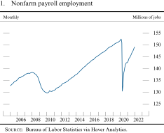
Payroll employment increased by 3.5 million jobs in the second half of 2021, bringing the gains for the year to a robust 6.7 million. And despite the headwind caused by the Omicron wave, employment growth in January remained robust at 467,000 (figure 1). Payroll gains over the past year have been widespread across industries, with a particularly large increase in the leisure and hospitality sector as people continued their return to many activities that had been curtailed by the pandemic.
1. Nonfarm payroll employment
Source: Bureau of Labor Statistics via Haver Analytics.
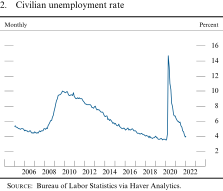
Meanwhile, the unemployment rate continued to move down rapidly, declining from 6.7 percent at the end of 2020 to 4.0 percent this January (figure 2). Notably, the nearly 2 percentage point decline in the unemployment rate since June of last year was the fastest half-year decline since the 1950s, apart from the unprecedented rebound when the economy first reopened in 2020. Moreover, this decline was broad based across racial and ethnic groups and was particularly large for Hispanics and African Americans (figure 3). While these recent declines brought the gaps between Hispanic and African American unemployment rates and those of whites and Asians to near historic lows, the gaps nevertheless remain and largely reflect long-standing structural issues.
2. Civilian unemployment rate
Source: Bureau of Labor Statistics via Haver Analytics.
3. Unemployment rate, by race and ethnicity
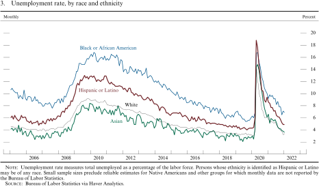
Unemployment rate measures total unemployed as a percentage of the labor force. Persons whose ethnicity is identified as Hispanic or Latino may be of any race. Small sample sizes preclude reliable estimates for Native Americans and other groups for which monthly data are not reported by the Bureau of Labor Statistics.
Source: Bureau of Labor Statistics via Haver Analytics.
Labor demand is very strong, but labor supply remains constrained...
Last year's job gains were driven by an appreciable and steady rise in labor demand as the economy reopened and activity bounced back. By the end of the year, the number of unfilled job openings was about 60 percent above pre-pandemic levels and at an all-time high. However, labor supply struggled to keep up. In particular, the labor force participation rate—which measures the share of people either working or actively seeking work—moved up only a little over the past year and remains below its February 2020 level (figure 4).3 Several pandemic-related factors appear to be holding back labor supply, including a pandemic-induced surge in retirements, increased caregiving responsibilities, and fears of contracting COVID-19. (See the box "The Limited Recovery of Labor Supply.") As a result, the recovery in employment—though rapid—has been incomplete, with payrolls nearly 3 million below their pre-pandemic level as of January.
4. Labor force participation rate and employment-to-population ratio
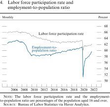
The labor force participation rate and the employment-to-population ratio are percentages of the population aged 16 and over.
Source: Bureau of Labor Statistics via Haver Analytics.
The Limited Recovery of Labor Supply
Although labor demand has bounced back strongly over the past year, labor supply has been much slower to rebound, resulting in an extremely tight labor market. In particular, the labor force participation rate (LFPR)—the share of working-age adults either employed or actively seeking work—fell early in the pandemic and changed little last year despite plentiful job openings and rapidly rising wages (figure A).1
A. Change in labor force participation in the United States
Monthly
The behavior of the LFPR reflects a combination of factors that have limited the recovery of labor supply following the pandemic. The most important of these factors are listed in turn.
Retirements: The retired share of the population is now substantially higher than before the pandemic, accounting for more than two-thirds of the net decline in the LFPR. About half (0.6 percentage point) of this increase was to be expected even in the absence of the pandemic, as additional members of the large baby-boom generation have reached retirement age in the past two years.2 The other half of the increase comes from excess retirements, above and beyond what would have been expected in the absence of the pandemic, due to individuals "pulling forward" their planned future retirements by a couple of years.3 The effect of this factor is likely to dwindle as the date when these individuals had previously planned to retire is reached, provided that younger cohorts continue to retire at expected rates.
Caregiving: Many individuals who have left the labor force have taken on caregiving responsibilities during the pandemic, accounting for an additional 0.4 percentage point of the LFPR shortfall as of December 2021.4 Caregiving responsibilities among parents of school-aged children exerted a large drag on labor supply in 2020, when schools were largely closed. This drag on labor supply eased over the course of 2021 as schools reopened, although the ongoing pandemic may leave parents unsure whether in-person schooling could be disrupted again. Other caregiving responsibilities (for example, elder care) remain a drag on labor supply, accounting for nearly all of the negative contribution of this category to the LFPR.
Additional factors: Labor supply has also been held back by other short-term factors related to the pandemic, including fear of contracting the virus and—especially during the Omicron wave—high numbers of quarantining workers.5 As of early January 2022, nearly 3 percent of out-of-work adults reported fear of contracting or spreading the virus as their main reason for being out of work; the rate is even higher among individuals with no college education, who are more likely to work in contact-intensive sectors when employed.6 This factor may exacerbate other labor supply factors, as retirees or caregivers may be especially fearful of contracting or spreading the virus. Additionally, many households, especially those with lower incomes, built up larger-than-normal savings during the pandemic, which may have enabled workers to retire, spend time on caregiving, or remain out of the labor force until virus conditions subside. Finally, reduced immigration likely has held back total labor supply, even though the effect on the LFPR is likely to be much smaller.7
...resulting in an extremely tight labor market...
A wide range of indicators have been pointing to a very tight labor market, reflecting robust demand for workers and constrained supply. There were two job openings per unemployed person at year-end, the highest level on record (figure 5). Both households' and small businesses' perceptions of labor market tightness were near or above the highest levels observed in the history of these series. The share of workers quitting jobs each month, an indicator of the availability of attractive job prospects, climbed from 2.4 percent to 2.9 percent last year, reaching an all-time high. Moreover, employers continued to report widespread hiring difficulties.
5. Ratio of job openings to job seekers and quits rate
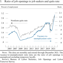
The data are monthly and extend through December 2021. The vacancy-to-unemployment ratio data are the ratio of job openings to unemployed excluding temporary layoffs.
Source: Bureau of Labor Statistics, Job Openings and Labor Turnover Survey.
...and a broad-based acceleration in wages
Measures of hourly labor compensation growth have risen sharply over the past year in nominal terms, reflecting the influences of strong labor demand and pandemic-related reductions in labor supply. Total hourly compensation as measured by the employment cost index, which includes both wages and benefits, rose at an annual rate of 5.2 percent in the second half of 2021, lifting the 12-month change to 4.4 percent, well above pre-pandemic rates (figure 6). Wage growth as computed by the Federal Reserve Bank of Atlanta, which tracks the median 12-month wage growth of individuals responding to the Current Population Survey, has also been rising smartly, as have average hourly earnings and compensation per hour in the business sector.4 Indeed, nominal wages are increasing at the fastest pace in at least 20 years. This wage growth has been widespread across most sectors and particularly large in the leisure and hospitality sector and for lower-wage workers. (See the box "Differences in Wage and Employment Growth across Jobs and Workers.") Even so, in the aggregate, these wage gains did not keep pace with the rise in prices last year.
6. Measures of change in hourly compensation
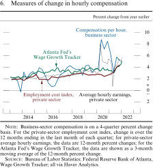
Business-sector compensation is on a 4-quarter percent change basis. For the private-sector employment cost index, change is over the 12 months ending in the last month of each quarter; for private-sector average hourly earnings, the data are 12-month percent changes; for the Atlanta Fed's Wage Growth Tracker, the data are shown as a 3-month moving average of the 12-month percent change.
Source: Bureau of Labor Statistics; Federal Reserve Bank of Atlanta, Wage Growth Tracker; all via Haver Analytics.
Differences in Wage and Employment Growth across Jobs and Workers
Wages have increased strongly during the past year, especially for workers in lower-paying jobs and industries. For example, figure A shows that compensation growth for leisure and hospitality jobs as measured by the employment cost index was stronger than for goods-producing and service-producing industries overall in the second half of 2021. The leisure and hospitality industry was substantially affected by social distancing earlier in the pandemic, leading to outsized employment losses relative to other industries and a much weaker recovery. However, job openings for this industry are very high, which, in combination with strong wage growth, indicates that the comparatively weak employment rebound in leisure and hospitality now largely reflects a lack of available workers.
A. Hourly compensation, by industry
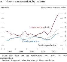
The data are the employment cost index for total compensation.
Source: Bureau of Labor Statistics via Haver Analytics.
The industry-specific effects of the pandemic are also apparent in the patterns of employment and wages for lower-paying jobs relative to higher-paying jobs. As shown in figure B, job losses initially aligned closely with workers' level of earnings, with the lowest-wage jobs (which are disproportionately found in service-producing industries) experiencing the greatest employment declines. As the economy has reopened, lower-wage employment has rebounded more. Consistent with the rebound in labor demand for these jobs coupled with hiring difficulties, figure C shows that wage growth has been especially strong for lower-wage jobs.
B. Employment, by wage quartile
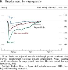
Series are adjusted to make total employment consistent with Current Employment Statistics private employment. Wage quartile cutoffs are adjusted for wage growth over time. The data extend through January 15, 2022.
Source: Federal Reserve Board staff calculations using ADP, Inc., Payroll Processing microdata.
C. Median wage growth, by quartile
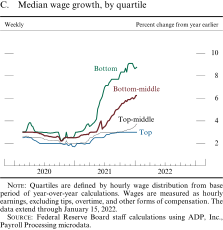
Quartiles are defined by hourly wage distribution from base period of year-over-year calculations. Wages are measured as hourly earnings, excluding tips, overtime, and other forms of compensation. The data extend through January 15, 2022.
Source: Federal Reserve Board staff calculations using ADP, Inc., Payroll Processing microdata.
Finally, figure D illustrates how wages have evolved across racial and ethnic groups over the course of the pandemic. In 2019, median hourly wages were around $1 higher for Asian and white workers relative to Black and Hispanic workers. From 2019 to 2021, median wages increased between $1.10 and $1.90 for all groups, leaving the disparities in wage levels across these groups little changed relative to 2019.1
D. Median hourly earnings, by race and ethnicity, wage and salary workers
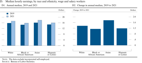
The data exclude incorporated self-employed.
Source: Bureau of Labor Statistics.
Labor productivity also appears to have accelerated
The extent to which sizable wage gains raise firms' costs and act as a source of inflation pressure depends importantly on the pace of productivity growth. In that regard, the behavior of labor productivity since the start of the pandemic has been encouraging. Over the 2020–21 period, productivity growth in the business sector averaged 2.3 percent per year—about 1 percentage point faster than its average pace since the mid-2000s (figure 7). Some of this acceleration in productivity might be the result of transitory factors. For example, worker effort, which surged in response to employment shortages and hiring difficulties, appears to be elevated, possibly above sustainable levels.5 But other pandemic-related developments could have a more persistent effect on productivity growth. For example, the pandemic has resulted in a high rate of new business formation, the widespread adoption of remote work technology, and a wave of labor-saving investments. Nevertheless, it is too early to tell what the ultimate effect of the pandemic will be on productivity growth in coming years.
7. Change in business-sector output per hour
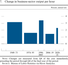
Changes are measured from Q4 of the year immediately preceding the period through Q4 of the final year of the period.
Source: Bureau of Labor Statistics via Haver Analytics.
Inflation increased significantly last year...
Consumer prices posted further sizable increases in the second half of 2021. Monthly increases in personal consumption expenditures (PCE) prices averaged about the same in the second half as in the first half, bringing the 12-month change in December to 5.8 percent—far above the Federal Open Market Committee's (FOMC) longer-run objective of 2 percent (figure 8). The core PCE price index, which excludes the more volatile food and energy prices categories, rose 4.9 percent last year as supply chain bottlenecks, hiring difficulties, and other capacity constraints amid strong demand exerted pervasive upward pressure on prices. Notably, these were the largest price increases since the early 1980s. In January, a further sizable rise in the consumer price index (CPI) indicated that price pressures had not yet begun to abate.
8. Change in the price index for personal consumption expenditures
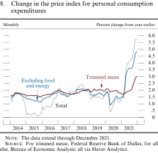
The data extend through December 2021.
Source: For trimmed mean, Federal Reserve Bank of Dallas; for all else, Bureau of Economic Analysis; all via Haver Analytics.
...and became more broad based in the second half...
Whereas the sizable price increases seen last spring were concentrated in a few key items, inflationary pressures broadened over the second half of 2021. As an illustration, the Federal Reserve Bank of Dallas trimmed mean index, which removes the PCE categories with the largest price increases and decreases each month, rose only modestly in the first half of last year but picked up in the second half and increased 3.1 percent for the year as a whole—its highest reading since 1991.
The broadening of price inflation is further evident when examining the price indexes for major PCE categories (figure 9). In the first half of 2021, rising inflation was driven by sharp increases in prices for certain goods such as motor vehicles, which experienced strong demand coupled with severe supply chain bottlenecks; a recovery in demand for nonhousing services, where many prices rebounded after having softened earlier in the pandemic; and rapid increases in energy prices. In the second half, prices of those items continued to move higher, and prices began to rise more rapidly for food and beverages (as increases in the costs of food commodities, labor, and transportation were passed on to consumers) as well as for housing services (as rents began to reflect the large increase in housing demand). (See the box "How Widespread Has the Rise in Inflation Been?")
9. Personal consumption expenditures price indexes
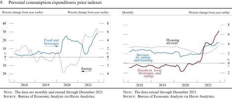
The data extend through December 2021.
Source: Bureau of Economic Analysis via Haver Analytics.
How Widespread Has the Rise in Inflation Been?
Consumer price inflation increased markedly in 2021, with the price index for personal consumption expenditures (PCE) rising 5.8 percent over the 12 months through December, following a subdued increase of 1.3 percent in 2020. In the first half of last year, the increase in inflation was driven by a fairly small number of categories. In contrast, over the second half of the year, relatively high price increases became more widespread, suggesting that broader-based inflationary pressures had taken hold. This discussion reviews how inflation evolved across a comprehensive set of product categories last year to help shed light on the forces generating higher inflation.
Although price increases driven by bottlenecks and production constraints have been more concentrated in a relatively small set of product categories that have been particularly affected by these supply–demand imbalances, labor shortages, rising wages, and other broad-based cost pressures likely contributed to a pickup in inflation across a wide range of goods and services.
Figure A divides PCE into 146 product categories and presents the share of those categories for which prices were increasing by over 3 percent.1 This share was stable at around 35 percent between 2016 and 2019—close to the average share observed since the mid-1990s—and continued to be stable in 2020. However, the share of products with more than 3 percent inflation increased last year to above 60 percent. And, as is evident from the black line, the share of categories with price increases of more than 3 percent (annual rate) over a three-month window increased gradually over the course of the year. As shown by the left panel, the share of product categories with inflation above 3 percent temporarily reached a similar level on two other occasions since the 1990s (in 2001 and 2007), but this share is still notably lower than that in the high-inflation regime of the 1970s.
A. Share of personal consumption expenditures product categories with inflation over 3 percent
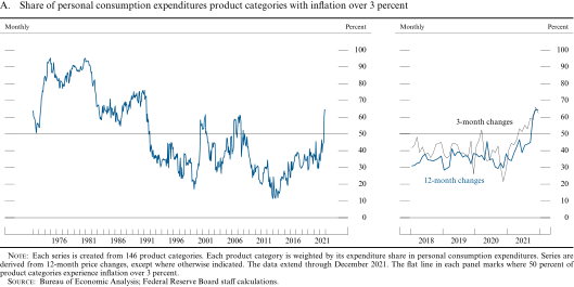
Each series is created from 146 product categories. Each product category is weighted by its expenditure share in personal consumption expenditures. Series are derived from 12-month price changes, except where otherwise indicated. The data extend through December 2021. The flat line in each panel marks where 50 percent of product categories experience inflation over 3 percent.
Source: Bureau of Economic Analysis; Federal Reserve Board staff calculations.
As seen in figure B, which reports the shares of product categories with 12-month price changes above 3 percent separately for goods and services, the increase in the breadth of large price increases was especially unusual for goods. Yet the share of higher inflation in services has also been moving up in the past few months, likely in part because of mounting inflation pressures from the labor market.
B. Share of personal consumption expenditures goods and services categories with inflation over 3 percent
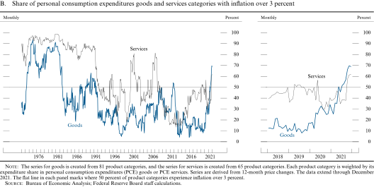
The series for goods is created from 81 product categories, and the series for services is created from 65 product categories. Each product category is weighted by its expenditure share in personal consumption expenditures (PCE) goods or PCE services. Series are derived from 12-month price changes. The data extend through December 2021. The flat line in each panel marks where 50 percent of product categories experience inflation over 3 percent.
Source: Bureau of Economic Analysis; Federal Reserve Board staff calculations.
While robust price increases became more prevalent across product categories in the past year, the size of price increases still varied significantly across product categories. To better understand the drivers of the high aggregate inflation last year, figure C presents the full distribution of price changes for different products and further emphasizes the different roles being played by prices of goods versus services in explaining changes in this distribution compared with the 2016–19 period.
C. Distribution of inflation across personal consumption expenditures product categories
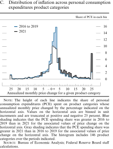
The height of each line indicates the share of personal consumption expenditures (PCE) spent on product categories whose annualized monthly price changed by the percentage indicated on the horizontal axis. Values on the horizontal axis are binned in unit increments and are truncated at positive and negative 25 percent. Blue shading indicates that the PCE spending share was greater in 2016 to 2019 than in 2021 for the associated values of price change on the horizontal axis. Gray shading indicates that the PCE spending share was greater in 2021 than in 2016 to 2019 for the associated values of price change on the horizontal axis. The histogram includes 146 product categories over the periods indicated.
Source: Bureau of Economic Analysis; Federal Reserve Board staff calculations.
In figure C, the blue line depicts the distribution of annualized monthly price changes observed from 2016 to 2019, while the black line depicts the distribution in 2021.2 In both periods, this distribution is very wide, reflecting the sizable heterogeneity in price behavior across items. The higher and broader inflation during 2021 is reflected in the chart as a rightward shift in the distribution of price changes relative to the 2016–19 period.3 Four aspects of the change in the distribution are worth noting:
(1) fewer items with price decreases, which are depicted in the blue shaded areas below zero on the horizontal axis
(2) a notable decline in the occurrence of price increases of between 1 and 4 percent, shown by the blue shaded area in the middle of the distribution
(3) more items with inflation between 5 and 12 percent as well as slightly more with inflation between 13 and 24 percent, shown in the gray shaded area in those ranges on the horizontal axis
(4) a striking 6 percentage point increase at the very top of the distribution, indicated by the large (gray shaded) spike in the share of items with price increases of at least 25 percent
These features of the distribution of price changes can be better understood by considering the contributions of goods and services to the changes. First, the left panel of figure D shows the contribution of goods to the total price change distribution between 2016 and 2019 (the blue line) and 2021 (the black line). Goods account for about 4 percentage points of the 6 percentage point increase in the spike at the top of the price change distribution in figure C as well as nearly all of the rightward shift in the price change distribution in excess of 12 percent inflation. Moreover, the increased occurrence of high inflation for goods is a stark departure from small positive or slightly negative price changes between 2016 and 2019 (seen in the blue shading). These observations are consistent with the very large price increases in goods categories such as motor vehicles and other categories disrupted by supply constraints against the backdrop of strong demand as consumption shifted away from services during the pandemic.
D. Distribution of inflation across personal consumption expenditures product categories
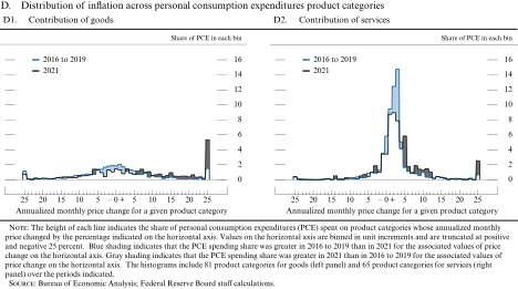
The height of each line indicates the share of personal consumption expenditures (PCE) spent on product categories whose annualized monthly price changed by the percentage indicated on the horizontal axis. Values on the horizontal axis are binned in unit increments and are truncated at positive and negative 25 percent. Blue shading indicates that the PCE spending share was greater in 2016 to 2019 than in 2021 for the associated values of price change on the horizontal axis. Gray shading indicates that the PCE spending share was greater in 2021 than in 2016 to 2019 for the associated values of price change on the horizontal axis. The histograms include 81 product categories for goods (left panel) and 65 product categories for services (right panel) over the periods indicated.
Source: Bureau of Economic Analysis; Federal Reserve Board staff calculations.
Second, the right panel of figure D shows the contribution of services to the total price change distribution. Services account for the vast majority of the shift from the middle of the distribution of price changes (the blue shaded area) to inflation between 5 and 12 percent (the gray shaded area), while they account for less than one-third of the increase in the spike at the top of the distribution.
In summary, the share of products experiencing notable price increases moved appreciably higher in 2021, with the broadening due to both goods and services prices. That said, most of last year's very high inflation readings were concentrated in goods—a reflection of strong demand in the face of supply bottlenecks that have particularly affected these items. Finally, although currently more widespread than in recent history, large price increases were considerably less widespread than was seen during the high-inflation regime of the 1970s. In the period ahead, the large price changes in goods may ease once supply chain disruptions finally resolve, but, if labor shortages continue and wages rise faster than productivity in a broad-based way, inflation pressures may persist and continue to broaden out.
...with further upward pressure on inflation from rising commodity and import prices
Oil prices continued climbing over the second half of last year and into this year, reaching their highest level in over seven years (figure 10). Demand for oil rose as the global economy recovered further, and oil supply was constrained by U.S. oil production disruptions due to Hurricane Ida and by only modest production increases by OPEC (Organization of the Petroleum Exporting Countries) and its partners. Geopolitical tensions with Russia have also contributed to higher energy prices, including oil and natural gas.
10. Spot prices for commodities
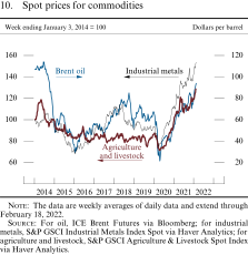
The data are weekly averages of daily data and extend through February 18, 2022.
Source: For oil, ICE Brent Futures via Bloomberg; for industrial metals, S&P GSCI Industrial Metals Index Spot via Haver Analytics; for agriculture and livestock, S&P GSCI Agriculture & Livestock Spot Index via Haver Analytics.
Series: Brent oil spot prices and industrial metals and agriculture and livestock price indexes Horizon: January 3, 2014, to February 18, 2022 Description: A line chart with three curves over January 3, 2014, to February 18, 2022. Units for the Brent spot price data are dollars per barrel, and units for the industrial metals and agriculture and livestock data have been indexed to 100 based on the respective values of the series the week ending January 3, 2014. The data are weekly averages of daily data. The Brent spot price series starts at about 110, falls steadily to about 30 by early 2016, and then rises again to about 85 by late 2018. The series fluctuates between approximately 55 and 70 before falling sharply to about 20 by mid-2020. The series then rises consistently throughout 2021 and the beginning of 2022, ending at about 95. The industrial metals series begins at 100, falls to about 70 by the start of 2016, and then steadily rises to approximately 110 by the beginning of 2018. The series falls to about 75 by early 2020 and then rises steadily through the rest of 2020, 2021, and early 2022, ending at about 155. The agriculture and livestock series starts at 100, spikes rapidly to about 120 by mid-2014, and then fluctuates between roughly 75 and 100 until the beginning of 2020. From there, the series rises consistently through the rest of 2020 and the first half of 2021. It falls from about 120 to about 105 in mid-2021 before rising again through the end of 2021 and the beginning of 2022, ending just below 130 in mid-February.
Nonfuel commodity prices have risen with the global economic recovery since the first half of last year, reflecting considerable increases in the prices of both industrial metals and agricultural commodities. Although still below their peak last year, lumber prices have increased sharply again in recent months because of elevated demand from residential construction and supply disruptions.
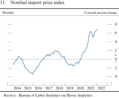
Import prices and the cost of transporting imported goods—a cost not included in measured import prices—are rising, and bottlenecks in supply chains have exacerbated the rise (see the box "Supply Chain Bottlenecks in U.S. Manufacturing and Trade"). Import price inflation has also remained elevated largely because of continued increases in commodity prices, bringing the 12-month change through January 2022 to 6.9 percent (figure 11).
11. Nonfuel import price index
Source: Bureau of Labor Statistics via Haver Analytics.
Supply Chain Bottlenecks in U.S. Manufacturing and Trade
Over the past year, global transportation and distribution networks have been overwhelmed, and manufacturers have struggled to find the materials and labor needed to meet demand for their products. Demand for goods has been notably boosted, as ongoing concerns about COVID-19 have led consumers and businesses to shift spending away from services, such as travel, in favor of goods, such as those related to increased time at home. While some distribution and production bottlenecks showed signs of improvement toward the end of last year, other bottlenecks are expected to remain for some time.
The surge in demand for imports has strained shipping networks worldwide, and U.S. ports have been particularly congested. About one-third of all U.S. goods imports (by value) arrive via seaborne containers, and, consistent with the strength in imports of consumer and capital goods in 2021, the number of containers processed at domestic ports last year was significantly higher than in any previous year (figure A). The combined ports of Los Angeles and Long Beach have faced substantial congestion, with the number of ships waiting for a berth recently reaching an all-time high.1 Elevated levels of port congestion in the United States and abroad have caused on-time arrivals of global shipping vessels to plunge and have resulted in dramatic increases in charter rates for container ships (figure B). Moreover, once goods arrive in port, major bottlenecks in U.S. trucking and rail transportation have further delayed their movement. Trucking cargo rates have risen sharply since mid-2020, and some measures are now more than 15 percent above the levels prevailing in 2019.
A. U.S. imports
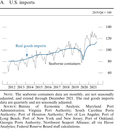
The seaborne containers data are monthly, are not seasonally adjusted, and extend through December 2021. The real goods imports data are quarterly and are seasonally adjusted.
Source: Bureau of Economic Analysis; Maryland Port Administration; Virginia Port Authority; South Carolina Ports Authority; Port of Houston Authority; Port of Los Angeles; Port of Long Beach; Port of New York and New Jersey; Port of Oakland; Georgia Ports Authority; Northwest Seaport Alliance; all via Haver Analytics; Federal Reserve Board staff calculations.
B. Developments in shipping
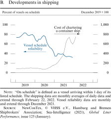
"On schedule" is defined as a vessel arriving within 1 day of its listed schedule. The shipping data are monthly averages of daily data and extend through February 21, 2022. Vessel reliability data are monthly and extend through December 2021.
Source: NewConTex, © VHSS e.V., Hamburg and Bremen Shipbrokers' Association; Sea-Intelligence (2021), Global Liner Performance, issue 125 (January).
Series: Cost of chartering a container ship and vessel schedule reliability Horizon: January 2019 to February 2022 Description: A line chart with two curves over January 2019 to February 2022. Units for the vessel reliability data are percent of vessels on schedule, and units for the shipping cost data have been indexed to 100 based on the series value in December 2019. The shipping cost data are monthly averages of daily data and extend through February 22, 2022. The vessel reliability data are monthly and extend through December 2021. The shipping cost series starts at about 90 and fluctuates between 88 and 102 throughout 2019. The series then tapers to about 70 by mid-2020 before climbing steadily to nearly 750 by late 2021. The series then retreats to about 600 at the end of 2021 before returning to about 750 by the end of the series in February 2022. The vessel reliability series starts at about 75 and ascends to nearly 85 by mid-2019. The series then fluctuates between 75 and 85 through the end of 2019 before decreasing to around 65 in early 2020. The series then rebounds to nearly 80 in mid-2020 before dropping steadily through the rest of the year to about 35 in early 2021. The series then fluctuates around 40 through mid-2021, after which it declines to just above 30 by the end of the series in December 2021.
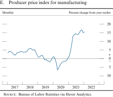
Distribution problems have also weighed heavily on domestic production. In 2021, a record number of manufacturers reported that an insufficient supply of materials was one reason they were unable to produce at full capacity (figure C). Together with increasingly strong demand for goods, these limitations on production led to backlogs of orders and to supplier delivery times well above historical norms (figure D). With supply unable to satisfy demand, prices for a wide range of goods increased last year, sometimes sharply. Indeed, the producer price index for overall manufacturing was more than 15 percent higher in the fourth quarter of 2021 than its year-earlier level (figure E).
C. Reasons for operating below capacity
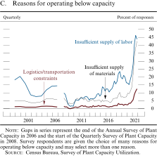
Gaps in series represent the end of the Annual Survey of Plant Capacity in 2006 and the start of the Quarterly Survey of Plant Capacity in 2008. Survey respondents are given the choice of many reasons for operating below capacity and may select more than one reason.
Source: Census Bureau, Survey of Plant Capacity Utilization.
D. Suppliers' delivery times and order backlogs
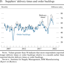
Values greater than 50 indicate that more respondents reported longer delivery times or order backlogs relative to a month earlier than reported shorter delivery times or order backlogs.
Source: Institute for Supply Management, ISM Manufacturing Report on Business.
E. Producer price index for manufacturing
Source: Bureau of Labor Statistics via Haver Analytics.
Domestic production has been further hampered by manufacturers' inability to hire and retain skilled labor. Despite adding about 350,000 workers in 2021, by the end of the year manufacturing employment was still about 250,000 below where it was just before the pandemic. Although manufacturers have long noted difficulties in finding workers, labor market conditions were particularly tight in 2021. At the end of the year, factory workers were quitting their jobs at near-record rates, and manufacturing plants had listed approximately 850,000 job openings—about twice as many openings as in the 2017–19 period.
The motor vehicle sector has faced a particularly acute and well-publicized shortage of semiconductor chips, reflecting a combination of factors. On the demand side, consumers' appetite for cars and trucks has remained remarkably strong, and the chip content per vehicle has increased.2 Meanwhile, the supply of semiconductors was disrupted by COVID-induced shutdowns in foreign countries—such as Malaysia and Vietnam—that are major players in the semiconductor supply chain. Even when enough of certain types of chips have been available, an undersupply of complementary chips has, at times, created problems for manufacturers. These chip shortages have led to widespread shutdowns and production slowdowns at U.S. motor vehicle assembly plants. Without an ample supply of new vehicles, many dealerships sold off remaining inventories and raised prices. The lean inventories and high prices weighed heavily on vehicle sales for much of 2021. Recently, however, semiconductor shortages have begun to ease somewhat, as indicated by an increase in U.S. vehicle production (figure F). Nevertheless, these shortages have persisted, and statements by some auto industry executives suggest that they expect production bottlenecks to continue well into this year.
F. Light motor vehicle production
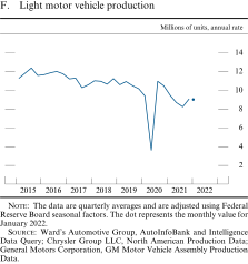
The data are quarterly averages and are adjusted using Federal Reserve Board seasonal factors. The dot represents the monthly value for January 2022 which is 9.03.
Source: Ward's Automotive Group, AutoInfoBank and Intelligence Data Query; Chrysler Group LLC, North American Production Data; General Motors Corporation, GM Motor Vehicle Assembly Production Data.
Series: Light motor vehicle production Horizon: January 2015 to January 2022 Description: A line chart with one curve over January 2015 to December 2021. The final monthly value for January 2022 is depicted as a dot. Units are millions of units at an annual rate, and the data are quarterly averages of monthly values. The series starts a touch above 11 in 2015:Q1. It fluctuates between 10 and 13, trending slightly downward, until 2020:Q1, when the series drops to about 9.5. The series declines further to about 3.5 in 2020:Q2 before rising again to nearly 11 in 2020:Q3 and falling to a bit more than 8 in 2021:Q2. From there, it increases to about 9 in 2021:Q4. The dot representing the monthly value for January 2022 remains at about 9.
Outside the auto sector, supply chain bottlenecks show some signs of improvement. Capacity expansion at some ports in late 2021 and waning seasonal demand likely contributed to recent declines in the cost of shipping. Additionally, inland rail hubs have decongested somewhat, facilitating the flow of containers inland. Also, late last year, domestic manufacturers saw slower increases in the price of inputs, improving delivery times, and fewer items in short supply than they had earlier. A few commodities have experienced a notable increase in availability. One example is steel, for which delivery times and prices have fallen sharply after having been elevated for much of last year.
Measures of near-term inflation expectations rose notably, but longer-term expectations moved up less
Inflation expectations likely influence actual inflation by affecting wage- and price-setting decisions. In the University of Michigan Surveys of Consumers, households' expectations for inflation over the next 12 months continued to climb, reaching levels that are among the highest observed since the early 1980s (figure 12). In contrast, expectations for average inflation over the next 5 to 10 years from the same survey flattened out in the second half of 2021 after having moved up modestly in the first half, and they now stand near levels observed about a decade ago. Meanwhile, 10-year PCE inflation expectations in the Survey of Professional Forecasters edged up, on net, since mid-2021 and stood at 2.2 percent in the first quarter of this year. That increase was driven by higher expectations for the next five years, with expectations for inflation remaining at 2 percent over years 6 through 10.
12. Measures of inflation expectations
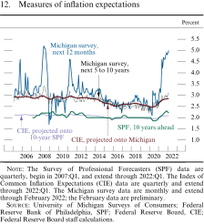
The Survey of Professional Forecasters (SPF) data are quarterly, begin in 2007:Q1, and extend through 2022:Q1. The Index of Common Inflation Expectations (CIE) data are quarterly and extend through 2022:Q1. The Michigan survey data are monthly and extend through February 2022; the February data are preliminary.
Source: University of Michigan Surveys of Consumers; Federal Reserve Bank of Philadelphia, SPF; Federal Reserve Board, CIE; Federal Reserve Board staff calculations.
Market-based measures of inflation compensation, which are based on financial instruments linked to inflation, are sending a similar message. A measure of CPI inflation compensation over the next five years implied by Treasury Inflation-Protected Securities (TIPS) continued to rise, on net, through the second half of 2021, reaching its highest level over the past decade.6 In contrast, the TIPS-based measure of CPI inflation compensation 5 to 10 years ahead rose over the first half of 2021 but has settled around 2-1/4 to 2-1/2 percent since then (figure 13). While elevated relative to pre-pandemic levels, this measure is well within the range of values observed in the first half of the previous decade and, because CPI inflation tends to run around 1/4 percentage point above PCE price inflation, it suggests inflation compensation close to 2 percent on a PCE basis.
13. Inflation compensation implied by Treasury Inflation-Protected Securities
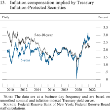
The data are at a business-day frequency and are based on smoothed nominal and inflation-indexed Treasury yield curves.
Source: Federal Reserve Bank of New York; Federal Reserve Board staff calculations.
Series: 5-to-10-year and 5-year Horizon: January 4, 2010, to February 22, 2022 Description: A line chart with two curves over January 4, 2010, to February 22, 2022. Units are percent, and the data are daily. The 5-to-10-year series begins around 3.25 in January 2010, decreases to about 2.25 by mid-August 2010, and then increases back to about 3.25 by December 2010. The series fluctuates between approximately 2.75 and 3.25 throughout most of 2011 before dropping to about 2.25 in September 2011, reaching nearly 3 in March 2012 and dropping to about 2.5 in June 2012. The series then increases to about 3 by January 2013 before it drops slightly below 1.5 in June 2016. The series increases to about 2 in January 2018, drops to about 1.5 by the end of February 2020, and then falls below 1 in March 2020 before climbing to about 2.5 by May 2021 and edging down to about 2.25 in September 2021. The series then fluctuates between approximately 2 and 2.5 throughout the end of 2021 before ending at around 2.25 in February 2022. The 5-year series follows a similar path to the 5-to-10-year series from 2010 to 2016, except that it starts at about 2, more than 1 percent lower than the 5-to-10-year series. The two series follow a similar path until 2016, and from 2016 through February 2020, they are nearly identical. The 5-year series then falls to almost 0 by mid-March 2020 and ramps up to more than 3 in November 2021, surpassing the 5-to-10-year series in January 2021. The series then drops slightly to about 2.75 in December 2021 and remains around there through February 2022.
The common inflation expectations (CIE) index constructed by Federal Reserve Board staff combines a wide variety of inflation expectations measures—including the measures cited earlier—into a single indicator that is rescaled to match the level and volatility of existing inflation expectation indicators.7 The measures used in the CIE differ along several key dimensions—the type of economic agent, data source (survey- or market-based measure), time horizon, and inflation measure. Both CIE indexes shown in figure 12 look most similar to the measures of longer-term expectations: They trended up in the first half of last year, reversing the downward drift observed in the years before the pandemic, but then flattened out at a level similar to those observed roughly a decade ago.
Gross domestic product growth stepped down modestly in the second half of last year...
The level of real gross domestic product (GDP) recovered further in the second half of 2021, but growth was somewhat slower, on average, than in the first half (figure 14). GDP growth is reported to have slowed notably to 2.3 percent at an annual rate in the third quarter but rebounded to a brisk 7 percent in the fourth quarter. Despite the solid average growth in the second half, several factors—including last summer's Delta wave and waning fiscal stimulus—likely weighed on demand growth. Moreover, supply chain bottlenecks, hiring difficulties, and other capacity constraints continued to significantly restrain economic activity. While there have been some recent signs of these constraints easing, the time frame for further improvement is highly uncertain. All told, at the end of 2021 GDP stood 3 percent above its level in the fourth quarter of 2019, before the pandemic began, but 1.5 percent below its level if growth had continued at its average pace over the five years before the pandemic.
14. Real gross domestic product
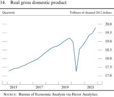
Source: Bureau of Economic Analysis via Haver Analytics.
...while the rapid spread of the Omicron variant appears to have slowed the pace of economic activity early this year
Fueled by the highly transmissible Omicron variant, new cases of COVID-19 began rising sharply in mid-December, peaked in mid-January with daily cases about three times as high as last winter's surge, and have fallen quickly since then. Although Omicron appears to cause less severe symptoms than previous variants, several indicators suggest it has damped the pace of economic activity early this year. High-frequency indicators reveal that flight cancellations, school closures, and temporary closings of small businesses jumped as the new year began, while demand for COVID-sensitive services like air travel, lodging, and restaurant meals flagged. Nevertheless, with cases rapidly declining and spending indicators having rebounded, Omicron seems likely to cause the continued reopening of the economy to slow only briefly.
Real consumer spending growth eased...
Consumer spending on goods edged lower, on balance, over the second half of 2021 as the boost from fiscal stimulus waned and low inventories held back purchases of some goods, particularly motor vehicles. Even so, goods spending remains quite elevated relative to its pre-pandemic trend (figure 15). The further reopening of the economy boosted spending on services in the second half, albeit at a less rapid pace than last spring, as the Delta wave weighed on demand for in-person services in the summer and the Omicron wave began to do so late in the year. Despite the continued recovery in services spending, this spending remains well below its pre-pandemic trend. In all, the data over the second half of 2021 indicate only a moderate amount of rebalancing of consumer demand toward services and away from goods.
15. Real personal consumption expenditures
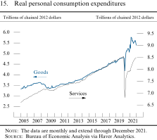
The data are monthly and extend through December 2021.
Source: Bureau of Economic Analysis via Haver Analytics.
...as higher prices damped otherwise healthy income and wealth positions...
Real consumer spending has been supported by further gains in household income and wealth, but that support was curbed by the marked rise in prices over the past year, especially for households that have not benefited from higher asset prices. Household disposable income in nominal terms has proven resilient due to the improving labor market, even as fiscal stimulus has waned, but after factoring in the higher prices, real disposable incomes edged lower over the year. Nevertheless, also supporting consumption, in the aggregate, are the substantial savings households have accumulated from curtailed services spending and historic levels of household-focused fiscal stimulus distributed earlier in the pandemic, as evidenced by a personal saving rate that, while no longer elevated, has not fallen below its pre-pandemic trend (figure 16). Furthermore, as a result of the large gains in home and equity prices since mid-2020, the wealth position of households that own these assets remains very solid (figure 17).
16. Personal saving rate
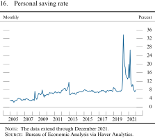
The data extend through December 2021.
Source: Bureau of Economic Analysis via Haver Analytics.
17. Wealth-to-income ratio
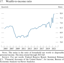
The series is the ratio of household net worth to disposable personal income. The data extend through 2021:Q3.
Source: For net worth, Federal Reserve Board, Statistical Release Z.1, "Financial Accounts of the United States"; for income, Bureau of Economic Analysis via Haver Analytics.
...and contributed to declining consumer sentiment
Amid the continued acceleration in prices in the second half of last year and despite solid household balance sheets, a closely watched index of consumer sentiment plunged (figure 18). Since the middle of 2021, the University of Michigan index fell below the levels seen at the onset of the pandemic, as survey respondents' concerns over inflation weighed heavily on their outlooks. The Conference Board index, an alternative measure of consumer sentiment, also deteriorated but, in contrast to the Michigan index, remains well above its earlier pandemic lows.
18. Indexes of consumer sentiment
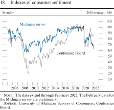
The data extend through February 2022. The February data for the Michigan survey are preliminary.
Source: University of Michigan Surveys of Consumers; Conference Board.
Meanwhile, consumer credit conditions continued to normalize
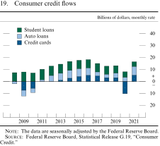
Financing has been generally available to support these gains in consumer spending. Standards for consumer loans, which banks reported eased in 2021 relative to 2020, are now generally in line with the standards that persisted before the pandemic; as a result, financing conditions are now largely accommodative for borrowers with high credit scores, though lending standards and terms remain somewhat tighter than pre-pandemic levels for borrowers with low credit scores. After initial declines at the onset of the pandemic, the growth rate of consumer credit recovered strongly in 2021, driven by the continued expansion of auto loans and an appreciable rebound in credit card balances (figure 19). Delinquency rates for nonprime auto and credit card borrowers remained well below pre-pandemic levels, likely stemming from forbearance programs and fiscal support.
19. Consumer credit flows
The data are seasonally adjusted by the Federal Reserve Board.
Source: Federal Reserve Board, Statistical Release G.19, "Consumer Credit."
Housing construction fell as supply constraints held back activity...
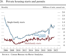
Residential investment is well above pre-pandemic levels but fell back somewhat last year, as construction was limited by persistent bottlenecks that led to materials shortages. In recent months, the sector has shown signs of a rebound, as single-family permits have risen steadily (figure 20). Nevertheless, the timing of the resolution of these supply constraints remains highly uncertain. Prices of lumber and other materials have moved up appreciably, and shortages of other construction inputs—such as labor and lots ready for development—remain acute.
20. Private housing starts and permits
Source: Census Bureau via Haver Analytics.
...amid surging demand for housing...
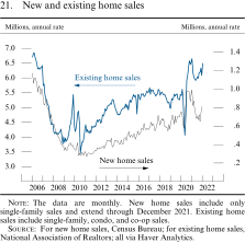
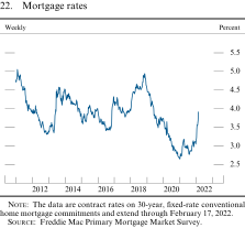
Demand for housing surged earlier during the pandemic and has remained strong, with home sales well above levels seen in the years before the pandemic despite very tight inventory of homes available for sale (figure 21). This surge in demand is likely due to a combination of factors, including increased work-from-home arrangements; shifts away from other types of consumer spending, such as travel and leisure; and mortgage rates that remain low despite notable recent increases (figure 22). Meanwhile, mortgage credit remained broadly available for a wide range of potential borrowers. Although mortgage credit for borrowers with low credit scores remained tighter than before the pandemic, it eased over the second half of last year.
21. New and existing home sales
The data are monthly. New home sales include only single-family sales and extend through December 2021. Existing home sales include single-family, condo, and co-op sales.
Source: For new home sales, Census Bureau; for existing home sales, National Association of Realtors; all via Haver Analytics.
22. Mortgage rates
The data are contract rates on 30-year, fixed-rate conventional home mortgage commitments and extend through February 17, 2022.
Source: Freddie Mac Primary Mortgage Market Survey.
Series: Mortgage rates Horizon: January 6, 2011, to February 17, 2022 Description: A line chart with one curve over January 6, 2011, to February 17, 2022. Units are percent, and the data are weekly. The series starts at about 4.7 before quickly rising to a peak of about 5 by mid-February 2011 and then declining to nearly 3.3 by the end of November 2012. It fluctuates between about 3.3 and 3.7, trending slightly upward until mid-May 2013 and then increasing sharply until reaching about 4.6 in mid-September 2013. The series then fluctuates between about 3.5 and 4.5, trending modestly downward before falling to just below 3.5 by July 2016 and remaining there through October 2016. The series ascends to around 4.3 by March 2017 before receding to about 3.8 in September 2017. From there, the series rises to a peak of nearly 5 in mid-November 2018 before falling to a low of just above 2.6 by January 2021. The series rebounds to about 3.2 by April 2021 before decreasing to about 2.8 in August 2021. It increases considerably through the end of 2021, ending at nearly 4 in mid-February 2022.
...which has contributed to record house price growth
As a result of supply constraints and surging demand, house price growth reached record levels, and, even after adjusting for overall inflation, home prices have surpassed their peak of the mid-2000s (figure 23). According to data from Zillow, national house prices rose almost 20 percent last year. Moreover, strong house price growth has been widespread across the United States, as nearly 80 percent of metropolitan areas experienced annual house price increases of at least 10 percent. Homebuying sentiment, as measured by the Michigan survey, remains depressed, reflecting the low inventory of homes and high prices.
23. Real prices of existing single-family houses
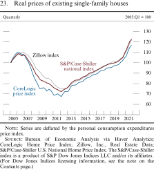
Series are deflated by the personal consumption expenditures price index.
Source: Bureau of Economic Analysis via Haver Analytics; CoreLogic Home Price Index; Zillow, Inc., Real Estate Data; S&P/Case-Shiller U.S. National Home Price Index. The S&P/Case-Shiller index is a product of S&P Dow Jones Indices LLC and/or its affiliates. (For Dow Jones Indices licensing information, see the note on the Contents page.)
Business investment slowed in response to supply constraints...
Investment in equipment and intangibles grew at an annual rate of just 4 percent in the second half of last year, a marked step-down from the nearly 14 percent pace in the first half. As with other sectors of the economy, investment demand has remained strong, while supply constraints have limited spending, as evidenced by shipments of capital goods increasingly lagging orders and equipment prices rising sharply. Supply bottlenecks in the motor vehicle sector have been particularly acute, and business spending on vehicles declined appreciably in the second half of 2021. Investment in nonresidential structures declined further last year despite a sharp rebound in oil drilling and remains well below pre-pandemic levels (figure 24). This sector typically lags in recoveries, and shortages of building materials may be further restraining activity.
24. Real business fixed investment
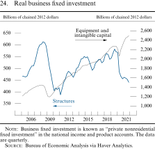
Business fixed investment is known as "private nonresidential fixed investment" in the national income and product accounts. The data are quarterly.
Source: Bureau of Economic Analysis via Haver Analytics.
...while financing conditions remain accommodative
Corporate financing conditions through capital markets remained broadly accommodative for nonfinancial firms and continued to be supported by corporate bond yields that remain very low by historical standards. Amid these low yields and ample investor demand, gross issuance of corporate bonds continued at a robust pace, albeit down from the exceptional pace seen in 2020. In contrast, bank lending to businesses was, on net, subdued last year. While commercial real estate loans grew at a modest pace similar to the years just before the pandemic, commercial and industrial loan balances contracted as a result of loan forgiveness associated with the Paycheck Protection Program (PPP), elevated paydowns, and generally weak borrower demand.
Meanwhile, financing conditions for small businesses have improved notably over the past year and have generally been stable in recent months. Lending standards have eased, and loan origination volumes are in line with pre-pandemic levels, though loan demand remains weak for the smallest firms. Moreover, default and delinquency rates are now within their pre-pandemic range. Nevertheless, the pandemic continues to negatively affect the operations of small businesses, especially in the most affected industries (accommodation and food services, arts, entertainment, and recreation).
The strong U.S. demand has partly been met through a rapid rise in imports
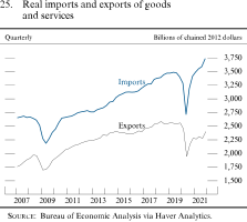
Driven by the strength in U.S. economic activity, particularly the strong demand for goods and a desire to restock inventories, U.S. imports have continued to increase at a notable pace. High levels of imported goods have kept international logistics channels operating under high pressure, which has continued to impair the timely delivery of goods to U.S. customers. By contrast, U.S. exports increased modestly over the second half of 2021 and remain below pre-pandemic levels (figure 25). Given the relative strength in imports compared with exports, both the nominal trade deficit and the current account deficit have increased as a share of GDP relative to 2019 (figure 26).
25. Real imports and exports of goods and services
Source: Bureau of Economic Analysis via Haver Analytics.
26. U.S. trade and current account balances
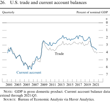
GDP is gross domestic product. Current account balance data extend through 2021:Q3.
Source: Bureau of Economic Analysis via Haver Analytics.
Federal fiscal actions provided a diminishing degree of support to economic activity...
In response to the pandemic, the federal government enacted a historic set of fiscal policies to ameliorate hardship caused by the viral outbreak and support the economic recovery. Policies such as stimulus checks, supplemental unemployment insurance, and child tax credit payments have aided households; grants-in-aid have supported state and local governments; and business support programs such as the PPP have helped sustain firms. Although these temporary policies continue to support the level of GDP, they have begun to unwind and are now likely imposing a drag on GDP growth as the effects on spending wane over time. In addition to pandemic-support policies, the Infrastructure Investment and Jobs Act will gradually boost spending on infrastructure over the next 10 years and is only partially offset by new revenues and other spending reductions.
...while significantly raising the budget deficit and federal debt
Overall, the Congressional Budget Office estimates that fiscal policies enacted since the start of the pandemic—including the infrastructure bill—will increase federal deficits by roughly $5.4 trillion by the end of fiscal year 2030, with the largest deficit effects in fiscal 2020 and 2021.8 These policies, combined with the effects of automatic stabilizers—the reduction in tax receipts and increase in transfers that occur as a consequence of depressed economic activity—caused the federal deficit to surge to 15 percent of nominal GDP in fiscal 2020 and remain elevated at 12-1/2 percent in fiscal 2021. But with fiscal support fading, the deficit is expected to fall sharply this year to a level closer to that observed in the years just before the pandemic (figure 27).
27. Federal receipts and expenditures
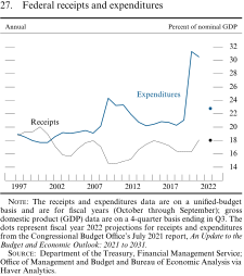
The receipts and expenditures data are on a unified-budget basis and are for fiscal years (October through September); gross domestic product (GDP) data are on a 4-quarter basis ending in Q3. The dots represent fiscal year 2022 projections for receipts and expenditures from the Congressional Budget Office's July 2021 report, An Update to the Budget and Economic Outlook: 2021 to 2031.
Source: Department of the Treasury, Financial Management Service; Office of Management and Budget and Bureau of Economic Analysis via Haver Analytics.
As a result of the unprecedented fiscal support over the past two years, federal debt held by the public jumped to around 100 percent of nominal GDP in 2020—the highest debt-to-GDP ratio since 1947—and remained at a similar level in 2021. Nevertheless, net interest outlays—primarily reflecting debt service payments—have remained relatively flat over the past two years due to historically low interest rates on government borrowing (figure 28).
28. Federal government debt and net interest outlays
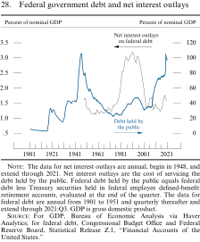
The data for net interest outlays are annual, begin in 1948, and extend through 2021. Net interest outlays are the cost of servicing the debt held by the public. Federal debt held by the public equals federal debt less Treasury securities held in federal employee defined-benefit retirement accounts, evaluated at the end of the quarter. The data for federal debt are annual from 1901 to 1951 and quarterly thereafter and extend through 2021:Q3. GDP is gross domestic product.
Source: For GDP, Bureau of Economic Analysis via Haver Analytics; for federal debt, Congressional Budget Office and Federal Reserve Board, Statistical Release Z.1, "Financial Accounts of the United States."
State and local government finances have been bolstered by federal aid and strong growth in tax revenue...
Federal policymakers have provided a historic level of fiscal support to state and local governments, with aid totaling nearly $1 trillion—more than covering pandemic-related budget shortfalls in the aggregate. Moreover, following the pandemic-induced slump, total state tax collections rose smartly in 2021, pushed up by the economic expansion (figure 29). At the local level, property taxes have continued to rise apace, and the typically long lags between changes in the market value of real estate and changes in taxable assessments suggest that property tax revenues will continue to rise going forward, given the rise in house prices. Meanwhile, conditions in municipal bond markets remained accommodative: Yields stayed near historical lows, and issuance continued at a solid pace, on par with pre-pandemic issuance.
29. State and local tax receipts
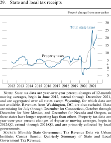
State tax data are year-over-year percent changes of 12-month moving averages, begin in June 2012, extend through December 2021, and are aggregated over all states except Wyoming, for which data are not available. Revenues from Washington, DC, are also excluded. Data are missing for July through December for Connecticut, October through December for New Mexico, and December for Nevada and Oregon, as these states have longer reporting lags than others. Property tax data are year-over-year percent changes of 4-quarter moving averages, begin in 2012:Q2, extend through 2021:Q3, and are primarily collected by local governments.
Source: Monthly State Government Tax Revenue Data via Urban Institute; Census Bureau, Quarterly Summary of State and Local Government Tax Revenue.
Series: Total state taxes and property taxes Horizon: June 2012 to December 2021 Description: A line chart with two curves. Units are percent change from one year earlier. The total state taxes data are monthly and extend from June 2012 to December 2021. The property taxes data are quarterly and extend from 2012:Q2 to 2021:Q3. The total state taxes series starts near 4 in June 2012, moves up to about 8 in September 2013, and decreases to 1.5 in September 2014. The series then climbs to about 5.9 in May 2015 before dropping to about 0.3 around the end of 2016. It then steadily increases to about 8 by September 2018 and falls to 3.6 in January 2019 before rebounding to 6.8 in May 2019. The series decreases to just above 5 by November 2019, then rises to about 8.3 in January 2020. The series plummets to about negative 4.5 in June 2020 before increasing to negative 0.1 and remaining between negative 1.0 and 0.0 throughout 2020. The series then soars to a peak of just above 25 in June 2021 before dropping to about 15 in July 2021 and ending at nearly 22.5 in December 2021. The property taxes series starts around negative 0.7 and gradually increases to about 5.2 by 2016:Q2. The series then moves down to 3.5 by 2017:Q2 and rises to about 6 by 2017:Q4. It decreases to 1.8 through 2018:Q4 and then increases to nearly 6 in 2019:Q4. The series lowers to 3.7 in 2020:Q2, strengthens to a peak of 14.3 by 2021:Q2, then wanes slightly to 12.4 by the end of the series in 2021:Q3.
...but hiring and construction outlays continued to lag
Despite the return to in-person schooling this year and the strong fiscal position of state and local governments, employment levels have regained only about one-half of their sizable pandemic losses, with the shortfall concentrated in public education (figure 30). One reason appears to be that public-sector wages have not kept pace with the rapid gains in the private sector, which is likely inhibiting the ability of these governments to staff back up to pre-pandemic levels. Meanwhile, real construction outlays by state and local governments appear to have declined significantly in 2021, and real infrastructure spending by these governments is currently about 10 percent below pre-pandemic levels.
30. State and local government payroll employment
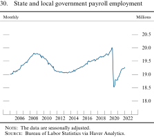
The data are seasonally adjusted.
Source: Bureau of Labor Statistics via Haver Analytics.
Financial Developments
The path of the federal funds rate expected to prevail over the next few years steepened notably
The market-based expected path of the federal funds rate steepened notably amid news about the labor market recovery, rising inflation pressures, and the accompanying prospect of tighter monetary policy. Market-based measures suggest that investors anticipate the federal funds rate will soon begin to rise and move above 1 percent in the middle of this year, about two and a half years earlier than expected in July (figure 31).9 Similarly, according to the results of the Survey of Primary Dealers and the Survey of Market Participants, both conducted by the Federal Reserve Bank of New York in January, the median respondent views the target range as most likely to increase later in the current quarter, about one and a half years earlier than in the June surveys.10
31. Market-implied federal funds rate path
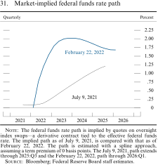
The federal funds rate path is implied by quotes on overnight index swaps–-a derivative contract tied to the effective federal funds rate. The implied path as of July 9, 2021, is compared with that as of February 22, 2022. The path is estimated with a spline approach, assuming a term premium of 0 basis points. The July 9, 2021, path extends through 2025:Q3 and the February 22, 2022, path through 2026:Q1.
Source: Bloomberg; Federal Reserve Board staff estimates.
Treasury yields increased substantially across maturities...
Yields on nominal Treasury securities across maturities have risen notably since early July, with much of the increase having occurred in the past couple of months as the anticipation for an imminent start to the removal of monetary accommodation has firmed (figure 32). Uncertainty about longer-term interest rates—as measured by the implied volatility embedded in the prices of near-term swap options on 10-year swap interest rates—also increased markedly, reportedly reflecting an increase in uncertainty about inflation and the policy outlook.
32. Yields on nominal Treasury securities
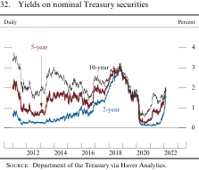
Source: Department of the Treasury via Haver Analytics.
...while spreads of other long-term debt to Treasury securities widened moderately
Across credit categories, corporate bond yields have risen substantially, and their spreads over yields on comparable-maturity Treasury securities have widened moderately since early July (figure 33). Still, both yields and spreads remain near the bottom of their historical distributions, and corporate credit quality is generally healthy and stable. News about the spread of new coronavirus variants appeared to have only limited and temporary effects on corporate bond spreads.
33. Corporate bond yields, by securities rating, and municipal bond yield
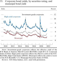
Investment-grade corporate reflects the effective yield of the ICE Bank of America Merrill Lynch (BofAML) triple-B U.S. Corporate Index (C0A4). High-yield corporate reflects the effective yield of the ICE BofAML High Yield Index (H0A0). Municipal reflects the yield to worst of the ICE BofAML U.S. Municipal Securities Index (U0A0).
Source: ICE Data Indices, LLC, used with permission.
Series: Investment-grade corporate, high-yield corporate, and municipal Horizon: January 4, 2010, to February 22, 2022 Description: A line chart with three curves over January 4, 2010, to February 22, 2022. The data are daily, and the units are percent. The investment-grade corporate series starts at approximately 5.8, its local maximum, at the beginning of 2010. It then drops substantially to about 3.5 by late 2012, increases to about 4.5 by the end of 2013, falls to around 3.5 by early 2015, and fluctuates fairly consistently between 3.5 and 5 until late 2019. It then spikes briefly to almost 5.5 in mid-March 2020, decreases to about 2.5 in mid-2021, and then increases rapidly to above 3 in early 2022. The high-yield corporate series begins at about 8.5, declines to above 5.5 by May 2013, increases to almost 10 by the beginning of 2016, drops to about 5.5 by mid-2017, and rises to about 7.5 by the end of 2018. It increases briefly to about 11.5 in mid-March 2020, declines to about 4 in mid-2021, and then increases to above 5 in early 2022. The municipal yield series starts around 4 at the beginning of 2010 and generally follows the same pattern as the other two series, with several fluctuations going forward. The series declines to about 3.7 at the end of 2010, increases to about 4 in 2011, declines to above 2 in 2013, and picks back up to below 4 toward the beginning of 2014. From 2016 to the beginning of 2019, the series generally stays above 2.5, increases briefly to below 3.5 in mid-March 2020, decreases to about 1.2 in mid-2021, and then increases to around 1.5 in early 2022.
Since early July, yields on 30-year agency mortgage-backed securities—an important pricing factor for home mortgage rates—increased, and spreads over comparable-maturity Treasury securities widened moderately but stayed near the low end of their historical range (figure 34). Municipal bond yields moved higher, and spreads over comparable-maturity Treasury securities widened to levels close to their historical medians.
34. Yield and spread on agency mortgage-backed securities
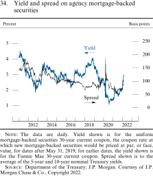
The data are daily. Yield shown is for the uniform mortgage-backed securities 30-year current coupon, the coupon rate at which new mortgage-backed securities would be priced at par, or face, value, for dates after May 31, 2019; for earlier dates, the yield shown is for the Fannie Mae 30-year current coupon. Spread shown is to the average of the 5-year and 10-year nominal Treasury yields.
Source: Department of the Treasury; J.P. Morgan. Courtesy of J.P. Morgan Chase & Co., Copyright 2022.
Series: Yield and spread Horizon: January 1, 2011, to February 22, 2022 Description: A line chart with two curves over January 1, 2011, to February 22, 2022. Units are percent for the yield series and basis points for the spread series. The data are daily. The yield series starts at around 4 in 2011, drops to below 2 in mid-2012, increases to about 3.5 by late 2013, decreases to about 2.5 by mid-2016, and increases to just over 4 by the end of 2018. It then plummets to about 1 by mid-2020, increases to about 2 by early 2021, decreases to about 1.7 in mid-2021, and rises to around 3 in early 2022. The spread series starts at about 140 in 2011 and increases to about 175 by late 2011 before dropping to about 75 by late 2012. The series then increases to about 150 by mid-2013, gradually decreases to about 75 by mid-2019, and spikes to about 190 in March 2020. It decreases to just above 50 in early 2021 before increasing through 2021 to just above 100 in early 2022.
Broad equity price indexes declined slightly on net
Broad indexes of equity prices decreased a little, on net, since early July. Recent declines amid expectations of an earlier beginning to the removal of policy accommodation have offset previous gains, which were supported by strong corporate earnings that had seemed resilient to pandemic developments (figure 35). Stocks of small-capitalization firms underperformed notably, as the likelihood for a tighter stance of monetary policy has increased. Bank stock prices rose, on net, buoyed by an improved economic outlook and expectations of higher levels of interest rates and net interest margins in the future. Measures of volatility for the S&P 500 index, both an option-implied metric (the VIX) and a comparable forward-looking measure based on realized volatility, increased somewhat amid evolving monetary policy expectations and concerns over the Omicron variant and stand above their respective historical medians (figure 36). (For a discussion of financial stability issues, see the box "Developments Related to Financial Stability.")
35. Equity prices
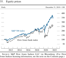
Source: S&P Dow Jones Indices LLC via Bloomberg. (For Dow Jones Indices licensing information, see the note on the Contents page.)
Series: Dow Jones bank index and S&P 500 index Horizon: January 3, 2011, to February 22, 2022 Description: A line chart with two curves over January 3, 2011, to February 22, 2022. Units for all series have been indexed to 100 based on their respective values on December 31, 2010, and the data are daily. The Dow Jones bank index series starts at around 102, drops to about 65 by the end of 2011, rises steadily to about 230 by early 2018 aside from a notable dip throughout 2016, and fluctuates between about 165 and 230 until early 2020, when it plummets to about 120; the series rebounds to about 260 by early 2021, falls again to about 240 by mid-2021, and then climbs again to around 280 at the beginning of 2022 before falling to around 260 in early 2022. The S&P 500 index series follows a similar trajectory but with a magnitude about 25 points higher until early 2019, when the gap begins to increase steadily to almost 130 points by mid-2020, fluctuating generally between 80 and 120 and ending just above 80 in early 2022.
36. S&P 500 volatility
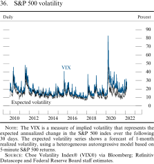
The VIX is a measure of implied volatility that represents the expected annualized change in the S&P 500 index over the following 30 days. The expected volatility series shows a forecast of 1-month realized volatility, using a heterogeneous autoregressive model based on 5-minute S&P 500 returns.
Source: Cboe Volatility Index® (VIX®) via Bloomberg; Refinitiv Datascope and Federal Reserve Board staff estimates.
Series: VIX and expected volatility Horizon: January 4, 2010, to February 22, 2022 Description: A line chart with two curves over January 4, 2010, to February 22, 2022. Units are percent, and the data are daily. The VIX series starts at around 20 in 2010 and generally remains flat from 2010 to 2015 aside from spikes to nearly 50 in May 2010 and August 2011. The series fluctuates between approximately 10 and 30 in 2016 and 2017, generally increases during 2018 aside from spikes to nearly 40 in February 2018 and December 2018, and declines to about 15 by the beginning of 2020. The series sharply increases to about 85 in early 2020 and quickly decreases to about 20 by early 2021, where it then stays relatively constant throughout 2021. The series gradually increases to around 30 in early 2022. The expected volatility series follows a similar trajectory but with a magnitude about 5 to 10 points lower.
Developments Related to Financial Stability
This discussion reviews vulnerabilities in the U.S. financial system. The framework used by the Federal Reserve Board for assessing the resilience of the U.S. financial system focuses on financial vulnerabilities in four broad areas: asset valuations, business and household debt, leverage in the financial sector, and funding risks. Although some asset valuations are elevated, measures of household and business leverage have declined, and the banking system has shown considerable resilience since the onset of the pandemic. Structural vulnerabilities in other parts of the financial system are still being addressed, including those related to various types of investment funds and vulnerabilities in Treasury market functioning.
Prices of risky assets remain elevated, supported in part by a low interest rate environment and low term premiums on Treasury securities. One common measure of equity valuations, the ratio of equity prices to forecast earnings, remains high compared with historical values. Spreads on corporate bonds and leveraged loans continue to be low. Price indexes for a range of commercial real estate sectors are at or near historical highs, and vacancy rates have declined. Residential home prices have continued to rise, with nearly 80 percent of metropolitan statistical areas seeing double-digit annual growth rates during 2021.
Nonfinancial-sector leverage has broadly declined. The rapid growth of nominal gross domestic product (GDP) has brought the ratio of nominal credit to nominal GDP, which measures the aggregate debt owed by the private nonfinancial sector relative to the size of the economy, down to near its pre-pandemic levels (figure A). Household debt relative to nominal GDP remains firmly below its long-run trend, and household credit growth has been driven almost exclusively by prime-rated borrowers. Homeowner equity is high, and mortgage delinquency and foreclosure rates are below their pre-pandemic levels despite the end of pandemic-related relief and forbearance programs. Because of high corporate cash holdings, aggregate net nonfinancial business leverage sits at its lowest level since 2014. Fueled by strong earnings and low borrowing costs, most businesses saw a sharp increase in their ability to service their debt burdens, with the interest coverage ratio (the ratio of earnings to interest expenses) for the median firm solidly above pre-pandemic levels and near historical highs. However, for firms in industries hit hardest by the pandemic, including airlines, hotels, and restaurants, leverage remains elevated and interest coverage ratios are lower.
A. Private nonfinancial-sector credit-to-GDP ratio and trend
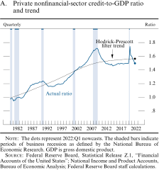
The dots represent 2022:Q1 nowcasts, where the actual ratio is 1.50 and the Hodrick-Prescott filter trend is 1.57. Shaded bars indicate periods of business recession as defined by the NBER: January 1980-July 1980, July 1981-November 1982, July 1990-March 1991, March 2001-November 2001, December 2007-June 2009, and February 2020 – April 2020. GDP is gross domestic product.
Source: Federal Reserve Board, Statistical Release Z.1, "Financial Accounts of the United States"; National Income and Product Accounts, Bureau of Economic Analysis; Federal Reserve Board staff calculations.
Vulnerabilities from financial-sector leverage are well within their historical range. Risk-based capital ratios at domestic bank holding companies reached a 20-year high during the first quarter of 2021. These capital ratios declined modestly over the rest of the year as banks increased their share repurchases and dividend payouts amid an improved economic outlook and the Federal Reserve's lifting of restrictions on capital distributions. Throughout 2021, robust economic growth and strong capital markets contributed to high bank profitability, which fosters resilience through greater loss absorption capacity and an ability to retain earnings to raise capital if needed. In contrast, leverage at certain nonbank financial institutions, including life insurers and hedge funds, has remained near historical highs. Data limitations and the complexity of hedge fund strategies can obscure the true nature of leverage in that sector. However, one common measure of hedge fund leverage, the ratio of gross notional exposures to equity capital, is near its peak since data became available in 2012.
Funding markets remain relatively stable. Domestic banks continue to maintain significant levels of high-quality liquid assets. Assets under management at prime and tax-exempt money market funds (MMFs), which experienced significant outflows during the March 2020 turmoil, continued to decline, on net, since mid-2021, while those at government MMFs remained near historical highs. In December 2021, the Securities and Exchange Commission (SEC) proposed reforms to MMFs intended to mitigate the financial stability risks they pose, including the adoption of swing pricing for certain fund types, increased liquidity requirements, and other measures meant to make them more resilient to redemptions. The market for digital assets, including stablecoins, has grown rapidly. The market value of stablecoins exceeded $150 billion as of January 2022. As detailed in a November 2021 report released by the President's Working Group on Financial Markets, the Federal Deposit Insurance Corporation, and the Office of the Comptroller of the Currency, some stablecoins are partially backed by assets that may lose value or become illiquid, making them susceptible to runs.1 Prefunded resources at central counterparties (CCPs) are high, particularly relative to current market volatility, reducing the likelihood of margin shortfalls and liquidity strains if volatility increases. Nevertheless, increased retail trading has exposed new challenges for the risk-management frameworks of the CCPs that clear equities and equity options. Financial institutions with significant holdings of long-term fixed-rate debt instruments (for example, Treasury securities, agency mortgage-backed securities (MBS), corporate bonds, and mortgage loans), such as banks and mutual funds, may recognize revaluation losses if long-term interest rates increase further, though some of those losses could be offset by higher interest income.
Treasury Market Resilience
In November 2021, the Interagency Working Group composed of staff from the Department of the Treasury, Federal Reserve Board, Federal Reserve Bank of New York, SEC, and Commodity Futures Trading Commission released a report detailing ongoing vulnerabilities in the U.S. Treasury market and principles to promote a well-functioning Treasury market.2 The report also outlined multiple ongoing workstreams designed to further enhance the group's understanding of Treasury market vulnerabilities and to consider policy options that may further strengthen the market.
LIBOR Transition
The shift away from the widely used U.S. dollar (USD) LIBOR reference rates stepped up notably in recent months, in line with regulatory guidance to end most new use of USD LIBOR by December 31, 2021, and well ahead of the cessation of those rates on June 30, 2023. The transition away from USD LIBOR has largely been completed in floating-rate debt markets, where nearly 90 percent of new issuance now references the Secured Overnight Financing Rate (SOFR). In securitization markets, the government-sponsored enterprises had stopped accepting LIBOR adjustable-rate mortgages (ARMs) in 2020, are now accepting only SOFR ARMs, and have tied all of their associated MBS issuance to SOFR. Interest rate swap markets saw increases in volumes for SOFR-based trades in the second half of 2021, and this pace accelerated rapidly in January such that SOFR-based swaps trading now accounts for the majority of risk traded in this market, indicating widespread awareness and adoption of risk-free reference rates. Eurodollar futures have lagged the swap market, although volumes for SOFR-based futures contracts are increasing there also. The transition in business lending has been slower, although recent data suggest that the use of USD LIBOR as a reference rate for business loans has fallen sharply since the start of the year and that the pace of SOFR adoption is accelerating.
Markets for Treasury securities, mortgage-backed securities, and corporate and municipal bonds functioned well...
Markets for Treasury securities and mortgage-backed securities functioned smoothly since July even as some measures of liquidity conditions for Treasury securities deteriorated moderately, which reflected increased yield volatility due, in part, to uncertainty about the path of monetary policy. Measures of market functioning in corporate and municipal bond markets indicated liquid and stable trading conditions. Bid-ask spreads for corporate bonds across credit ratings currently stand below pre-pandemic levels and near the bottom of their historical distributions.
...while short-term funding market conditions remained stable
Short-term funding markets continued to function smoothly. The effective federal funds rate and other overnight unsecured rates declined slightly relative to the interest rate on reserve balances since early July. Secured overnight rates remained stable, with the Secured Overnight Financing Rate steady at the offering rate on the overnight reverse repurchase agreement (ON RRP) facility on most days since early July. Ample liquidity and a limited supply of Treasury bills kept short-term interest rates low and led to increased usage of the ON RRP facility. (See the box "Developments in the Federal Reserve's Balance Sheet and Money Markets" in Part 2.)
Bank credit expanded and bank profitability remained strong
Total loans and leases outstanding at commercial banks expanded significantly in the second half of last year, driven by continued solid growth in commercial real estate, residential real estate, and consumer loans, which outweighed declines in commercial and industrial loans (figure 37). In both October and January, the Senior Loan Officer Opinion Survey on Bank Lending Practices, conducted by the Federal Reserve, reported easier standards for most loan categories over the second half of 2021.11 In the January survey, respondents generally anticipated a further easing of lending standards and stronger loan demand over the current year. Bank profitability remained strong, declining slightly over the second half of last year but remaining at pre-pandemic levels, helped by the continued release of loan loss reserves, given solid credit quality indicators (figure 38). Delinquency rates on bank loans remained low relative to historical averages throughout the second half of 2021.
37. Growth in total loans and leases
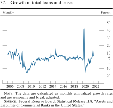
The data are calculated as monthly annualized growth rates and are seasonally and break adjusted.
Source: Federal Reserve Board, Statistical Release H.8, "Assets and Liabilities of Commercial Banks in the United States."
38. Profitability of bank holding companies
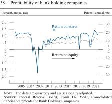
The data are quarterly and are seasonally adjusted.
Source: Federal Reserve Board, Form FR Y-9C, Consolidated Financial Statements for Bank Holding Companies.
International Developments
The recovery abroad continued in the second half of the year...
Economic activity abroad continued to recover briskly in the second half of last year (figure 39), as a noticeable pickup in vaccinations and greater adaptability allowed many foreign economies to further reopen. Unemployment rates in advanced foreign economies (AFEs) have now generally returned to levels near those that prevailed before the pandemic. That said, the emergence of the Delta variant of the virus last summer slowed the recovery of some economies, especially in Asia, and resulted in factory and port closures, which, in turn, exacerbated supply bottlenecks. More recently, the Omicron outbreak has been a headwind and a risk, especially for countries with lower vaccination rates; and order backlogs in industries such as automobile manufacturing remain high. Still, production bottlenecks in Asia have started to unwind.
39. Foreign real gross domestic product
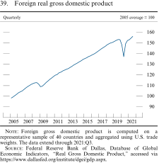
Foreign gross domestic product is computed on a representative sample of 40 countries and aggregated using U.S. trade weights. The data extend through 2021:Q3.
Source: Federal Reserve Bank of Dallas, Database of Global Economic Indicators, "Real Gross Domestic Product," accessed via https://www.dallasfed.org/institute/dgei/gdp.aspx.
...and foreign inflation increased significantly in most economies
As in the United States, foreign inflation has picked up noticeably since late 2020 (figure 40). This higher inflation has been mostly driven by soaring prices for energy and food, which, combined, account for well over half of the level of inflation abroad (figure 41). Higher prices for core goods have also contributed to the rise of inflation, but core inflation abroad has risen less than in the United States, in part because demand for durable goods in foreign economies appears to have increased relatively less sharply.
40. Consumer price inflation in selected foreign economies
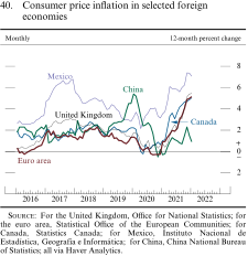
Source: For the United Kingdom, Office for National Statistics; for the euro area, Statistical Office of the European Communities; for Canada, Statistics Canada; for Mexico, Instituto Nacional de Estadística, Geografía e Informática; for China, China National Bureau of Statistics; all via Haver Analytics.
41. Consumer price inflation in foreign economies
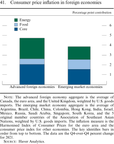
The advanced foreign economy aggregate is the average of Canada, the euro area, and the United Kingdom, weighted by U.S. goods imports. The emerging market economy aggregate is the average of Argentina, Brazil, Chile, China, Colombia, Hong Kong, India, Israel, Mexico, Russia, Saudi Arabia, Singapore, South Korea, and the 5 original member countries of the Association of Southeast Asian Nations, weighted by U.S. goods imports. The inflation measure is the Harmonised Index of Consumer Prices for the euro area and the consumer price index for other economies. The key identifies bars in order from top to bottom. The data are the Q4-over-Q4 percent change for 2021.
Source: Haver Analytics.
Many foreign central banks are tightening monetary policy or have signaled a future shift in stance
In light of elevated inflation, many policymakers are moving to reduce the significant monetary stimulus undertaken since the start of the pandemic. Several emerging market central banks, including those of Brazil, Korea, and Mexico, have already raised their policy rates because of concerns over the persistence of inflationary pressures.
In AFEs, a few central banks, including those of New Zealand, Norway, and the United Kingdom, have started raising their policy rates, and the Bank of Canada has signaled its intention to raise its policy rate soon (figure 42). Others have taken steps to normalize their balance sheet policies: The Bank of Canada, the Bank of England, and the Reserve Bank of Australia have ceased net asset purchases, and the European Central Bank plans to reduce its asset purchases this year. In contrast, the Bank of Japan has communicated that it is not in a rush to tighten policy, noting that measures of underlying inflation in Japan remain below its 2 percent target.
42. 12-month policy expectations for selected advanced foreign economies
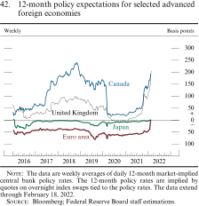
The data are weekly averages of daily 12-month market-implied central bank policy rates. The 12-month policy rates are implied by quotes on overnight index swaps tied to the policy rates. The data extend through February 18, 2022.
Source: Bloomberg; Federal Reserve Board staff estimations.
Series: Euro area, Japan, United Kingdom, and Canada Horizon: January 8, 2016, to February 18, 2022 Description: A line chart with four curves over January 8, 2016, to February 18, 2022. Units are basis points, and the data are weekly. The euro area begins at around negative 40 and fluctuates between negative 45 and negative 35 until early 2019, when it falls slightly to near negative 80. It rises back up to negative 50 by the end of 2019, falls again to near negative 80 in early 2020, and rises to around negative 60, where it holds constant until the end of 2021. It then rises sharply to nearly 0 in early 2022. Japan follows a similar pattern to the euro area, only with all of its values closer to zero. It begins at around 5 and falls immediately to around negative 30, rising back to around 0 by the end of 2016, where it stays, deviating to around negative 20 from early 2019 to early 2020 and rising back to 0 through early 2022. The United Kingdom begins at around 65, falls gradually to near 10 by mid-2016, rises steadily to nearly 100 by late 2018, falls steadily to just below 0 in early 2020, stays below 0 for the duration of 2020, rises gradually to around 25 by mid-2021, and then rises sharply to just over 200 by early 2022. Canada begins at around 35, rises gradually to around 60 by mid-2017, increases sharply to over 150 by late 2017, increases gradually to just below 250 by late 2018, falls gradually to around 150 by early 2020, falls sharply to around 30 in early 2020, rises slowly to around 50 by late 2021, and increases sharply to just under 200 by early 2022.
Foreign financial conditions tightened some but remain accommodative...
Expectations for faster removal of monetary policy accommodation, amid higher inflation and easing concerns about the pandemic, led to notable increases in sovereign yields in several AFEs (figure 43). Despite expectations for tighter monetary policy, the strength in corporate earnings and reduced concerns about the pandemic have supported AFE equities, which are little changed, on net, since mid-2021.
43. Nominal 10-year government bond yields in selected advanced foreign economies
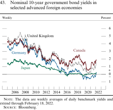
The data are weekly averages of daily benchmark yields and extend through February 18, 2022.
Source: Bloomberg.
Series: Japan, Germany, United Kingdom, and Canada Horizon: January 1, 2005, to February 18, 2022 Description: A line chart with four curves over January 1, 2005, to February 18, 2022. Units are percent, and the data are weekly averages of daily benchmark yields. Japan begins above 1, rises to nearly 2 in 2006, declines steadily to 0 through 2015, fluctuates near 0 from 2016 to the end of 2021, and rises gradually to about 0.25 in early 2022. Germany, the United Kingdom, and Canada all vary significantly at short time scales. Germany begins below 4, climbs close to 5 in 2007, drops to about 3 in late 2008, declines steadily to 0 by 2016, fluctuates between 0 and 1 through 2018, stays between 0 and negative 1 from 2019 through early 2021, rises to near 0 by early 2021, falls again to around negative 0.5 in mid-2021, and slowly rises to just over 0 in early 2022. The United Kingdom begins at about 4.5, increases to about 5.5 in mid-2007, declines to about 2 at the end of 2008, rises to about 4 in 2010, drops to about 1.5 in 2012, climbs to about 3 in 2013, slides to less than 1 in 2016, rises to about 2 in 2018, slumps to about 0 in mid-2020, and increases to about 1.5 by early 2022. Canada follows a path like that of the United Kingdom, only diverging significantly after 2016. In mid-2016, it drops to almost 1, fluctuates around 2 through 2018, slides to just above 0.5 by 2020, rises to over 1 in early 2021, and stays between 1 and 2 until early 2022.
The change in financial conditions in emerging market economies (EMEs) has been relatively muted despite the shift in advanced-economy monetary policy expectations and increased geopolitical tensions. Net inflows to EME-dedicated funds stepped down and hovered around zero, in contrast with notable outflows during the 2013–14 period, and EME sovereign spreads widened only somewhat (figure 44). In China, solvency problems in the real estate sector and regulatory uncertainty appeared to weigh on stock prices of large Chinese firms listed in Hong Kong, with the Hang Seng Index decreasing notably. Brazilian equity prices also decreased amid political uncertainty, while some other EME stock indexes registered moderate gains. More recently, geopolitical tensions surrounding Russia and Ukraine have led to the underperformance of Eastern European equity indexes.
44. Emerging market mutual fund flows and spreads
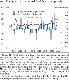
The bond and equity fund flows data are semiannual sums of weekly data from December 28, 2006, to December 29, 2021, and a monthly sum of weekly data from December 30, 2021, to January 26, 2022. Weekly data span Thursday through Wednesday, and the semiannual and monthly values are sums over weekly data for weeks ending in that half year or month. The fund flows data exclude funds located in China. The J.P. Morgan Emerging Markets Bond Index Plus (EMBI+) data are weekly averages of daily data, extend through January 28, 2022, and exclude Venezuela.
Source: For bond and equity fund flows, EPFR Global; for EMBI+, J.P. Morgan Emerging Markets Bond Index Plus via Bloomberg.
Series: EMBI+, equity fund flows, and bond fund flows Horizon: December 28, 2006, to January 28, 2022 Description: A line chart with one curve overlaid on a stacked bar chart with two series. The EMBI+ curve data are weekly averages of daily data, and the units are basis points. The stacked bar chart comprises a series for equity fund flows and a series for bond fund flows, which are semiannual sums from December 28, 2006, to December 29, 2021, and a monthly sum from December 30, 2021, to January 26, 2022. The units are billions of dollars. The EMBI+ series begins around 150, rises sharply to about 750 in mid-2008, drops to about 300 in 2009, fluctuates between about 200 and about 300 through 2019, spikes upward to about 600 in early 2020, and ends at about 300 in January 2022. The equity fund flows begin in late 2007 at about 35, fall to about negative 25 by late 2008, rise to about 35 in 2009, increase sharply to about 55 in late 2010, drop to about negative 30 in 2011, rise to about 35 in 2012, fluctuate between just above 0 and about negative 25 through early 2015, fall sharply to about negative 60 in late 2015, rise to fluctuate between about 15 and 30 through early 2018, decrease to fluctuate between just above 0 and about negative 15 through 2019, slide sharply to about negative 40 in early 2020, rebound to about 40 in late 2020, increase to about 85 in the first half of 2021, decrease to about 20 in the second half of 2021, and end around 15 in January 2022. The bond fund flows begin in early 2007 and follow a similar pattern with about one-third to one-half the magnitude of the equity fund flows through 2016. The bond fund flows increase to about 35 in early 2017, fall to negative 15 by the end of 2018, increase to between about 20 and 35 in 2019, slide to about negative 35 in early 2020, rebound to about 50 in the second half of 2020, decrease to about 30 in the first half of 2021, decrease to about negative 5 in the second half of 2021, and end just below 0 in January 2022.
...and the dollar appreciated moderately on net
The broad dollar index—a measure of the trade-weighted value of the dollar against foreign currencies—has risen modestly since mid-2021 (figure 45). The dollar appreciated against Latin American currencies amid increased political uncertainty in some countries, while it was mixed against Asian EME currencies. The dollar appreciated against many AFE currencies, in part reflecting the more notable increase in the U.S. near-term yields compared with the AFE counterparts.
45. U.S. dollar exchange rate indexes
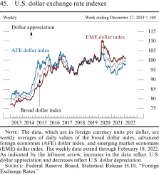
The data, which are in foreign currency units per dollar, are weekly averages of daily values of the broad dollar index, advanced foreign economies (AFE) dollar index, and emerging market economies (EME) dollar index. The weekly data extend through February 18, 2022. As indicated by the leftmost arrow, increases in the data reflect U.S. dollar appreciation and decreases reflect U.S. dollar depreciation.
Source: Federal Reserve Board, Statistical Release H.10, "Foreign Exchange Rates."
Footnotes
Monetary Policy
The Federal Open Market Committee has maintained the federal funds rate near zero...
The Federal Open Market Committee (FOMC) has been providing forward guidance for the target range for the federal funds rate, indicating that the range would be maintained at 0 to 1/4 percent until specific employment and inflation criteria had been met. Consistent with that guidance, the FOMC has maintained the target range for the federal funds rate at 0 to 1/4 percent (figure 46). In December, the Committee concluded that the inflation criteria in the forward guidance had been met and the target range would be maintained until labor market conditions had reached levels consistent with the Committee's assessments of maximum employment. In January, the Committee stated that, with inflation well above 2 percent and a strong labor market, it expected it would soon be appropriate to raise the target range for the federal funds rate.
Selected interest rates
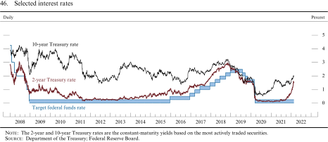
The 2-year and 10-year Treasury rates are the constant-maturity yields based on the most actively traded securities.
Source: Department of the Treasury; Federal Reserve Board.
...and the Committee has gradually reduced the monthly pace of its net asset purchases of Treasury securities and agency mortgage-backed securities, which will end in early March
From June 2020 until November 2021, the Federal Reserve had been expanding its holdings of Treasury securities by $80 billion per month and its holdings of agency mortgage-backed securities (MBS) by $40 billion per month. At its November meeting, in light of the substantial further progress the economy had made toward maximum employment and price stability, the Committee decided to reduce the monthly pace of its net asset purchases by $10 billion per month for Treasury securities and by $5 billion per month for agency MBS. At its December meeting, in light of inflation developments and the further improvement in the labor market, the Committee began to reduce the monthly pace of net purchases more rapidly, by $20 billion per month for Treasury securities and by $10 billion per month for agency MBS. At its January meeting, the Committee decided to continue to reduce the monthly pace of net purchases and conclude net purchases in early March.
The FOMC will continue to monitor the implications of incoming information for the economic outlook
The Committee will continue to monitor incoming economic data and would be prepared to adjust the stance of monetary policy as appropriate to manage risks that could impede the attainment of its goals. The Committee's assessments will take into account a wide range of information, including readings on public health, labor market conditions, inflation pressures and inflation expectations, and financial and international developments. With appropriate policy, inflation is expected to decline over the course of the year as supply constraints ease and demand moderates due to waning effects of fiscal support and the removal of monetary policy accommodation. The FOMC will use its policy tools as appropriate to prevent higher inflation from becoming entrenched while promoting a sustainable expansion and strong labor market.
The Federal Reserve issued a statement regarding principles for reducing the size of its balance sheet
Following the conclusion of its January meeting, the FOMC issued a set of principles regarding its planned approach for significantly reducing the size of the Federal Reserve's balance sheet.12 With these principles, the Committee reiterated its view that changes in the target range for the federal funds rate are its primary means of adjusting the stance of monetary policy and conveyed its expectation that reducing the size of the Federal Reserve's balance sheet would occur after the process of increasing the target range for the federal funds rate had begun. The Committee also noted that it would determine the timing and pace of reductions in the size of its balance sheet so as to promote its maximum-employment and price-stability goals and that reductions would occur over time in a predictable manner, primarily by adjusting the amounts reinvested of principal payments received from securities held in the System Open Market Account (SOMA). Furthermore, the FOMC communicated that, over time, it intended to maintain securities holdings in amounts needed to implement monetary policy efficiently and effectively in its ample reserves regime. The Committee also noted that, in the longer run, it intended to hold primarily Treasury securities in the SOMA, thereby minimizing the effect of Federal Reserve holdings on the allocation of credit across sectors of the economy. Finally, the Committee emphasized that it was prepared to adjust any details of its approach in light of economic and financial developments.
The size of the Federal Reserve's balance sheet continued to grow, although at a diminished pace since November
The Federal Reserve's balance sheet has grown to $8.9 trillion from $8.1 trillion in July, reflecting continued net asset purchases of U.S. Treasury securities and agency mortgage-backed securities to support smooth market functioning and foster accommodative financial conditions, thereby supporting the flow of credit to households and businesses (figure 47). All of the Federal Reserve's emergency credit and liquidity facilities have been closed for new lending for some time, and the residual outstanding balances at those facilities have continued to decline.13
Federal Reserve assets and liabilities
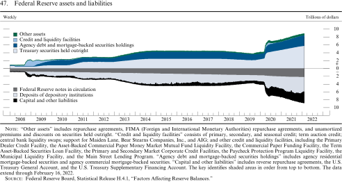
"Other assets" includes repurchase agreements, FIMA (Foreign and International Monetary Authorities) repurchase agreements, and unamortized premiums and discounts on securities held outright. "Credit and liquidity facilities" consists of primary, secondary, and seasonal credit; term auction credit; central bank liquidity swaps; support for Maiden Lane, Bear Stearns Companies, Inc., and AIG; and other credit and liquidity facilities, including the Primary Dealer Credit Facility, the Asset-Backed Commercial Paper Money Market Mutual Fund Liquidity Facility, the Commercial Paper Funding Facility, the Term Asset-Backed Securities Loan Facility, the Primary and Secondary Market Corporate Credit Facilities, the Paycheck Protection Program Liquidity Facility, the Municipal Liquidity Facility, and the Main Street Lending Program. "Agency debt and mortgage-backed securities holdings" includes agency residential mortgage-backed securities and agency commercial mortgage-backed securities. "Capital and other liabilities" includes reverse repurchase agreements, the U.S. Treasury General Account, and the U.S. Treasury Supplementary Financing Account. The key identifies shaded areas in order from top to bottom. The data extend through February 16, 2022.
Source: Federal Reserve Board, Statistical Release H.4.1, "Factors Affecting Reserve Balances."
Reserve balances have changed little, on net, since July and stand near $4 trillion. Usage of the overnight reverse repurchase agreement facility increased significantly. (See the box "Developments in the Federal Reserve's Balance Sheet and Money Markets.")
The Federal Reserve established two standing repurchase agreement facilities
In July of last year, the Federal Reserve established a domestic standing repurchase agreement (repo) facility and a standing repo facility for foreign and international monetary authorities. These facilities are intended to serve as backstops in money markets to support the effective implementation of monetary policy and smooth market functioning. The rates for these facilities have been maintained at levels somewhat higher than rates in overnight funding markets, consistent with their intended roles as backstops.
Developments in the Federal Reserve's Balance Sheet and Money Markets
The size of the Federal Reserve's balance sheet increased from $4.2 trillion before the pandemic to its current level of roughly $8.9 trillion, largely reflecting an increase in System Open Market Account holdings from asset purchases (figure A). As net asset purchases have continued, albeit at a slower pace in recent months, the Federal Reserve's liabilities have also increased (figure B).1 This discussion reviews recent developments in the size and composition of the Federal Reserve's balance sheet and conditions in money markets.
A. Federal Reserve assets
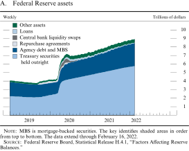
MBS is mortgage-backed securities. The key identifies shaded areas in order from top to bottom. The data extend through February 16, 2022.
Source: Federal Reserve Board, Statistical Release H.4.1, "Factors Affecting Reserve Balances."
B. Federal Reserve liabilities
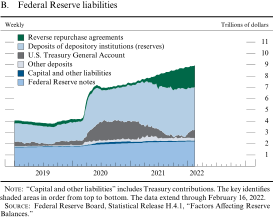
"Capital and other liabilities" includes Treasury contributions. The key identifies shaded areas in order from top to bottom. The data extend through February 16, 2022.
Source: Federal Reserve Board, Statistical Release H.4.1, "Factors Affecting Reserve Balances."
The Federal Reserve's net asset purchases continued at a pace of $120 billion per month from July through October. At its November meeting—in light of the substantial further progress the economy had made toward the Federal Open Market Committee's goals since December 2020—the Committee decided to begin reducing the monthly pace of its net asset purchases by $10 billion per month for Treasury securities and $5 billion per month for agency mortgage-backed securities. At its December meeting—in light of inflation developments and further improvement in the labor market—the Committee decided to double the pace of reductions in its net asset purchases, implying that increases in securities holdings would cease by mid-March. The Federal Reserve's net asset purchases since July 2021 have led to an $813 billion increase in its total assets (figure C).
C. Balance sheet comparison
(Billions of dollars)
Federal Reserve liabilities increased in line with changes in its assets. The level of reserve balances was little changed, on net, while other liabilities—most notably the overnight reverse repurchase agreements (ON RRP)—increased substantially. Another Federal Reserve liability—balances maintained in the Treasury General Account (TGA)—varied significantly over recent months in connection with developments related to the debt limit. The U.S. Treasury lowered its outstanding balance in the TGA from $725 billion in the beginning of July 2021 to a low of $42 billion on December 16, 2021. Following the debt limit resolution on December 16, 2021, which raised the debt limit of the U.S. government, both net Treasury bill issuance and the TGA balance increased to more normal levels.2
Money markets continued to function smoothly amid these developments, with ample liquidity putting broad downward pressure on short-term interest rates. In addition, the limited supply of Treasury bills during the debt limit episode pushed bill yields lower. In this environment of ample liquidity, limited Treasury bill supply, and low repurchase agreement rates, the ON RRP facility continued to serve its intended purpose of helping to provide a floor under short-term interest rates and support effective implementation of monetary policy.3 Usage of the facility has nearly doubled, on average, since early July, primarily driven by greater participation from government money market funds.4 The ON RRP take-up reached a record high of $1.9 trillion on year-end before retracing to around $1.6 trillion in early January.
Footnotes
Summary of Economic Projections
The following material was released after the conclusion of the December 14–15, 2021, meeting of the Federal Open Market Committee. The following material was released after the conclusion of the December 14–15, 2021, meeting of the Federal Open Market Committee.
In conjunction with the Federal Open Market Committee (FOMC) meeting held on December 14–15, 2021, meeting participants submitted their projections of the most likely outcomes for real gross domestic product (GDP) growth, the unemployment rate, and inflation for each year from 2021 to 2024 and over the longer run. Each participant's projections were based on information available at the time of the meeting, together with her or his assessment of appropriate monetary policy—including a path for the federal funds rate and its longer-run value—and assumptions about other factors likely to affect economic outcomes. The longer-run projections represent each participant's assessment of the value to which each variable would be expected to converge, over time, under appropriate monetary policy and in the absence of further shocks to the economy. "Appropriate monetary policy" is defined as the future path of policy that each participant deems most likely to foster outcomes for economic activity and inflation that best satisfy his or her individual interpretation of the statutory mandate to promote maximum employment and price stability.
Table 1. Economic projections of Federal Reserve Board members and Federal Reserve Bank presidents, under their individual assumptions of projected appropriate monetary policy, December 2021
Percent
Medians, central tendencies, and ranges of economic projections, 2021–24 and over the longer run
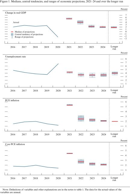
Definitions of variables and other explanations are in the notes to table 1. The data for the actual values of the variables are annual.
FOMC participants' assessments of appropriate monetary policy: Midpoint of target range or target level for the federal funds rate
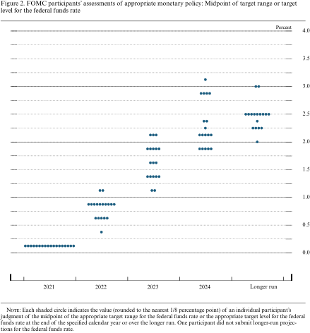
Each shaded circle indicates the value (rounded to the nearest 1/8 percentage point) of an individual participant's judgment of the midpoint of the appropriate target range for the federal funds rate or the appropriate target level for the federal funds rate at the end of the specified calendar year or over the longer run. One participant did not submit longer-run projections for the federal funds rate.
Distribution of participants' projections for the change in real GDP, 2021–24 and over the longer run
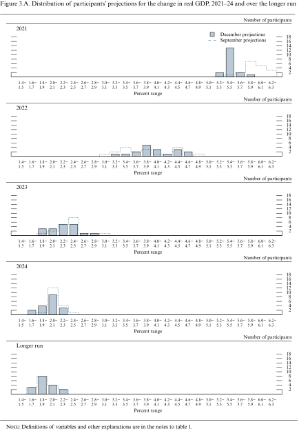
Definitions of variables and other explanations are in the notes to table 1.
Distribution of participants' projections for the unemployment rate, 2021–24 and over the longer run
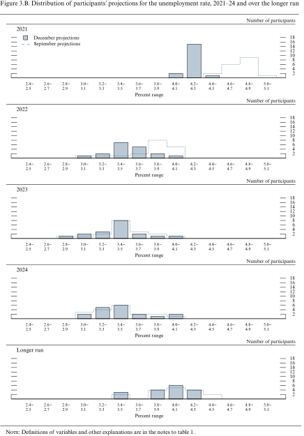
Definitions of variables and other explanations are in the notes to table 1.
Distribution of participants' projections for PCE inflation, 2021–24 and over the longer run
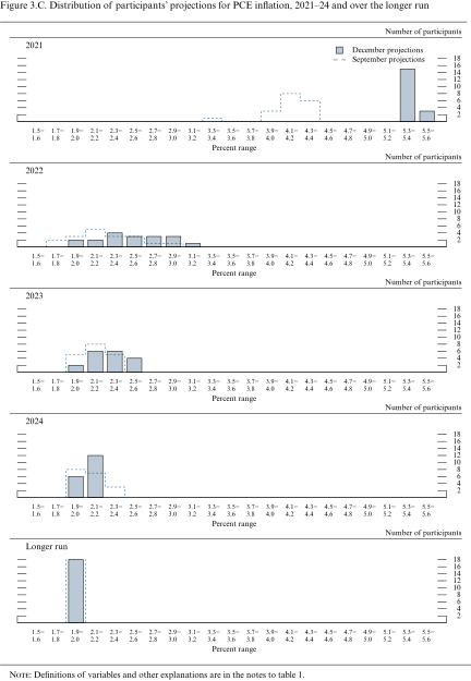
Definitions of variables and other explanations are in the notes to table 1.
Distribution of participants' projections for core PCE inflation, 2021–24
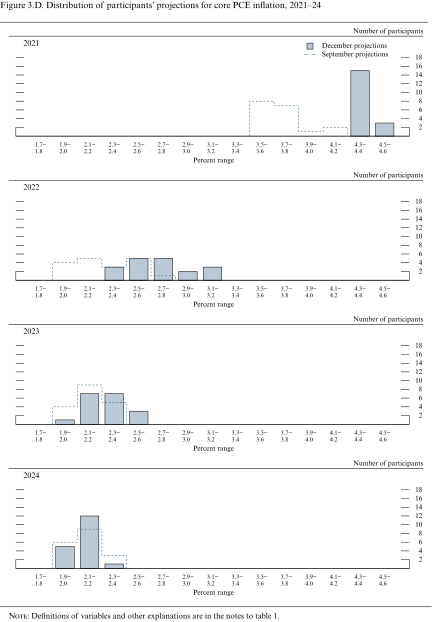
Definitions of variables and other explanations are in the notes to table 1.
Distribution of participants' judgments of the midpoint of the appropriate target range for the federal funds rate or the appropriate target level for the federal funds rate, 2021–24 and over the longer run
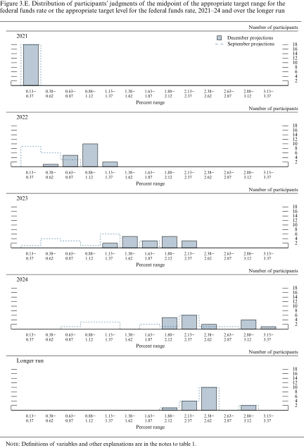
Definitions of variables and other explanations are in the notes to table 1.
Uncertainty and risks in projections of GDP growth
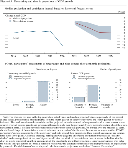
The blue and red lines in the top panel show actual values and median projected values, respectively, of the percent change in real gross domestic product (GDP) from the fourth quarter of the previous year to the fourth quarter of the year indicated. The confidence interval around the median projected values is assumed to be symmetric and is based on root mean squared errors of various private and government forecasts made over the previous 20 years; more information about these data is available in table 2. Because current conditions may differ from those that prevailed, on average, over the previous 20 years, the width and shape of the confidence interval estimated on the basis of the historical forecast errors may not reflect FOMC participants' current assessments of the uncertainty and risks around their projections; these current assessments are summarized in the lower panels. Generally speaking, participants who judge the uncertainty about their projections as "broadly similar" to the average levels of the past 20 years would view the width of the confidence interval shown in the historical fan chart as largely consistent with their assessments of the uncertainty about their projections. Likewise, participants who judge the risks to their projections as "broadly balanced" would view the confidence interval around their projections as approximately symmetric. For definitions of uncertainty and risks in economic projections, see the box "Forecast Uncertainty."
Uncertainty and risks in projections of the unemployment rate
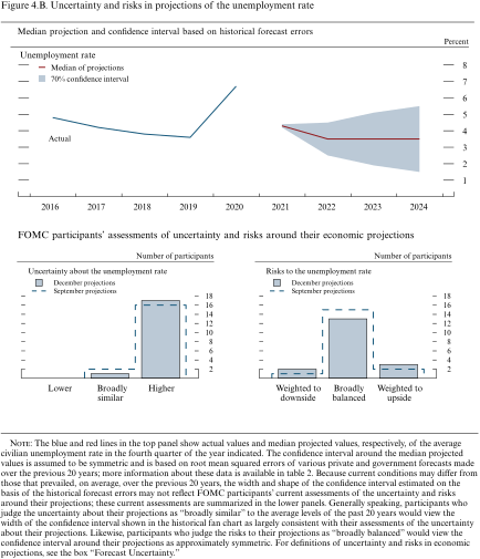
The blue and red lines in the top panel show actual values and median projected values, respectively, of the average civilian unemployment rate in the fourth quarter of the year indicated. The confidence interval around the median projected values is assumed to be symmetric and is based on root mean squared errors of various private and government forecasts made over the previous 20 years; more information about these data is available in table 2. Because current conditions may differ from those that prevailed, on average, over the previous 20 years, the width and shape of the confidence interval estimated on the basis of the historical forecast errors may not reflect FOMC participants' current assessments of the uncertainty and risks around their projections; these current assessments are summarized in the lower panels. Generally speaking, participants who judge the uncertainty about their projections as "broadly similar" to the average levels of the past 20 years would view the width of the confidence interval shown in the historical fan chart as largely consistent with their assessments of the uncertainty about their projections. Likewise, participants who judge the risks to their projections as "broadly balanced" would view the confidence interval around their projections as approximately symmetric. For definitions of uncertainty and risks in economic projections, see the box "Forecast Uncertainty."
Uncertainty and risks in projections of PCE inflation
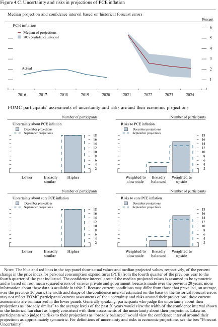
The blue and red lines in the top panel show actual values and median projected values, respectively, of the percent change in the price index for personal consumption expenditures (PCE) from the fourth quarter of the previous year to the fourth quarter of the year indicated. The confidence interval around the median projected values is assumed to be symmetric and is based on root mean squared errors of various private and government forecasts made over the previous 20 years; more information about these data is available in table 2. Because current conditions may differ from those that prevailed, on average, over the previous 20 years, the width and shape of the confidence interval estimated on the basis of the historical forecast errors may not reflect FOMC participants' current assessments of the uncertainty and risks around their projections; these current assessments are summarized in the lower panels. Generally speaking, participants who judge the uncertainty about their projections as "broadly similar" to the average levels of the past 20 years would view the width of the confidence interval shown in the historical fan chart as largely consistent with their assessments of the uncertainty about their projections. Likewise, participants who judge the risks to their projections as "broadly balanced" would view the confidence interval around their projections as approximately symmetric. For definitions of uncertainty and risks in economic projections, see the box "Forecast Uncertainty."
Diffusion indexes of participants' uncertainty assessments
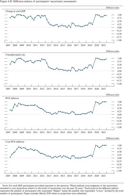
For each SEP, participants provided responses to the question "Please indicate your judgment of the uncertainty attached to your projections relative to the levels of uncertainty over the past 20 years." Each point in the diffusion indexes represents the number of participants who responded "Higher" minus the number who responded "Lower," divided by the total number of participants. Figure excludes March 2020 when no projections were submitted.
Diffusion indexes of participants' risk weightings
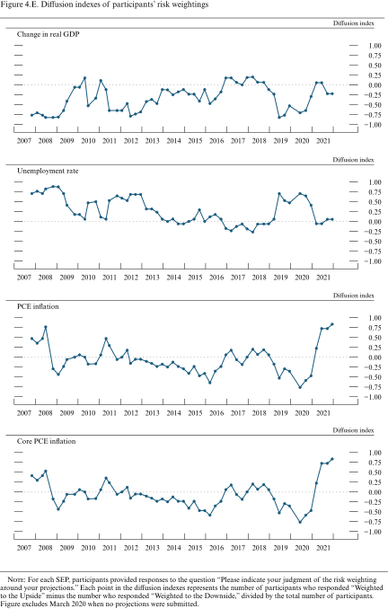
For each SEP, participants provided responses to the question "Please indicate your judgment of the risk weighting around your projections." Each point in the diffusion indexes represents the number of participants who responded "Weighted to the Upside" minus the number who responded "Weighted to the Downside," divided by the total number of participants. Figure excludes March 2020 when no projections were submitted.
Uncertainty and risks in projections of the federal funds rate
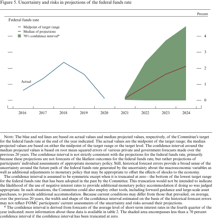
The blue and red lines are based on actual values and median projected values, respectively, of the Committee's target for the federal funds rate at the end of the year indicated. The actual values are the midpoint of the target range; the median projected values are based on either the midpoint of the target range or the target level. The confidence interval around the median projected values is based on root mean squared errors of various private and government forecasts made over the previous 20 years. The confidence interval is not strictly consistent with the projections for the federal funds rate, primarily because these projections are not forecasts of the likeliest outcomes for the federal funds rate, but rather projections of participants' individual assessments of appropriate monetary policy. Still, historical forecast errors provide a broad sense of the uncertainty around the future path of the federal funds rate generated by the uncertainty about the macroeconomic variables as well as additional adjustments to monetary policy that may be appropriate to offset the effects of shocks to the economy.
Table 2. Average historical projection error ranges
Percentage points
Forecast Uncertainty
The economic projections provided by the members of the Board of Governors and the presidents of the Federal Reserve Banks inform discussions of monetary policy among policymakers and can aid public understanding of the basis for policy actions. Considerable uncertainty attends these projections, however. The economic and statistical models and relationships used to help produce economic forecasts are necessarily imperfect descriptions of the real world, and the future path of the economy can be affected by myriad unforeseen developments and events. Thus, in setting the stance of monetary policy, participants consider not only what appears to be the most likely economic outcome as embodied in their projections, but also the range of alternative possibilities, the likelihood of their occurring, and the potential costs to the economy should they occur.
Table 2 summarizes the average historical accuracy of a range of forecasts, including those reported in past Monetary Policy Reports and those prepared by the Federal Reserve Board's staff in advance of meetings of the Federal Open Market Committee (FOMC). The projection error ranges shown in the table illustrate the considerable uncertainty associated with economic forecasts. For example, suppose a participant projects that real gross domestic product (GDP) and total consumer prices will rise steadily at annual rates of, respectively, 3 percent and 2 percent. If the uncertainty attending those projections is similar to that experienced in the past and the risks around the projections are broadly balanced, the numbers reported in table 2 would imply a probability of about 70 percent that actual GDP would expand within a range of 2.3 to 3.7 percent in the current year, 1.3 to 4.7 percent in the second year, 0.8 to 5.2 percent in the third year, and 0.7 to 5.3 percent in the fourth year. The corresponding 70 percent confidence intervals for overall inflation would be 1.8 to 2.2 percent in the current year, 1.1 to 2.9 percent in the second year, 1.0 to 3.0 percent in the third year, and 1.1 to 2.9 percent in the fourth year. Figures 4.A through 4.C illustrate these confidence bounds in "fan charts" that are symmetric and centered on the medians of FOMC participants' projections for GDP growth, the unemployment rate, and inflation. However, in some instances, the risks around the projections may not be symmetric. In particular, the unemployment rate cannot be negative; furthermore, the risks around a particular projection might be tilted to either the upside or the downside, in which case the corresponding fan chart would be asymmetrically positioned around the median projection.
Because current conditions may differ from those that prevailed, on average, over history, participants provide judgments as to whether the uncertainty attached to their projections of each economic variable is greater than, smaller than, or broadly similar to typical levels of forecast uncertainty seen in the past 20 years, as presented in table 2 and reflected in the widths of the confidence intervals shown in the top panels of figures 4.A through 4.C. Participants' current assessments of the uncertainty surrounding their projections are summarized in the bottom-left panels of those figures. Participants also provide judgments as to whether the risks to their projections are weighted to the upside, are weighted to the downside, or are broadly balanced. That is, while the symmetric historical fan charts shown in the top panels of figures 4.A through 4.C imply that the risks to participants' projections are balanced, participants may judge that there is a greater risk that a given variable will be above rather than below their projections. These judgments are summarized in the lower-right panels of figures 4.A through 4.C.
As with real activity and inflation, the outlook for the future path of the federal funds rate is subject to considerable uncertainty. This uncertainty arises primarily because each participant's assessment of the appropriate stance of monetary policy depends importantly on the evolution of real activity and inflation over time. If economic conditions evolve in an unexpected manner, then assessments of the appropriate setting of the federal funds rate would change from that point forward. The final line in table 2 shows the error ranges for forecasts of short-term interest rates. They suggest that the historical confidence intervals associated with projections of the federal funds rate are quite wide. It should be noted, however, that these confidence intervals are not strictly consistent with the projections for the federal funds rate, as these projections are not forecasts of the most likely quarterly outcomes but rather are projections of participants' individual assessments of appropriate monetary policy and are on an end-of-year basis. However, the forecast errors should provide a sense of the uncertainty around the future path of the federal funds rate generated by the uncertainty about the macroeconomic variables as well as additional adjustments to monetary policy that would be appropriate to offset the effects of shocks to the economy.
If at some point in the future the confidence interval around the federal funds rate were to extend below zero, it would be truncated at zero for purposes of the fan chart shown in figure 5; zero is the bottom of the lowest target range for the federal funds rate that has been adopted by the Committee in the past. This approach to the construction of the federal funds rate fan chart would be merely a convention; it would not have any implications for possible future policy decisions regarding the use of negative interest rates to provide additional monetary policy accommodation if doing so were appropriate. In such situations, the Committee could also employ other tools, including forward guidance and asset purchases, to provide additional accommodation.
While figures 4.A through 4.C provide information on the uncertainty around the economic projections, figure 1 provides information on the range of views across FOMC participants. A comparison of figure 1 with figures 4.A through 4.C shows that the dispersion of the projections across participants is much smaller than the average forecast errors over the past 20 years.